
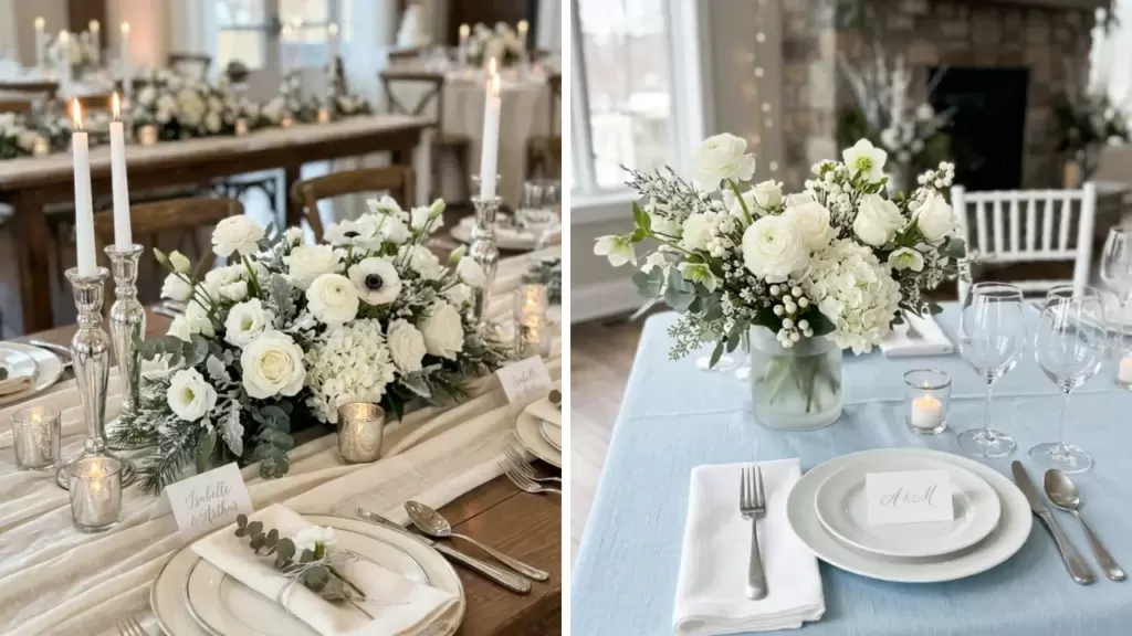
Winter wedding colors can be icy, warm, muted or boldly saturated. These 60 palette ideas show how to place each color in flowers, fabric, stationery and reception details.
Choose the combinations that work with your venue and the materials you can source. These are research-informed styling proposals for 2027 planning, not a claim that every palette is a predicted trend.
The Knot's published 2027 wedding forecast highlights silver as an emerging direction. Silver appears here alongside other options, so you can choose a finish that fits your own celebration.
Frosted Neutrals and Soft Color
1. Snow White, Ivory and Silver
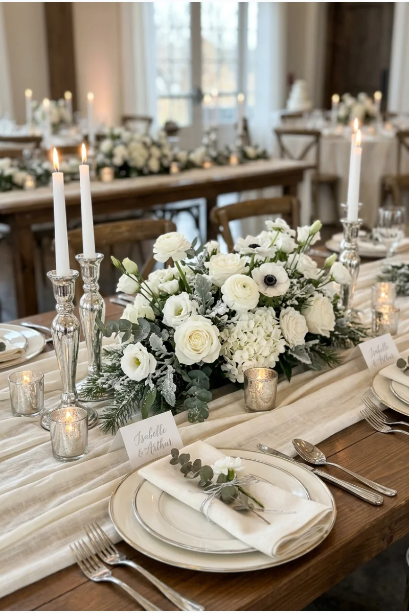
Layer snow-white flowers against ivory fabric, then use silver holders as the smallest accent. The difference between the two whites gives a pale winter palette depth without adding another color.
Show the fabric and flower samples together before ordering. A white that looks crisp online can appear much warmer beside ivory in the actual room.
2. Ice Blue, White and Platinum
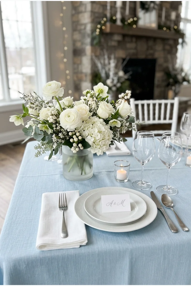
Ice-blue linens give this palette a clear cool foundation, while white flowers keep the table bright. Platinum-toned flatware adds a quiet metallic edge rather than a competing accent color.
Keep the blue visibly pale instead of drifting into turquoise. Ask your rental company for a fabric sample and compare it with your chosen white.
3. Pearl Gray, White and Black
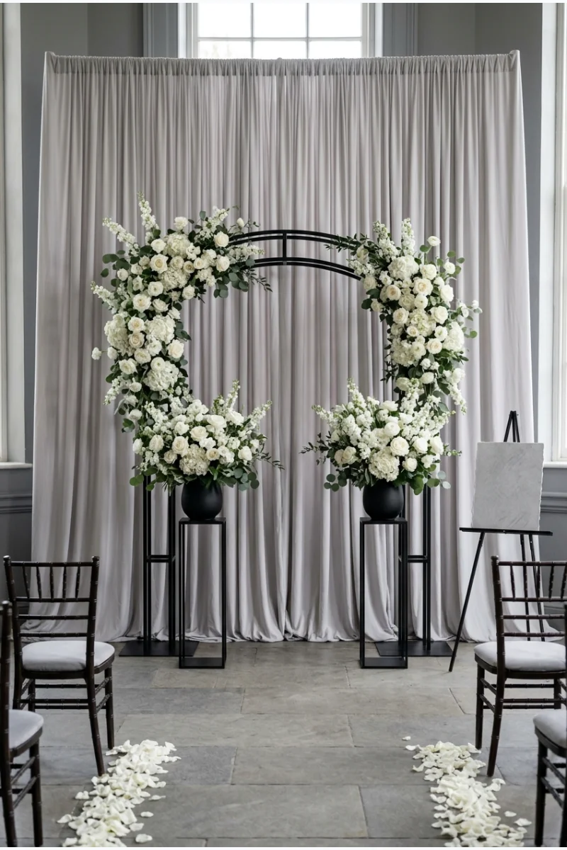
Pearl-gray ceremony draping creates a soft background for white flowers and a few black structural details. The black provides definition without turning the whole ceremony into a dark setting.
Use black on the frame or small vessels rather than across every surface. This preserves the gentle gray character of the palette.
This can be a useful option when the room already has black architectural details. Let those existing elements supply the darkest tone instead of adding more.
4. Champagne, White and Gold
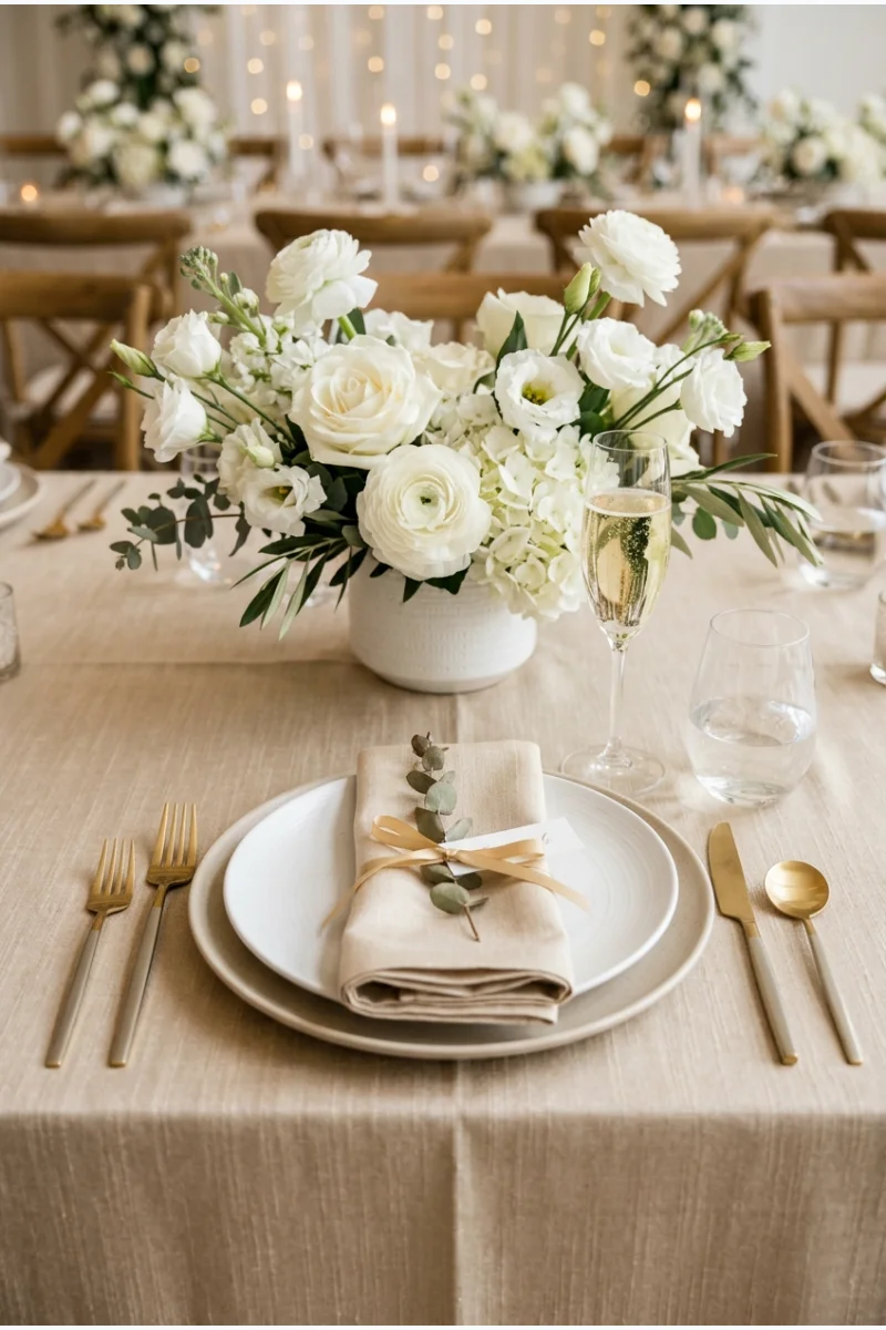
Champagne table linen supplies warmth, with white flowers and gold flatware completing the setting. It is a useful choice when you want winter color without a strong seasonal motif.
Keep champagne in the fabric rather than treating it as a second metal. Choose one gold finish so the small accents feel connected.
5. Blush, White and Pewter
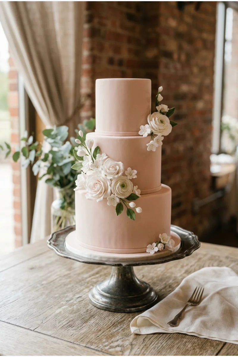
A blush wedding cake on a pewter-toned stand can introduce this soft palette with very little extra decoration. White floral details keep the pink from becoming the only thing you notice.
Repeat blush in a few napkins or paper details elsewhere. You do not need to make every dessert pink to carry the colors through the reception.
For smaller sweets to coordinate with the cake, explore these bridal shower dessert ideas and adapt the presentation to your wedding palette.
6. Lilac, White and Frost Gray
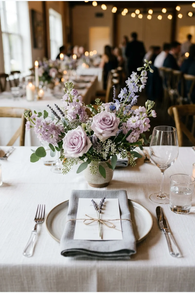
Pale lilac flowers gain a winter setting when paired with white linen and frost-gray napkins. Keep the gray light enough to sit beside the flowers without flattening their color.
This works best when lilac appears in a clear cluster rather than scattered single stems. Ask the florist to show the proposed purple shades together.
- Lilac supplies the floral color.
- White stays on the main linen.
- Frost gray appears in smaller fabric details.
7. Mint, Peach and Cream
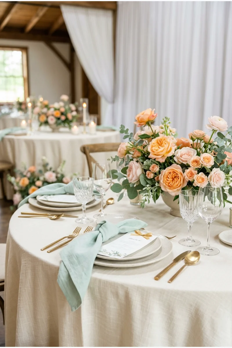
Mint napkins and peach flowers give a cream-covered wedding table a gentle contrast. The combination offers a lighter direction for winter without requiring icy colors or holiday decorations.
Choose a softened mint rather than a vivid green. Let cream occupy most of the table so the peach and mint remain easy to distinguish.
8. Butter Yellow, Ivory and Dove Gray
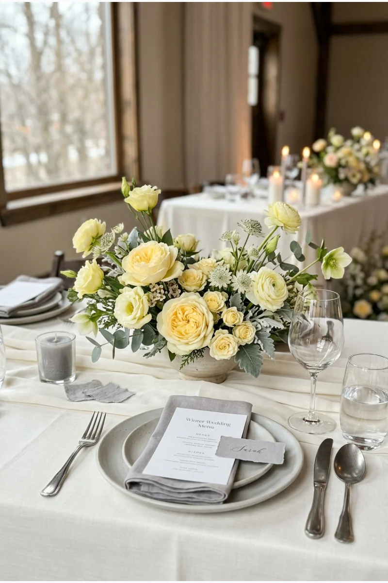
Butter-yellow flowers introduce a small warm note to ivory linen and dove-gray place details. The result can suit a daytime winter reception that needs a little color without a saturated tablecloth.
Keep yellow pale and concentrated in the flowers. A deeper mustard would create a different palette with more visual weight.
Sample check Place the yellow flowers beside both neutral samples. The aim is a gentle warm accent, not three nearly identical pale shades.
9. Powder Blue, Blush and White
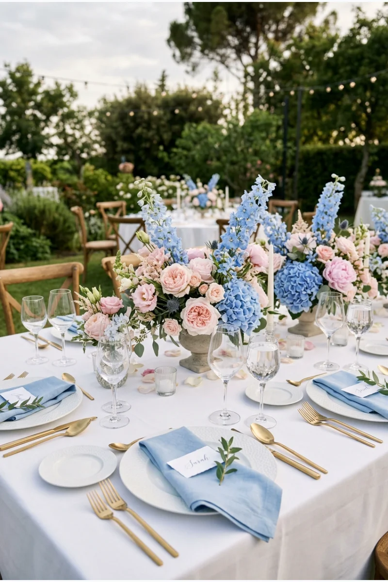
Pair powder-blue napkins with blush flowers on a white table for a light winter reception. Give blue slightly more space than pink so the two pastels do not compete equally.
Use white stationery to connect the settings. Keeping one large surface neutral makes the combination easier to repeat across several tables.
10. Greige, Pearl and Ivory
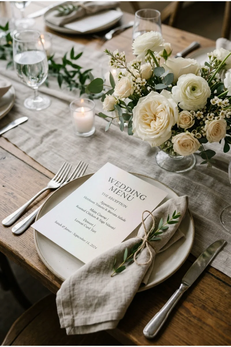
Greige fabric, pearl-toned paper and ivory flowers create a restrained palette built around subtle differences. This is useful when you want the materials to carry more interest than a strong color contrast.
Keep the pearl effect on stationery or small accessories rather than adding imitation pearls everywhere. Check that the greige stays distinct from the ivory.
Winter Greens With Distinct Accents
11. Emerald, Gold and Cream
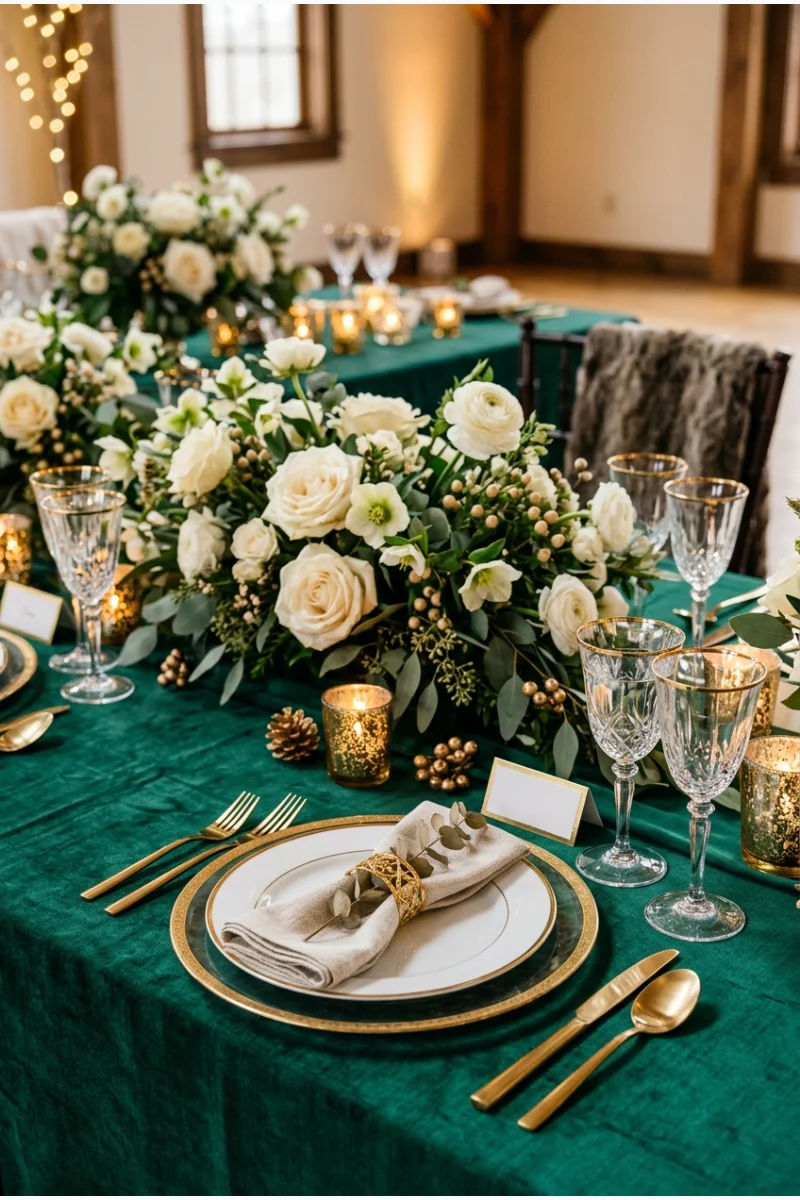
Emerald linen gives a winter wedding table a saturated foundation, while cream flowers prevent the setting from feeling uniformly dark. Use gold in flatware or small holders to connect the two.
Choose one emerald fabric before matching other items. Velvet, satin and matte cloth can show the same named green quite differently.
Give the cream flowers enough volume to show above the emerald cloth. A tiny pale arrangement may look disconnected from such a large area of green.
12. Forest Green, Copper and Ivory
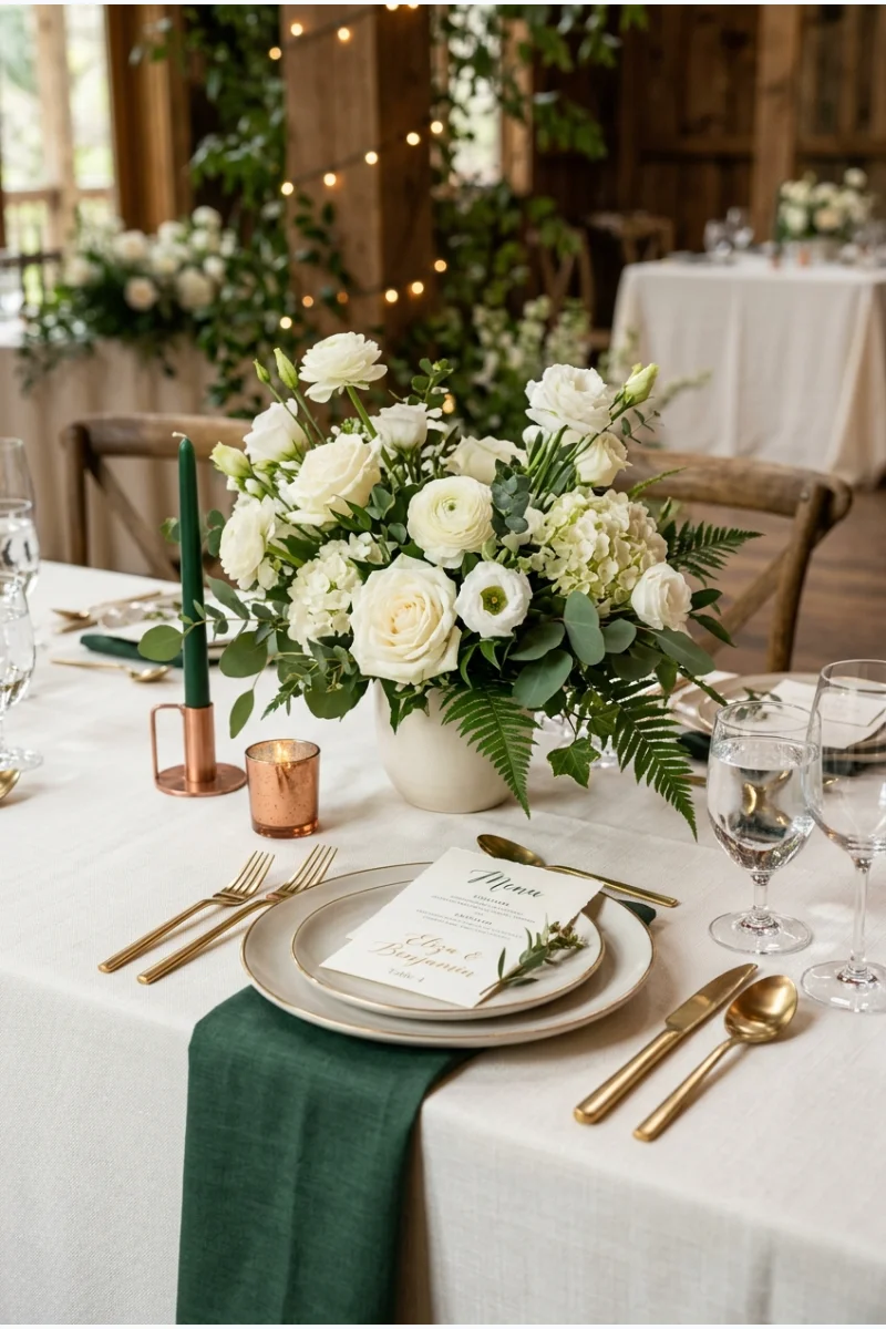
Forest-green napkins, ivory flowers and copper-toned holders bring a warm metal into a deep green palette. Keep the main cloth ivory so the green reads as an intentional accent.
Use copper selectively rather than adding it to every plate and glass. Its reddish finish should remain clearly different from the forest green.
13. Pine Green, White and Black
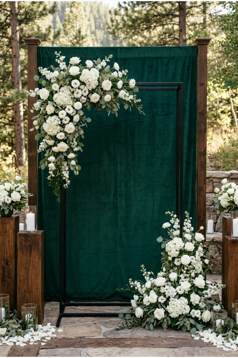
A pine-green ceremony backdrop with white floral clusters and a black frame gives the vow space strong definition. The colors can suggest winter without relying on ornaments or a Christmas-tree display.
Leave some of the green backdrop visible around the flowers. If white covers the whole structure, the palette loses its main color.
14. Sage, Slate and Silver
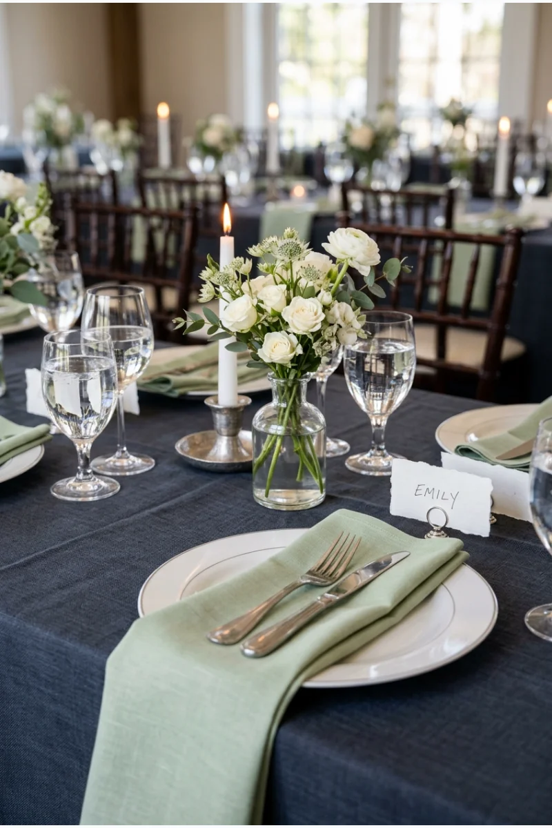
Sage napkins soften a slate-covered reception table, with silver-toned holders providing a small reflective detail. The green-gray relationship makes a quieter alternative to saturated jewel tones.
Use a pale sage so it remains visible against slate. Keep the supporting flowers white and modest rather than introducing another dominant color.
15. Olive, Champagne and Burgundy
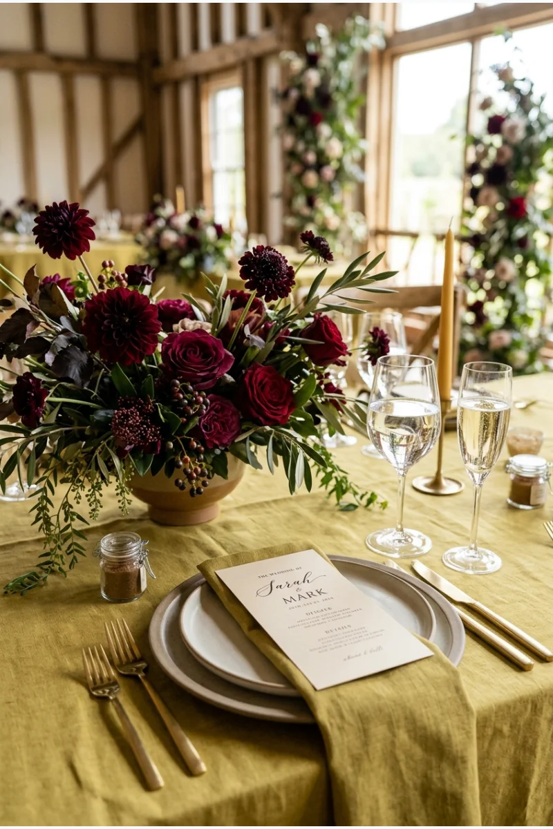
Use olive linen and champagne paper as the quieter foundation, then concentrate burgundy in the flowers. This lets a rich floral color stand out without covering the whole reception in red.
Choose olive with a clear yellow-green character, rather than swapping in forest green. That warmer undertone is what separates this palette from a traditional holiday pairing.
- Olive leads on the table.
- Champagne lightens the paper details.
- Burgundy is concentrated in the flowers.
16. Deep Teal, Dusty Rose and Brass
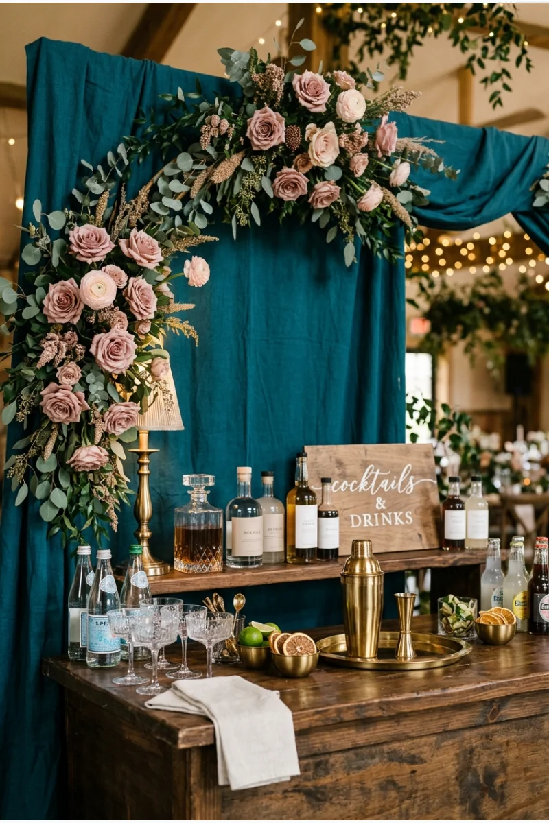
Deep-teal fabric behind a wedding bar gives dusty-rose flowers a strong contrasting background. Brass-toned bar accessories bring the two colors together without needing another floral shade.
Keep the drinks themselves incidental to the color plan. The backdrop and flowers should communicate the palette even before the bar opens.
17. Eucalyptus Green, Navy and White
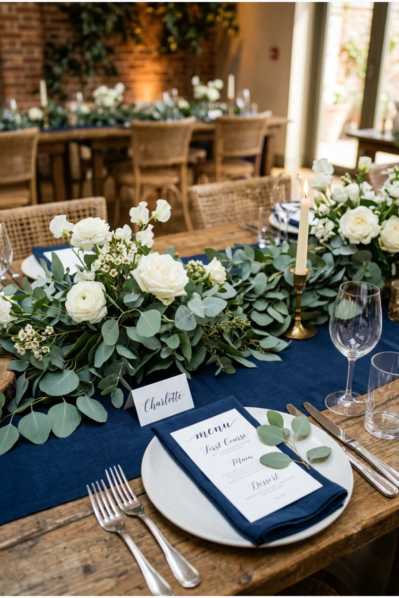
Eucalyptus foliage across a navy runner makes the cool green-gray leaves central to the palette. White flowers and paper details keep the reception arrangement from becoming too dark.
Compare the actual foliage with your navy sample. Natural leaves vary, so aim for a harmonious family of shades rather than a perfect color match.
18. Moss, Chocolate and Parchment
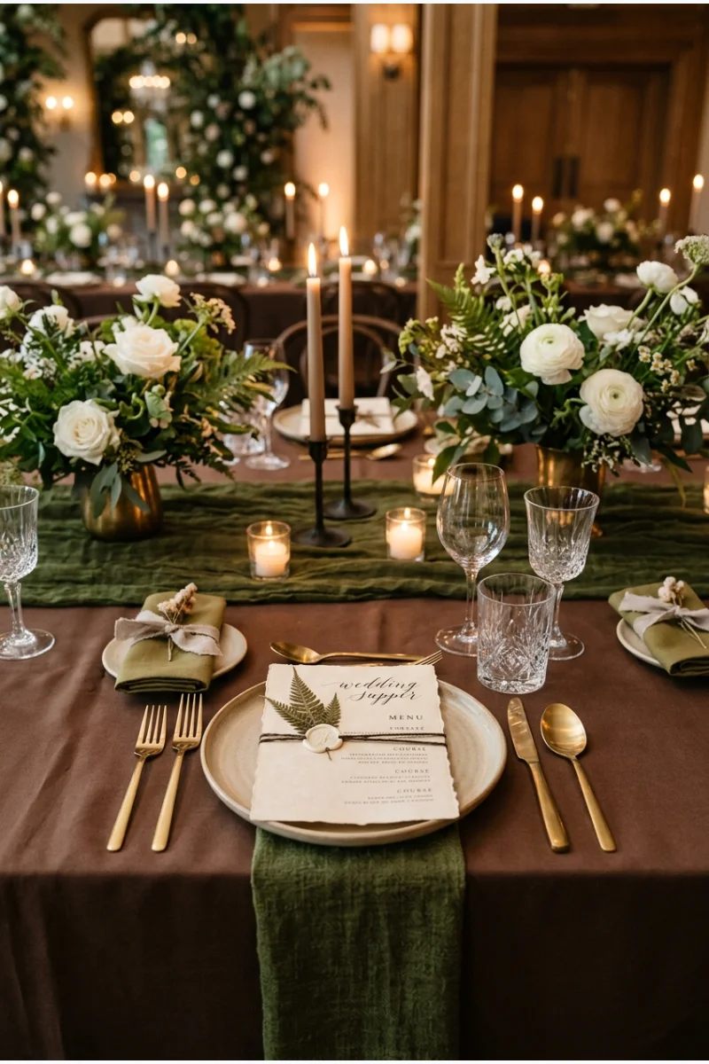
A moss-colored runner over chocolate linen gives a winter dinner table a layered green-and-brown foundation. Parchment-toned menus provide a lighter place for the eye to rest.
This palette gets its character from colored textiles and paper; it does not require exposed timber or a woodland venue.
Material choice Keep the chocolate color in linen if you want the brown without committing to a wood-heavy setting.
19. Bottle Green, Lilac and Silver
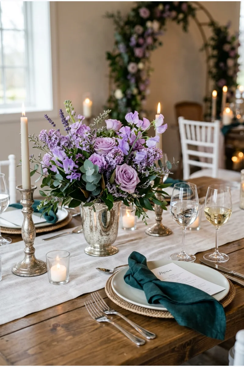
Bottle-green napkins make lilac flowers feel more pronounced, with silver-toned vessels linking the cool colors. Keep the table base pale so the green and purple remain separate.
Use a deeper bottle green with a slightly blue cast. A yellow-green would shift the relationship toward a different, warmer palette.
20. Emerald, Peach and Rust
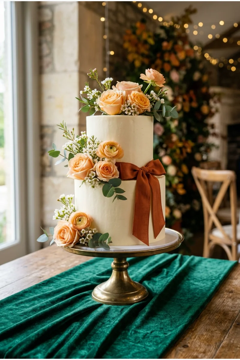
An emerald-covered cake table can support peach flowers and a rust-colored cake detail without becoming a red-and-green holiday scheme. Peach supplies the lighter middle tone between the two strong colors.
Ask the baker and florist to work from the same reference samples. Rust should remain orange-brown rather than becoming burgundy.
Leave some emerald cloth visible around the cake stand. The display should show all three palette colors in one clear composition.
Reds, Wine Shades and Berry Colors
21. Burgundy, Blush and Ivory
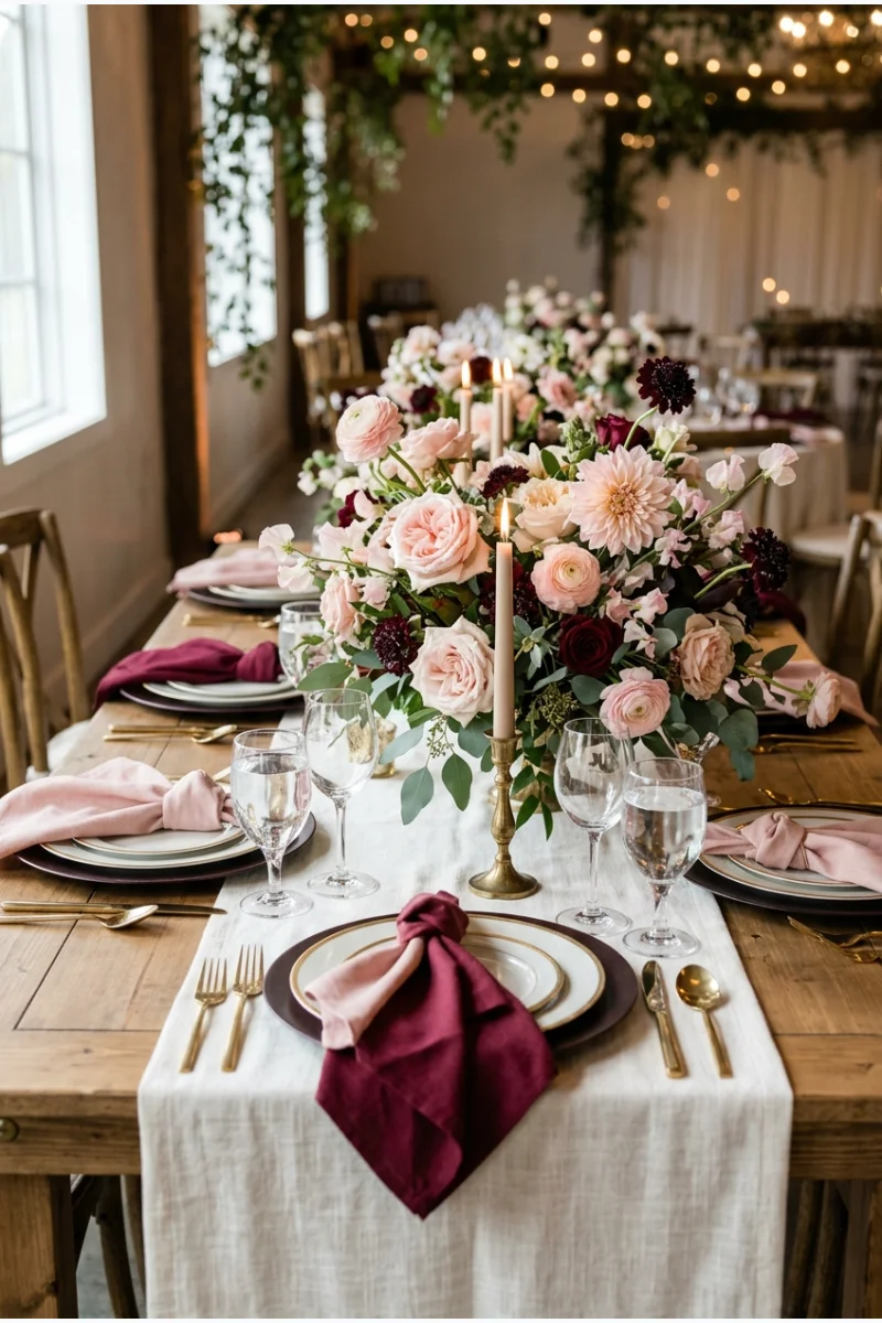
Burgundy napkins and blush flowers add two distinct depths of red-pink to ivory linen. Keep burgundy in repeated blocks so the darker color has a clear role throughout the reception.
Use the blush flowers generously enough to register beside the napkins. A handful of tiny pale accents can disappear against a strong burgundy fabric.
As an Amazon Associate I earn from qualifying purchases.
One practical starting point is the Utopia Home 24-pack of burgundy cloth napkins. Compare a sample with your blush flowers and ivory linen before committing to the full table plan.
22. Cranberry, Pine and Gold
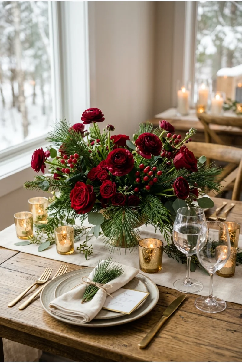
Cranberry flowers, pine foliage and gold holders make an intentionally festive winter wedding palette. Let the floral arrangement carry the red and green, with a quieter table beneath it.
If you want a Christmas wedding, these colors can do much of the thematic work. Additional holiday motifs are optional.
For festive place-setting details, browse these Christmas table setting ideas and adapt the elements that fit a wedding reception rather than copying a whole holiday display.
23. Ruby, Black and White
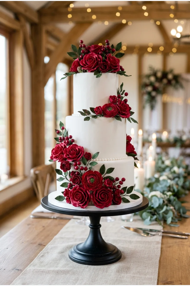
A white wedding cake with ruby-colored decoration on a black stand gives this palette a sharp focal point. Keep the red detail concentrated instead of covering the entire cake.
Repeat black in small reception elements and ruby in the flowers. This keeps the cake connected to the room without duplicating its design everywhere.
24. Oxblood, Champagne and Charcoal
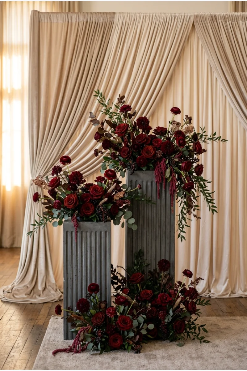
Oxblood flowers against champagne ceremony fabric create a rich focal point, while charcoal plinths add structure. The pale fabric gives the darkest red enough room to stand out.
Check that oxblood remains red-brown under the planned lighting. A very dark sample can appear almost black from across the room.
A small lighter gap between the flowers and charcoal supports helps each element read separately. Avoid crowding the darkest pieces together.
25. Merlot, Mauve and Pewter
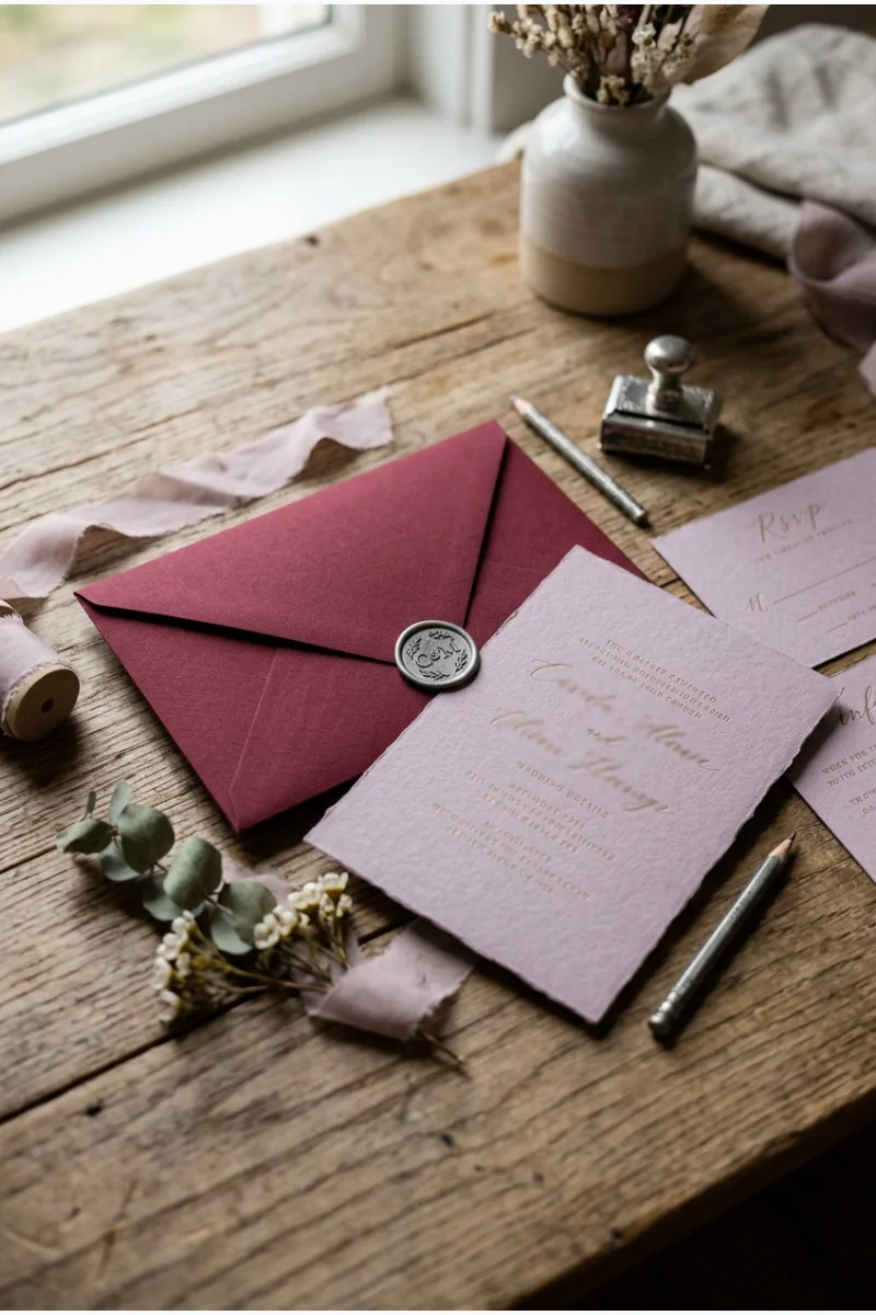
Merlot envelopes, mauve invitation cards and pewter-toned seals introduce a winter palette before the wedding day. The softer purple-pink gives the deep wine color a clear companion.
Carry the same relationship into reception flowers and napkins. Keep the invitation lettering simple and high-contrast when you order the finished suite.
26. Cherry Red, Rose Pink and White
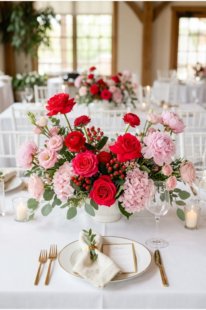
Cherry-red and rose-pink flowers on a white reception table create a bright, romantic option for a February wedding. Let red lead while pink softens the edges of each arrangement.
Choose a clear cherry red instead of wine or burgundy. The brighter red is central to this palette's cheerful contrast.
A few favors can repeat these colors through icing. These bridal shower cookie ideas offer designs you can adapt to wedding cookies in cherry red, rose pink and white.
27. Scarlet, Ice Blue and Silver
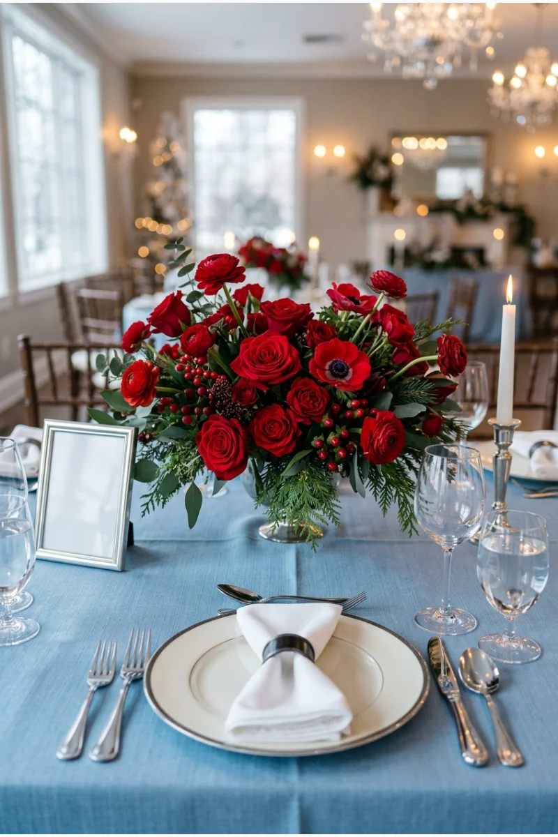
Scarlet flowers above ice-blue linen create a deliberately high-contrast winter table. Silver flatware connects to the cool blue while leaving the red as the main visual accent.
Use a small number of strong red arrangements rather than scattering red accessories over every setting. That keeps the contrast clear.
28. Raspberry, Plum and Blush
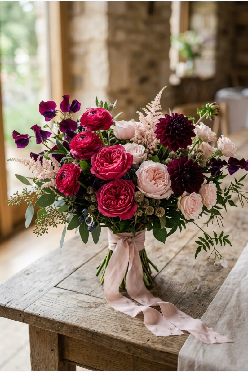
Raspberry and plum flowers can give a winter bouquet depth, with blush blooms creating lighter spaces between the saturated colors. A blush ribbon repeats the softest shade without adding another hue.
Ask the florist to distinguish raspberry from plum in the sample arrangement. If both are too dark, the bouquet can read as one undifferentiated color.
A bouquet is a useful place to test this palette before extending it to the whole reception. Its compact scale makes the color balance easier to judge.
29. Burgundy, Navy and Gold
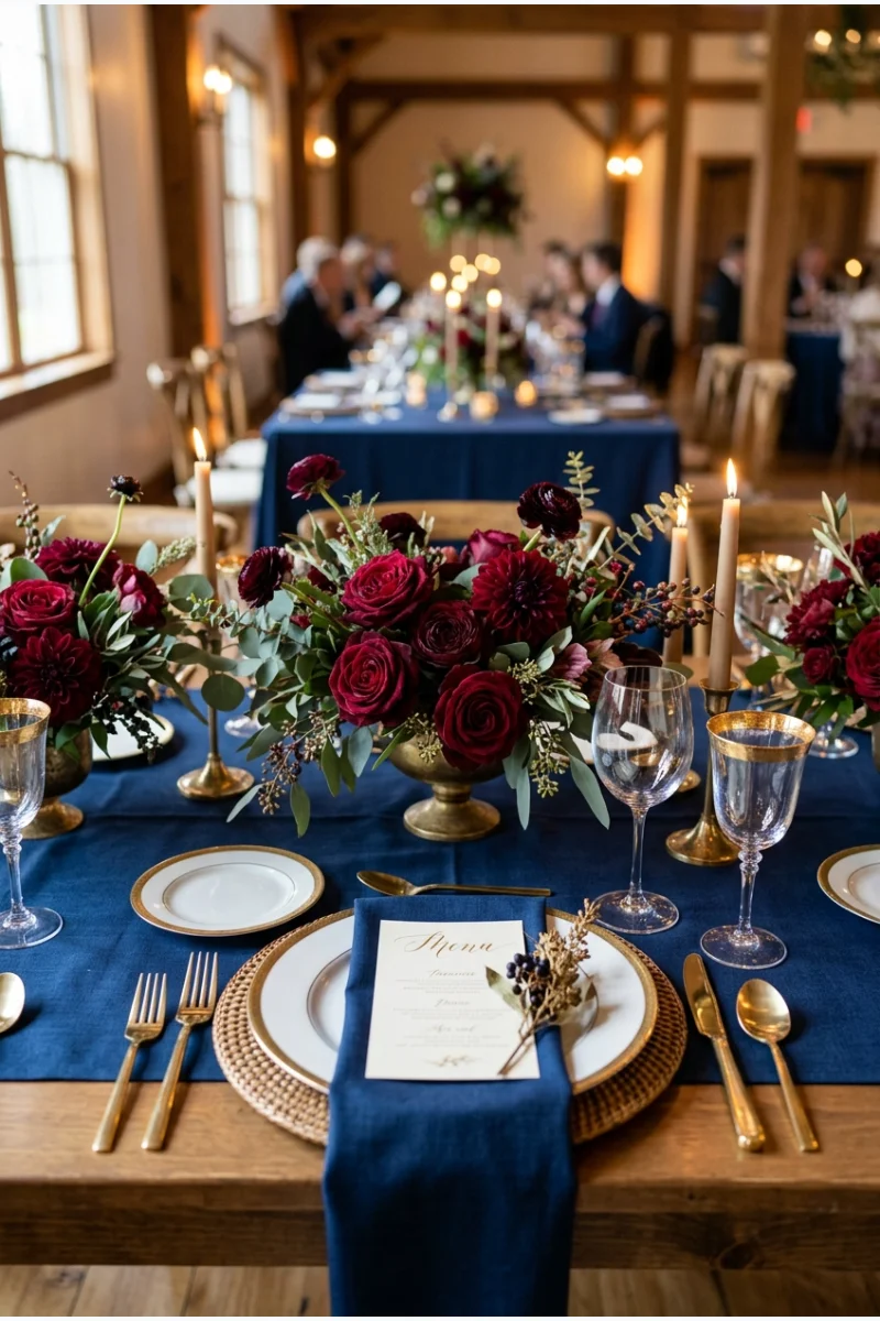
Navy table linen gives burgundy flowers a dark blue setting, with gold flatware adding a narrow bright accent. Use burgundy on the flowers rather than a second large fabric surface.
Leave enough separation between individual arrangements for the navy to show. This palette depends on seeing both dark colors clearly.
30. Mulberry, Ochre and Cream
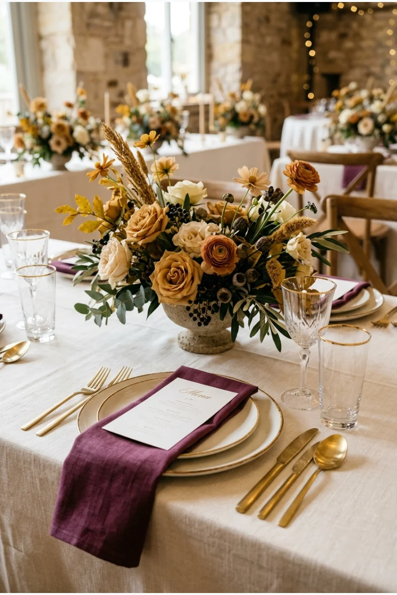
Mulberry napkins and ochre flowers bring an unexpected warm contrast to a cream-covered wedding table. Keep cream dominant so the purple-red and yellow do not become equally heavy.
Choose ochre rather than bright lemon yellow. Its muted golden tone is what makes the combination feel more grounded.
- Keep cream as the main surface.
- Repeat mulberry in the napkins.
- Let ochre appear in focused floral accents.
Blues From Powder to Midnight
31. Navy, White and Gold
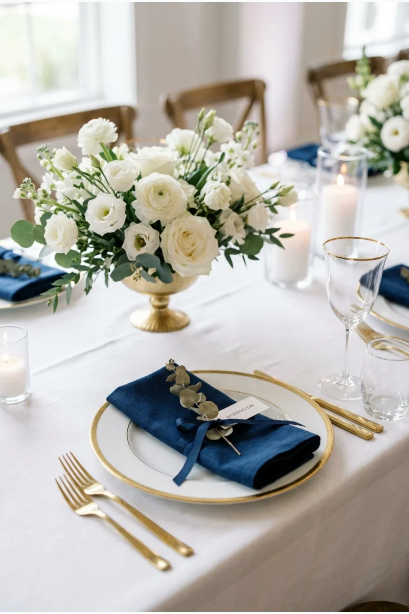
Navy napkins, white flowers and gold plate rims make a straightforward winter palette with strong light-dark contrast. A white cloth keeps the table bright even when navy is your main color.
Repeat navy in the menus or table numbers if you want it to register beyond the napkins. There is no need to add a celestial theme.
32. Midnight Blue, Black and Silver
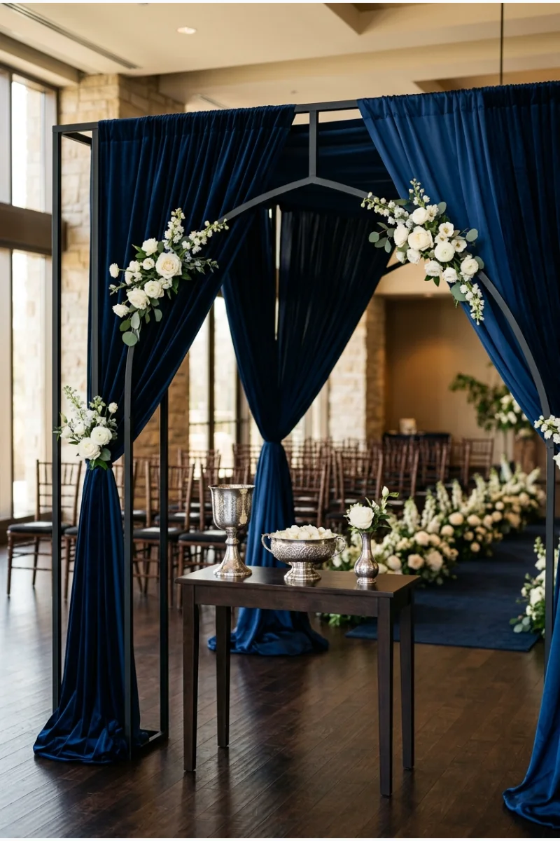
Midnight-blue ceremony fabric, black structural framing and silver-toned vessels create a restrained dark palette. A small amount of white in the flowers gives the focal point a readable shape.
Check the blue beside black in the actual room. They should be close in depth but still visibly different.
Silver vessels need not be highly polished. Choose the finish that shows clearly against the two dark colors without creating distracting glare.
33. Cobalt, White and Emerald
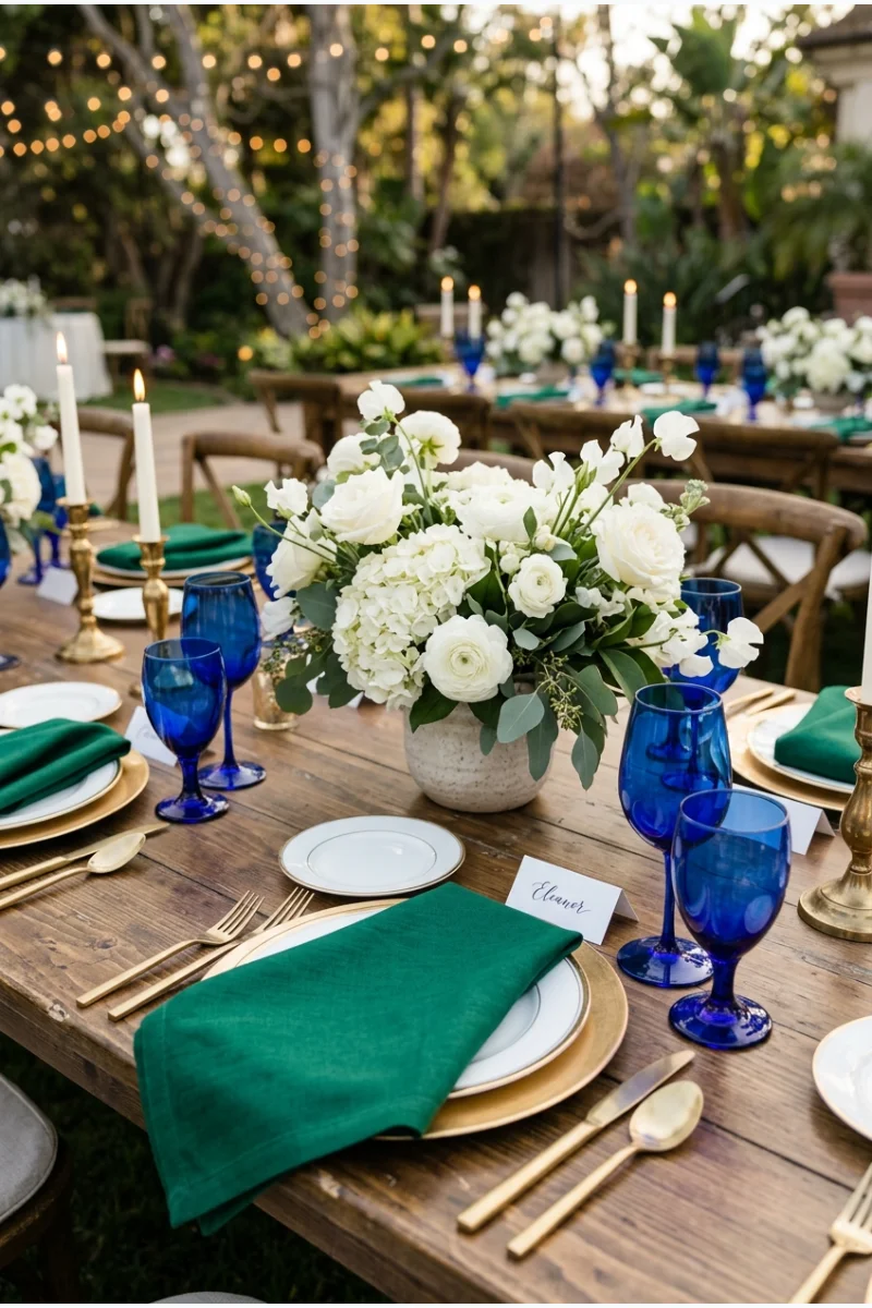
Cobalt glassware, white flowers and emerald napkins bring two saturated colors into one wedding table. Give cobalt the smaller but more repeated role so the green can remain a solid accent.
Avoid adding several more jewel tones to this version. The clear relationship between blue, green and white is its defining feature.
34. Dusty Blue, Taupe and Ivory
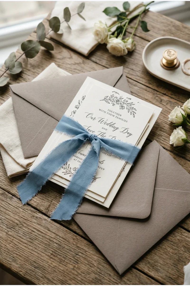
Dusty-blue ribbon around taupe invitation envelopes introduces a softer winter palette, with ivory cards providing a clean center. This combination can move easily into table linen and flowers later.
Compare ribbon and paper samples in person. Dusty blue should stay visibly blue rather than disappearing into the gray-brown taupe.
For the paper details, consider HUIHUANG dusty-blue double-face satin ribbon. Compare its shade with the actual taupe envelopes and ivory cards; color names alone will not establish a match.
35. Slate Blue, Copper and Peach
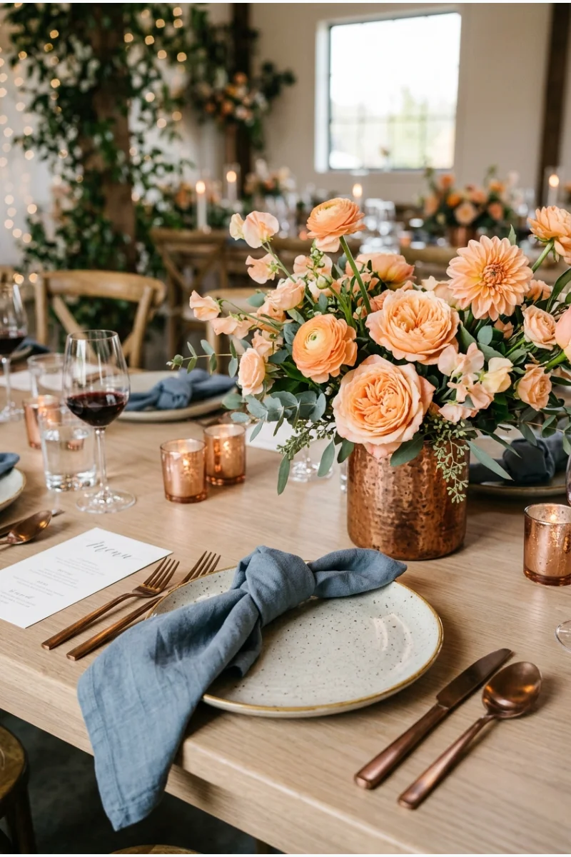
Slate-blue napkins give peach flowers a cooler setting, while copper-toned vessels repeat the flowers' warmth. Leave the main table surface neutral so the three colors stay readable.
Choose a muted slate blue rather than a bright blue. The gray in the fabric helps connect the soft peach to the metal.
Metal sample Compare copper with the peach flowers before booking rentals. Some copper finishes are more orange or pink than others.
36. Peacock Blue, Plum and Gold
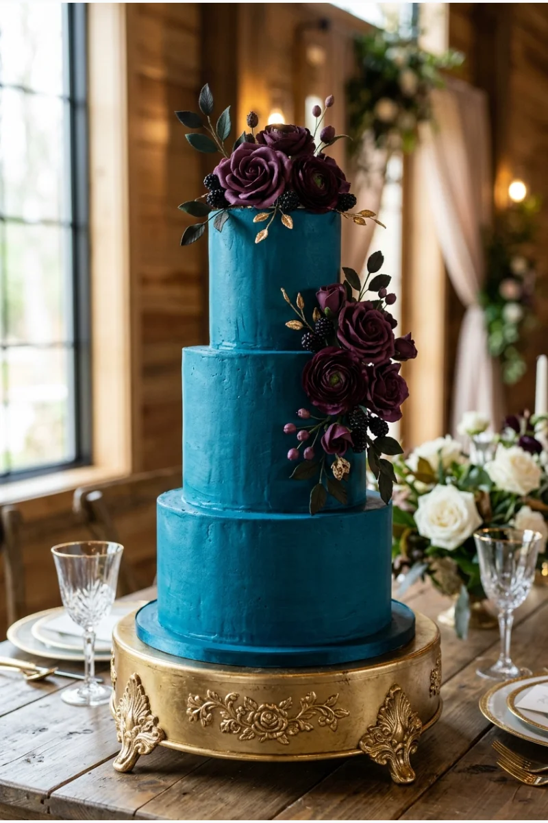
A peacock-blue wedding cake with plum-colored decoration and a gold stand creates a strong three-color focal point. Keep the decoration limited enough that the blue cake remains visible.
Bring small touches of plum and peacock into the reception stationery. That connection matters more than repeating the whole cake design on the tables.
37. Steel Blue, Graphite and White
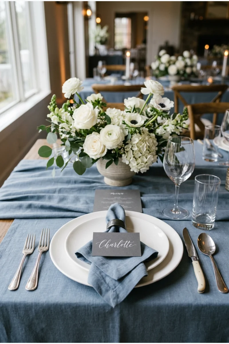
Steel-blue linen, graphite place cards and white flowers produce a cool winter table with a clear range of light and dark. The blue is softer than navy but stronger than an icy pastel.
Use white on the flowers and plate surfaces to keep the graphite details legible. Check the menu print against the actual card stock.
38. Indigo, Lavender and Silver
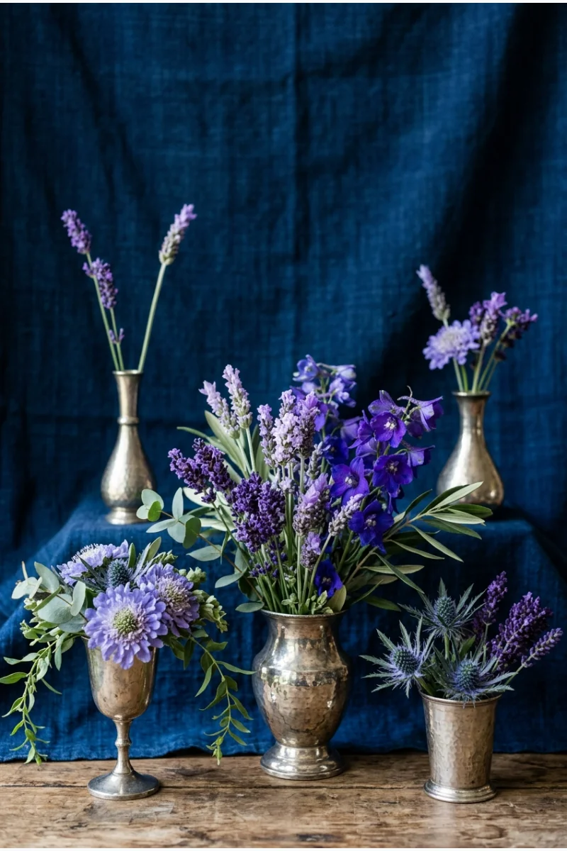
Lavender ceremony flowers stand out against an indigo fabric backdrop, with silver-toned vessels adding a small cool accent. The contrast comes from two depths of purple-blue rather than a warm complementary color.
Keep lavender in grouped arrangements so it reads clearly from the seats. A few scattered stems may be too subtle against indigo.
A full fabric sample will give you a better sense of indigo's depth than a small printed swatch. View it upright, as it will appear behind the flowers.
39. Denim Blue, Terracotta and Cream
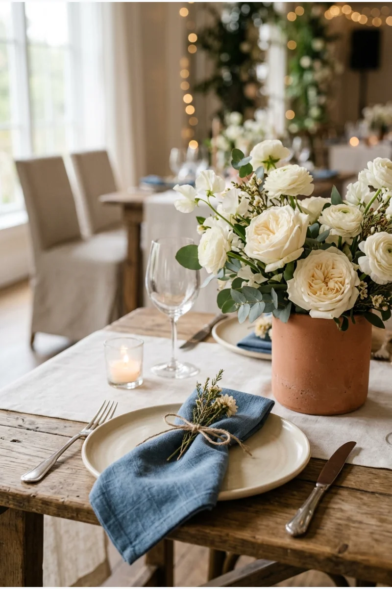
Denim-blue napkins and terracotta-colored vessels make a winter table feel approachable, with cream flowers softening the contrast. The palette comes from color choices rather than requiring rustic furniture.
Use a clearly blue textile rather than actual denim if that suits your event better. A matte napkin can suggest the same softened shade.
40. Blue Gray, Sea Glass and Pearl
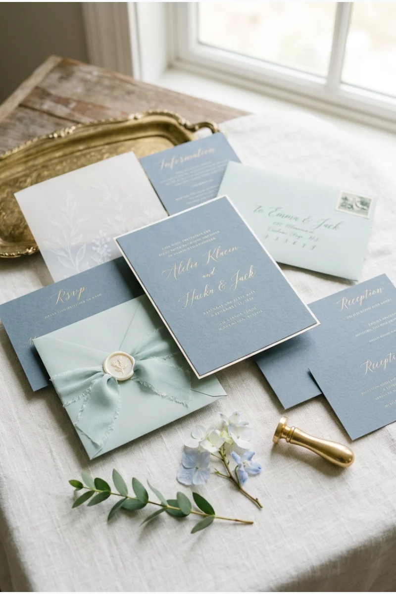
Blue-gray stationery with sea-glass ribbon and pearl-toned card details creates a muted cool palette. It suits a winter celebration where you want color without deep blue or strong metallic shine.
Keep sea glass pale green-blue and visibly different from the blue-gray paper. Compare the materials together before ordering the complete suite.
Warm Neutrals and Dark Contrast
41. Chocolate, Champagne and Gold
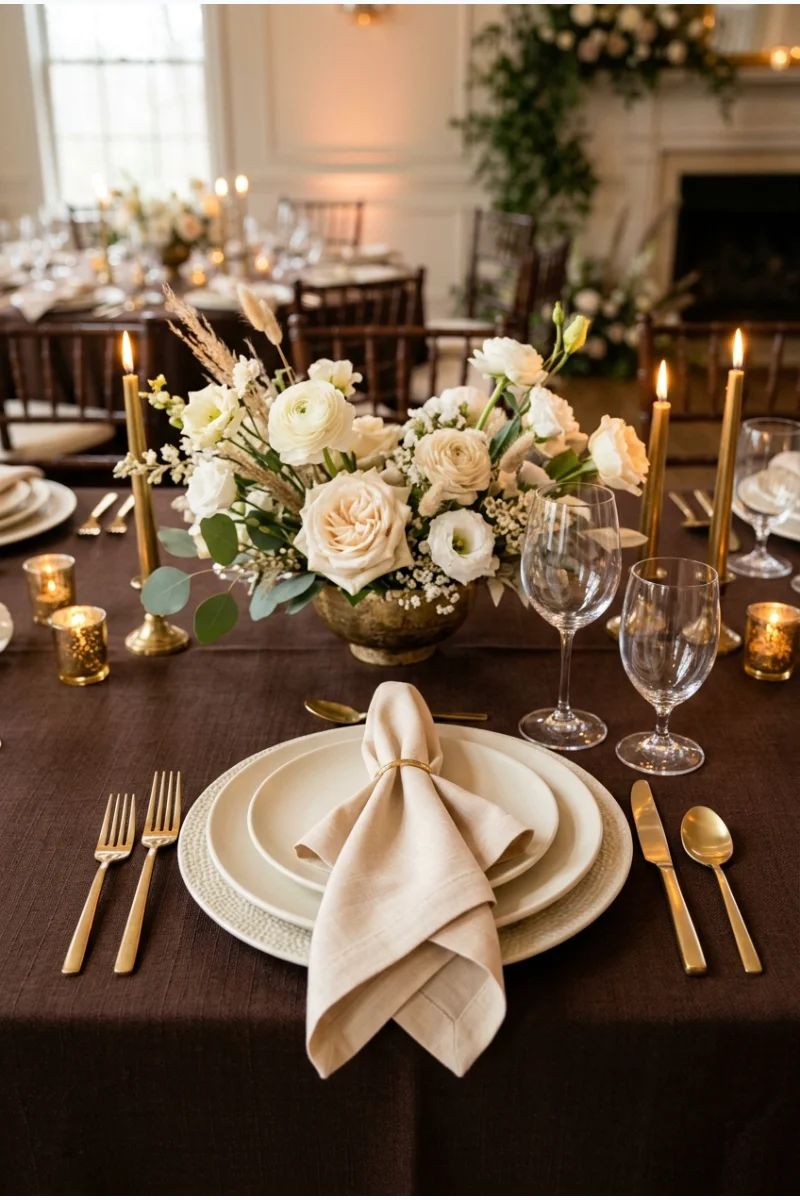
Chocolate table linen gives champagne napkins a rich background, with gold flatware adding a small warm highlight. This palette can work without introducing a single wooden decorative element.
Let champagne repeat in the paper details so the brown does not occupy every surface. Choose flowers in a related pale neutral.
- Chocolate creates the dark foundation.
- Champagne supplies the lighter fabric.
- Gold stays in small repeated accents.
42. Espresso, Blush and Ivory
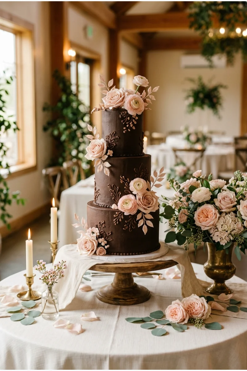
An espresso-colored cake with blush decoration and an ivory-covered display table gives brown a different role from a neutral tablecloth. The pink supplies a gentle floral counterpoint.
Keep the espresso finish dark enough to register as brown rather than red. Coordinate the cake sample with the blush flowers planned for the display.
43. Caramel, Cream and Bronze
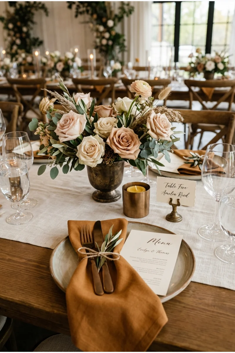
Caramel napkins and bronze-toned holders create a warm frame around cream flowers and linen. The metal should deepen the palette rather than looking like a brighter yellow-gold accent.
Choose one strong caramel textile and let it repeat. Too many different tan shades can blur the intended contrast with cream.
44. Rust, Sand and Black
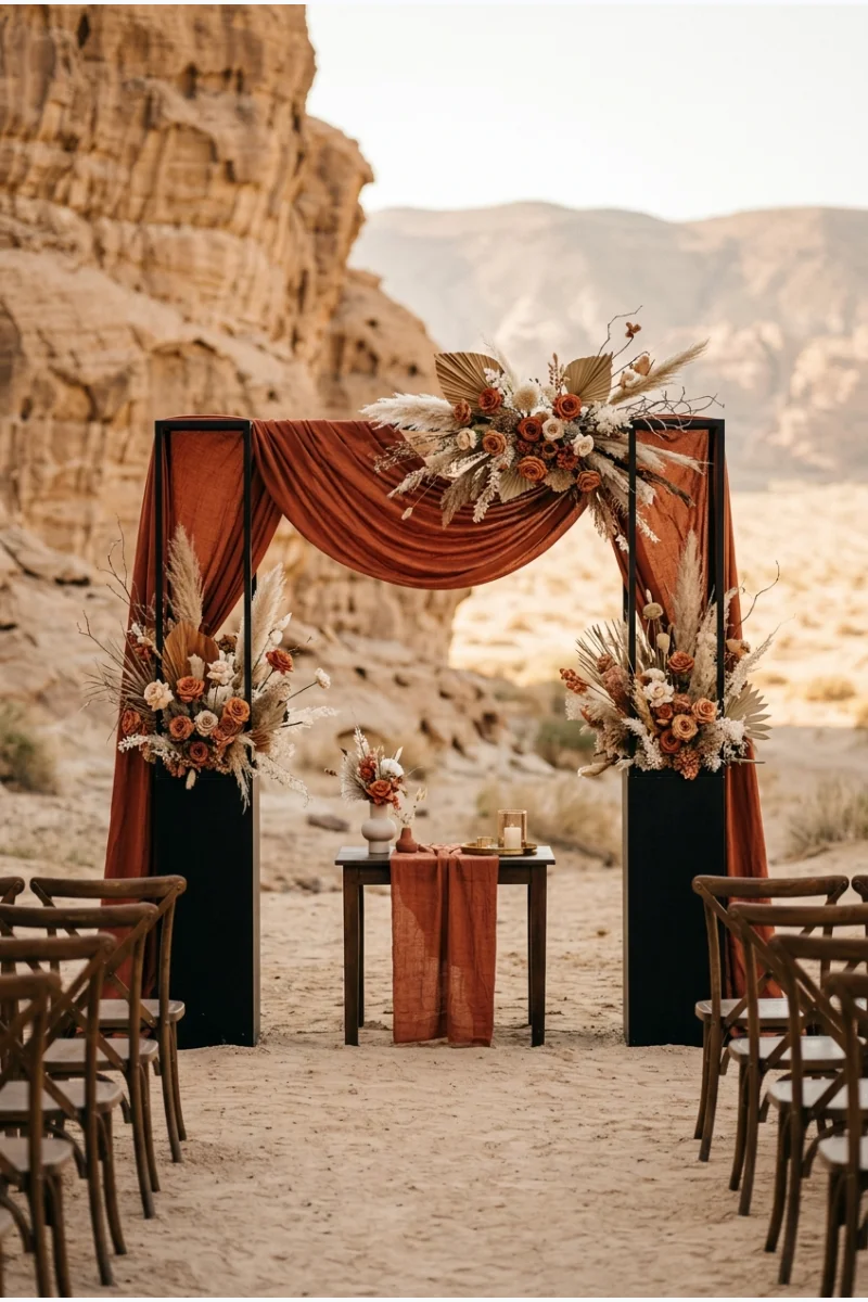
Rust-colored ceremony fabric against a sand-toned backdrop gains definition from black plinths or a black frame. This palette offers a warm direction for winter without relying on holiday colors.
Keep the floral details within the same rust-and-sand family. The black should outline the arrangement rather than cover the whole vow space.
This combination can suit an indoor winter ceremony just as easily as an outdoor setting. The colors do not require pumpkins, foliage garlands or other seasonal props.
45. Greige, Cream and Pewter
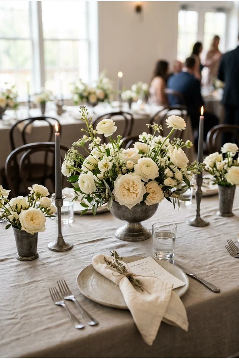
Greige table linen with cream flowers and pewter-toned vessels makes a quiet winter reception palette. Slightly deeper pewter gives the pale colors a visible edge without sharp black accents.
Look at a complete sample place setting before approving the combination. Texture can add interest, but the colors should remain distinguishable on their own.
46. Cinnamon, Mustard and Ivory
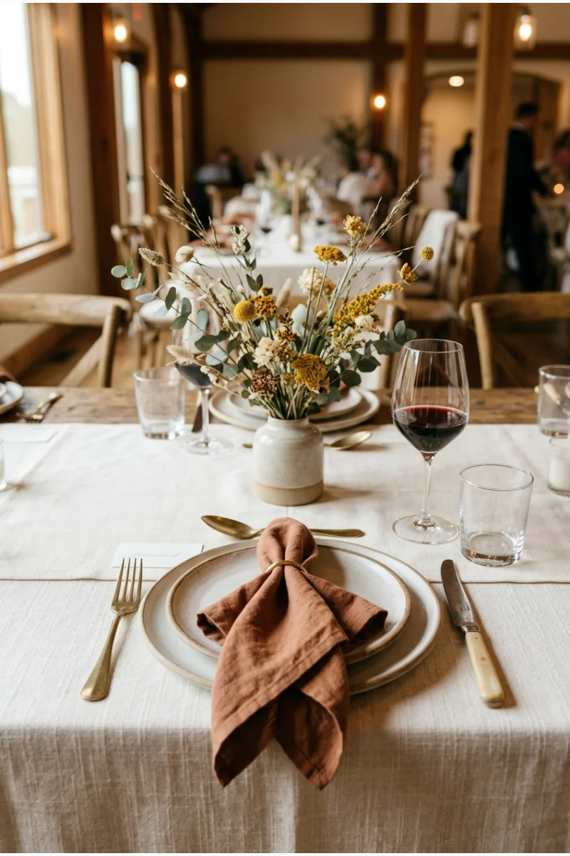
Cinnamon napkins and mustard-colored flower accents bring two warm hues to an ivory wedding table. Use mustard sparingly so it reads as a deliberate highlight.
Choose cinnamon with a reddish-brown cast rather than orange terracotta. That distinction keeps this palette separate from a brighter harvest-style combination.
47. Taupe, Mauve and Rose Gold
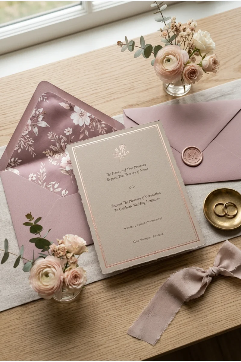
Taupe paper, mauve envelope liners and rose-gold foil create a soft wedding invitation palette with a warm metallic accent. Keep the foil confined to a border or small motif.
Ask the stationer for a foil sample rather than judging the finish on a screen. Rose gold varies noticeably between suppliers.
Paper detail Keep important invitation information in a readable ink color. Metallic foil can remain a decorative accent rather than carrying every line.
48. Copper, Black and Dusty Rose
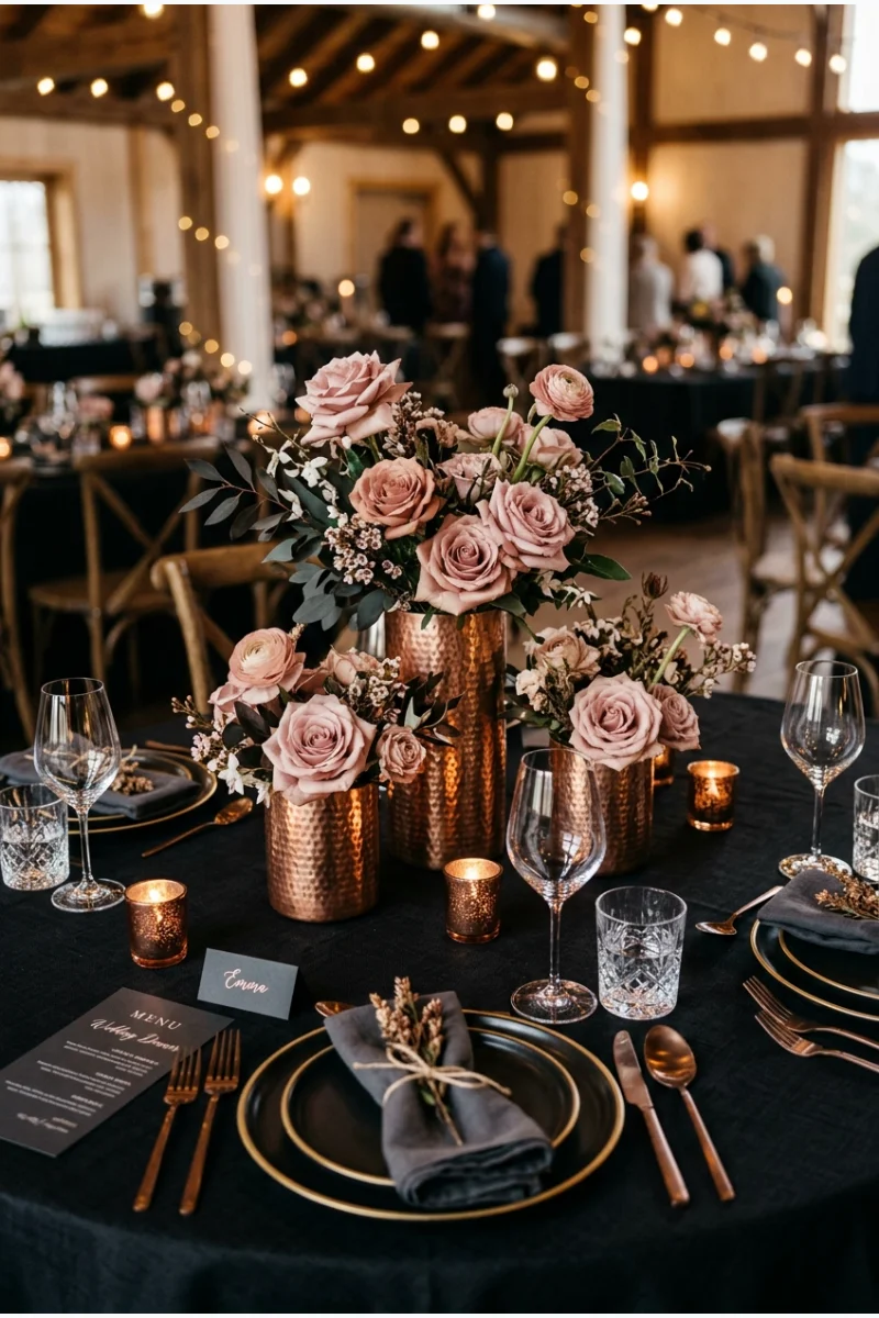
Black linen makes copper-toned vessels and dusty-rose flowers the focus of the table. Keep the flowers soft in color so the contrast comes mainly from the dark base and warm metal.
Use dusty rose rather than bright pink. A muted flower shade allows copper to remain a clear part of the palette.
49. Black, White and Gold
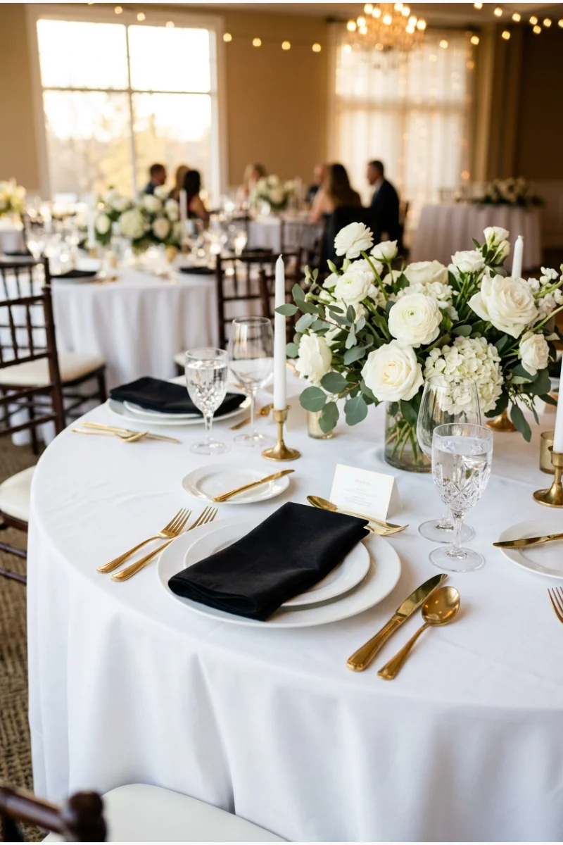
Black napkins, white flowers and gold flatware create a clear reception palette with only one metallic finish. Let white occupy the largest area so the table does not depend on dark lighting.
Keep gold on a few repeated functional pieces. The contrast is strong enough without adding glitter, sequins or a themed backdrop.
50. Charcoal, Warm White and Amber
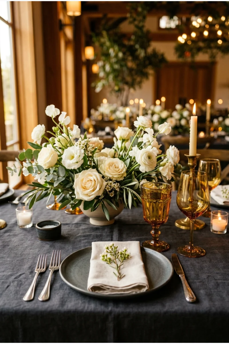
Amber glassware adds a warm translucent note to charcoal linen and warm-white flowers. It is a useful palette when you want a dark table with color coming through glass rather than extra fabric.
View the glasses under the reception lighting before renting a full set. Their color can look quite different when filled.
Choose a clear amber rather than an opaque orange glass if you want the light to pass through. The translucent effect is part of the idea.
Purples, Bright Accents and Mixed Metals
51. Aubergine, Ivory and Gold
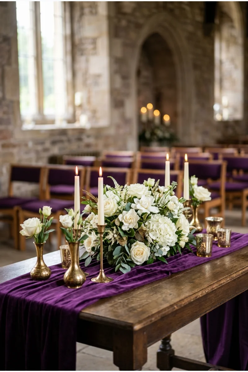
Aubergine ceremony fabric gives ivory flowers a deep purple background, with gold-toned vessels adding a narrow warm accent. Keep the floral arrangement concentrated so the fabric remains part of the composition.
Choose aubergine with a visible purple cast rather than a near-black finish. That hue is the main distinction from a monochrome ceremony.
52. Amethyst, Lilac and Silver
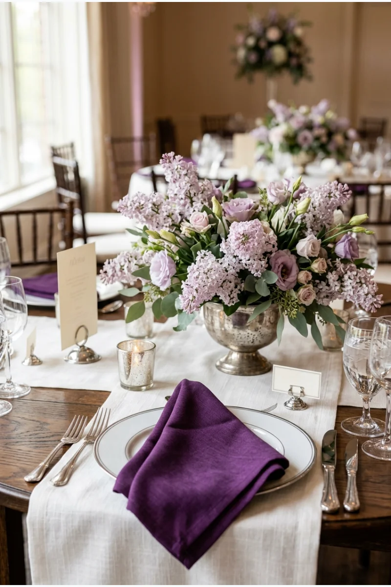
Amethyst napkins and lilac flowers create a tonal purple table, with silver-toned holders keeping the metal cool. The two purples should be different enough in depth to read separately.
Let lilac dominate the flowers and keep amethyst concentrated in textiles. That division makes the palette easier to carry across the reception.
53. Plum, Olive and Blush
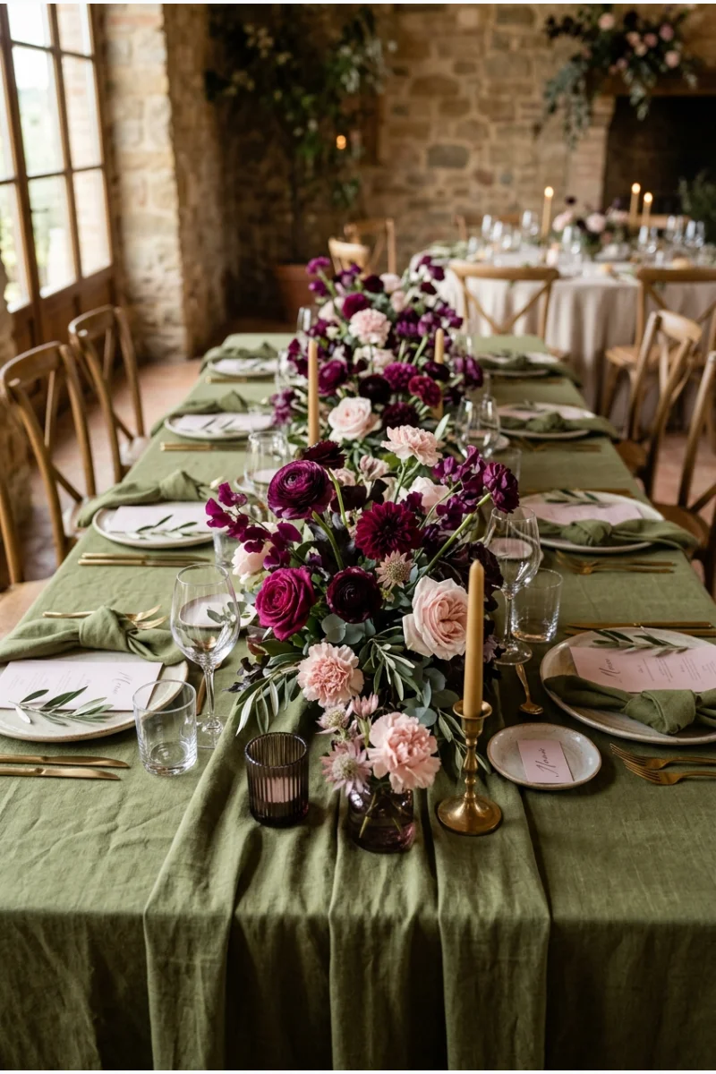
Plum and blush flowers over olive linen create a layered floral palette with an earthy green foundation. Blush supplies a lighter interval between the deeper colors.
Choose olive that stays distinct from the foliage. The linen should remain an intentional part of the scheme rather than disappearing into the arrangements.
54. Mauve, Cocoa and Champagne
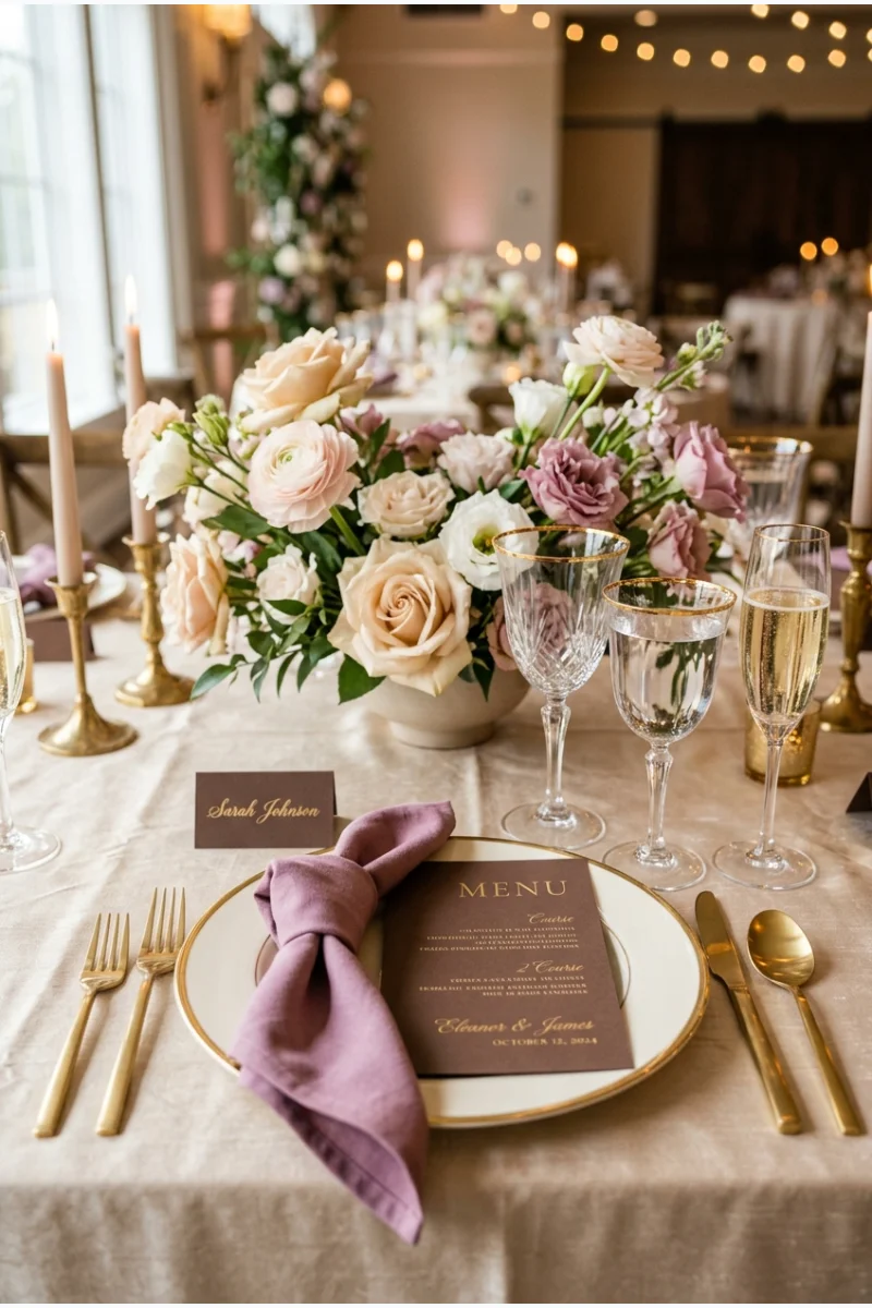
Mauve napkins, cocoa-colored menus and champagne linen form a muted pink-and-brown table palette. Give mauve enough area to keep the result from reading as an entirely neutral setting.
Keep cocoa in the smaller paper details and repeat champagne in the flowers. This maintains a clear order between the three colors.
55. Orchid, Navy and Pale Gray
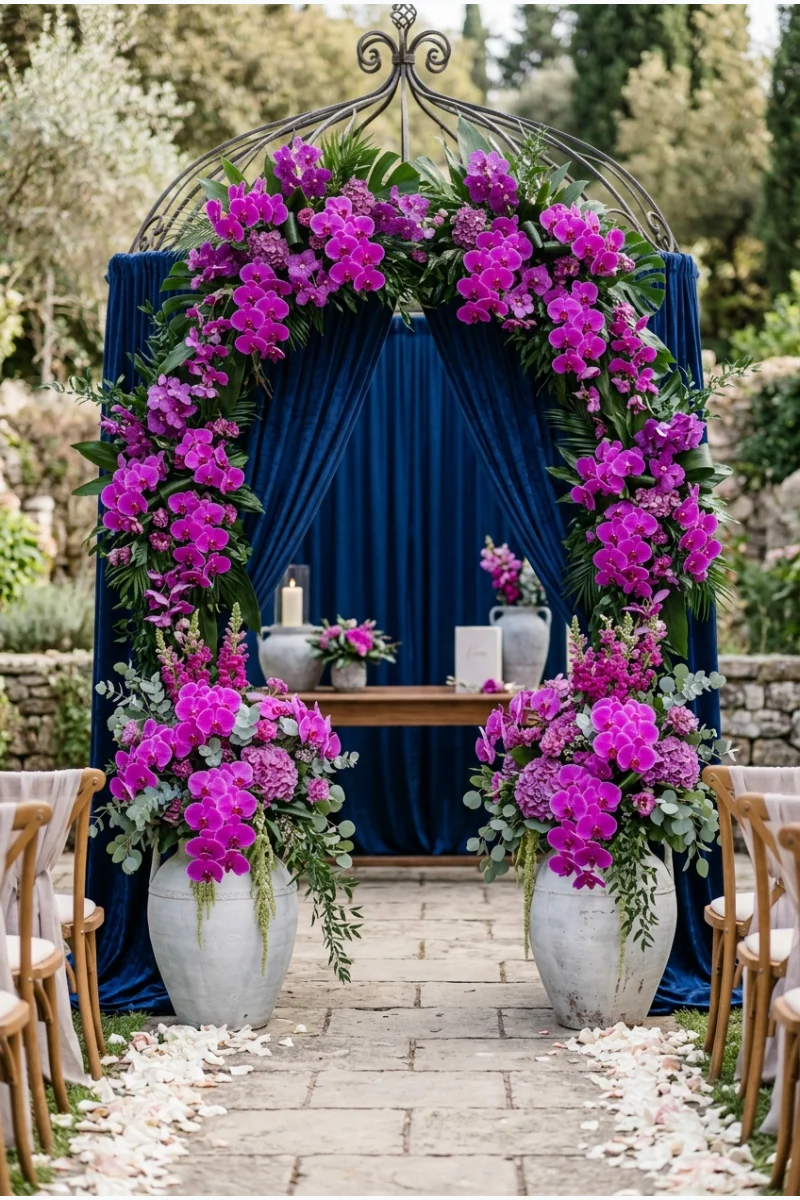
Orchid-colored flowers against navy ceremony fabric bring a brighter purple-pink into winter. Pale-gray vessels give the strong colors a quieter supporting element.
Keep orchid vivid enough to stand apart from navy. A dusty mauve would create a softer and substantially different effect.
Use pale gray on the supports instead of adding another metallic finish. That keeps attention on the orchid-and-navy contrast.
56. Magenta, Orange and Black
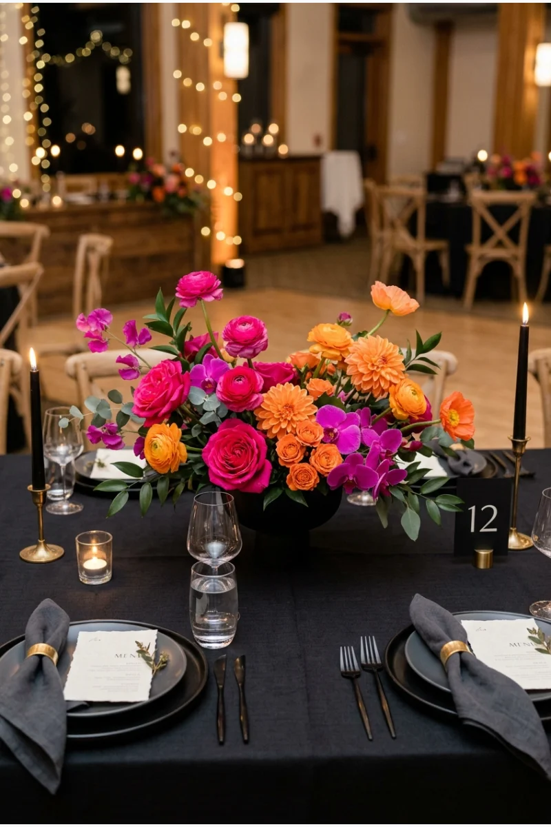
Magenta and orange flowers on a black reception table create a bright alternative to traditional winter palettes. Let the flowers carry the color so the rest of the setting can stay simple.
Use this when you actively want a high-energy contrast. The orange and magenta should both be visible rather than blending into a single coral tone.
Color balance Test one complete centerpiece on black fabric before extending the palette. A small arrangement can show whether one bright color is overwhelming the other.
57. Petrol Blue, Chartreuse and White
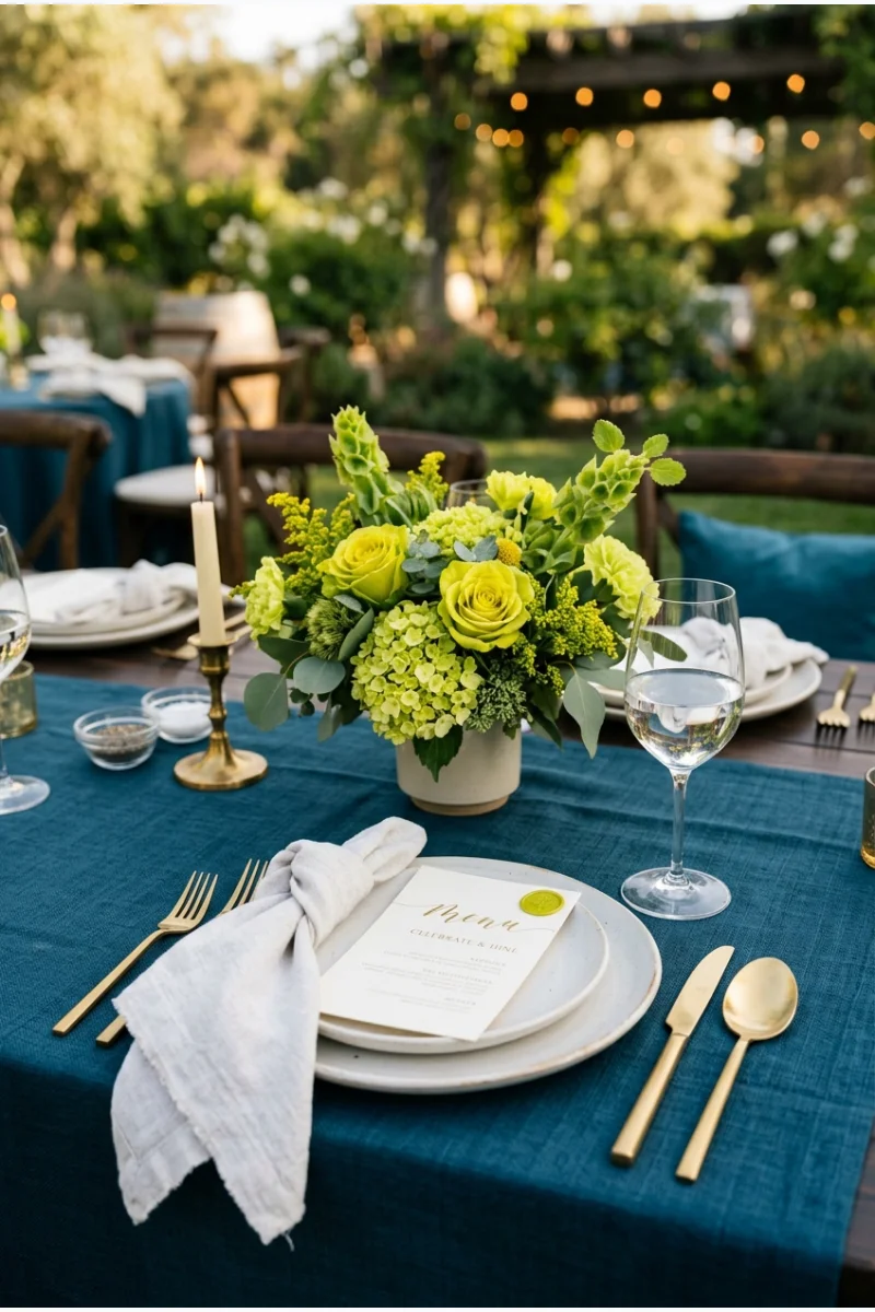
Petrol-blue linen gives chartreuse flowers a strong dark background, while white place settings keep the table readable. The yellow-green should appear as a focused accent rather than a full second tablecloth.
Ask your florist to show achievable chartreuse options for your date. The color plan should adapt to available materials rather than depend on one particular flower.
58. Emerald, Sapphire and Ruby
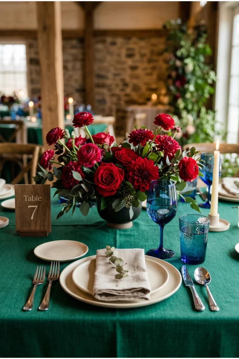
Use emerald fabric, sapphire glassware and ruby flowers for a clearly defined three-jewel palette. Giving each color a different material makes a saturated combination easier to organize.
Keep the supporting pieces simple. The three main hues provide enough contrast without needing another strong accent or a dominant metallic finish.
- Emerald leads through fabric.
- Sapphire repeats in the glassware.
- Ruby stays concentrated in the flowers.
59. Violet, Teal and Copper
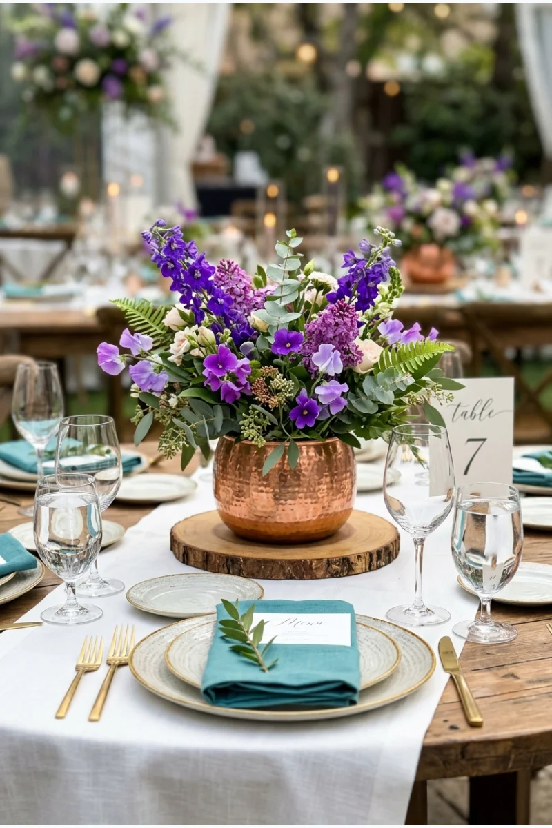
Violet wedding flowers with teal napkins and copper-toned vessels create a cool-color palette warmed by one metal. Keep violet visibly brighter than plum so the combination retains its distinct character.
Let teal occupy the repeated fabric details and use copper only at the centerpieces. This avoids giving all three colors equal visual weight.
60. Black, White, Silver and Gold
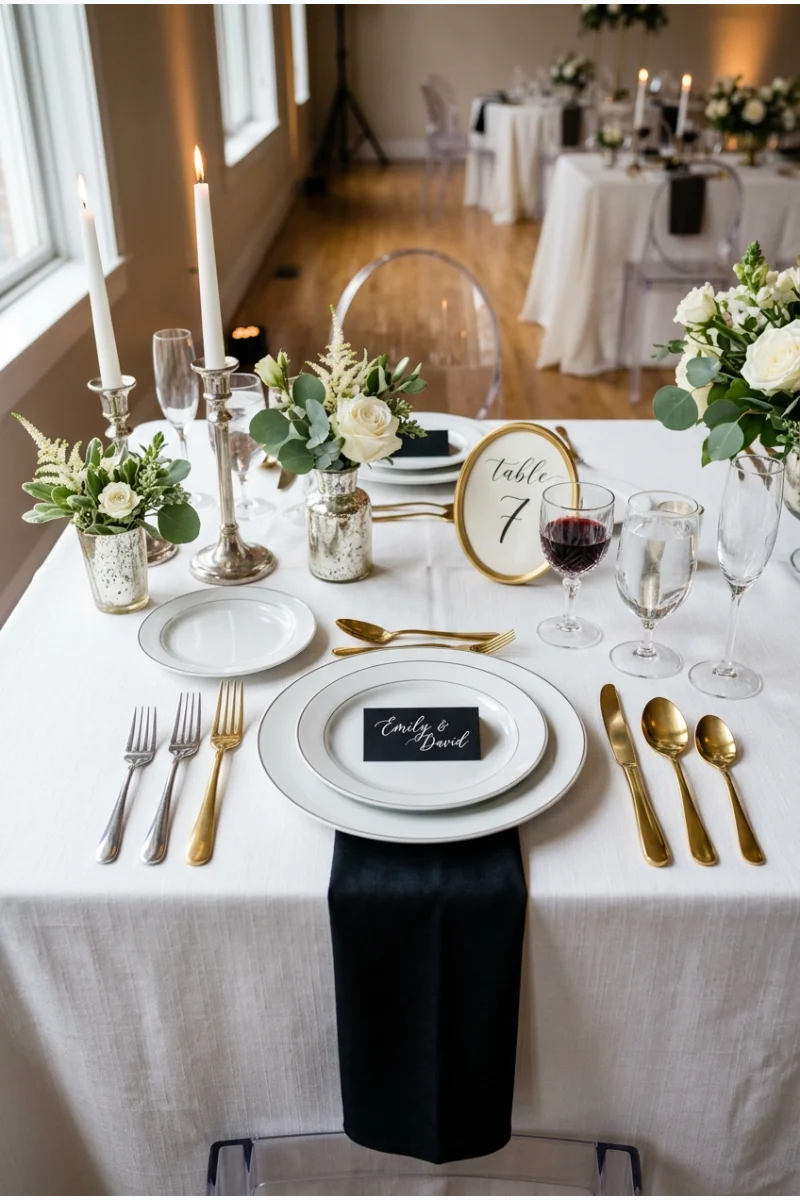
A white reception table with black place details and both silver and gold accents can suit a New Year's Eve wedding. Assign each metal a clear role instead of mixing finishes randomly.
Try silver vessels with gold flatware, then repeat that pairing consistently. Keep the black elements small so both metals remain visible.
For a midnight celebration, these New Year's Eve party ideas offer lighting and toast details you can adapt to a wedding while keeping the mixed-metal palette consistent.
Do winter wedding colors have to include red and green?
No. Choose colors that suit your venue and preferences. Blue, purple, brown, pale neutrals and brighter combinations can all be adapted for a winter wedding without a Christmas theme.
How many colors should we use?
A main color, a supporting color and a smaller accent are a practical starting point. You can use fewer or more; what matters is assigning each a clear role.
Will fabric and flowers match exactly?
Not necessarily. Natural flowers vary, and different fabrics reflect light differently. Compare real samples together and aim for a coordinated family of shades rather than relying on color names alone.
Should we choose the palette before booking the venue?
You can collect ideas first, but check the shortlisted colors against the venue's existing finishes and lighting before ordering. Permanent carpets, walls and chairs will appear alongside your decorations.
Do all these palettes require snow or cold weather?
No. These combinations can be used in indoor or mild-climate winter weddings. Show the season through your chosen materials and event details rather than depending on snowy scenery.
This post may contain affiliate links: full affiliate disclosure.