
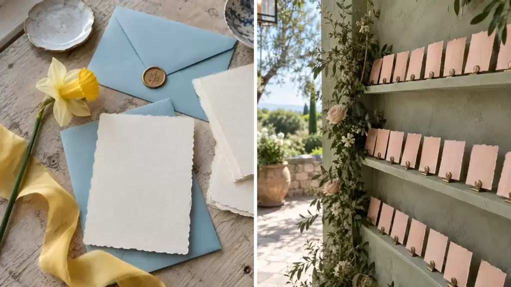
A spring wedding palette is more useful when it tells you where every color should go. The combinations below name a dominant shade, a supporting color, and an accent, then connect them to real materials and venue light.
Use the proportions as a starting point rather than a rule. Your venue already contributes color through walls, flooring, landscape, and lighting, so sample fabric, paper, metal, and flowers together in the actual space whenever possible.
Soft Spring Palettes
These light combinations rely on texture and careful proportions, so they remain readable in real venue light rather than blending into one pastel wash.
1. Robin's-Egg Blue, Ivory, and Daffodil
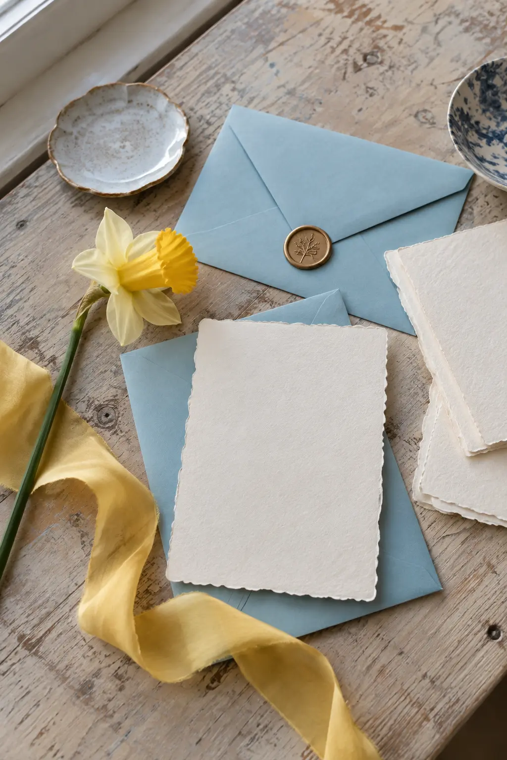
Let robin's-egg blue lead, use warm ivory across the largest paper and linen surfaces, then reserve daffodil yellow for narrow ribbons and tiny floral notes. Matte paper keeps the blue calm in cool early-spring light.
2. Sage, Blush, and Antique Brass
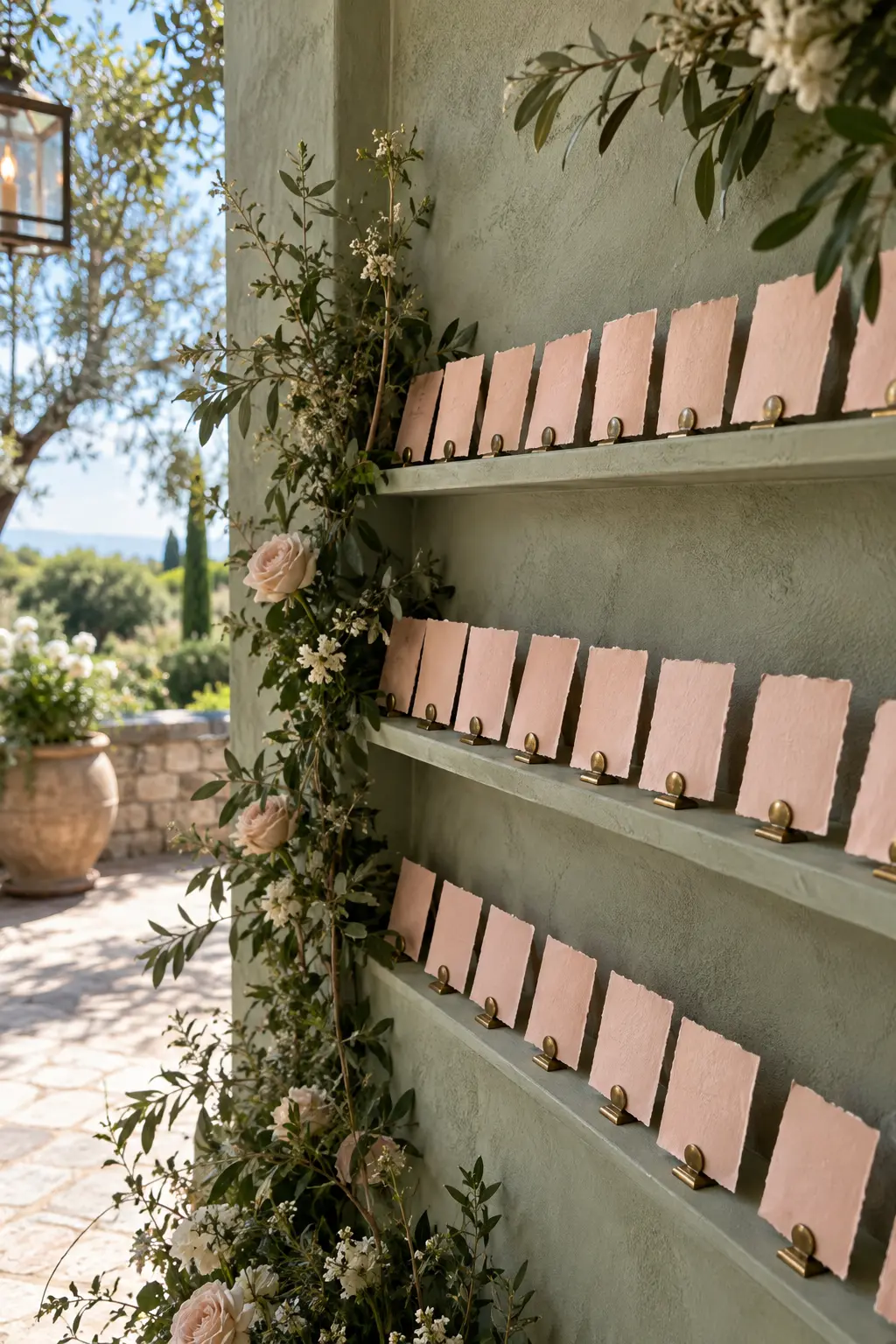
Build the room with sage, soften it with blush textiles, and use antique brass only where you want a warm glint. Brushed metal is especially helpful in a shaded garden venue because it adds warmth without making the palette feel autumnal.
3. Lilac, Powder Blue, and Buttercream
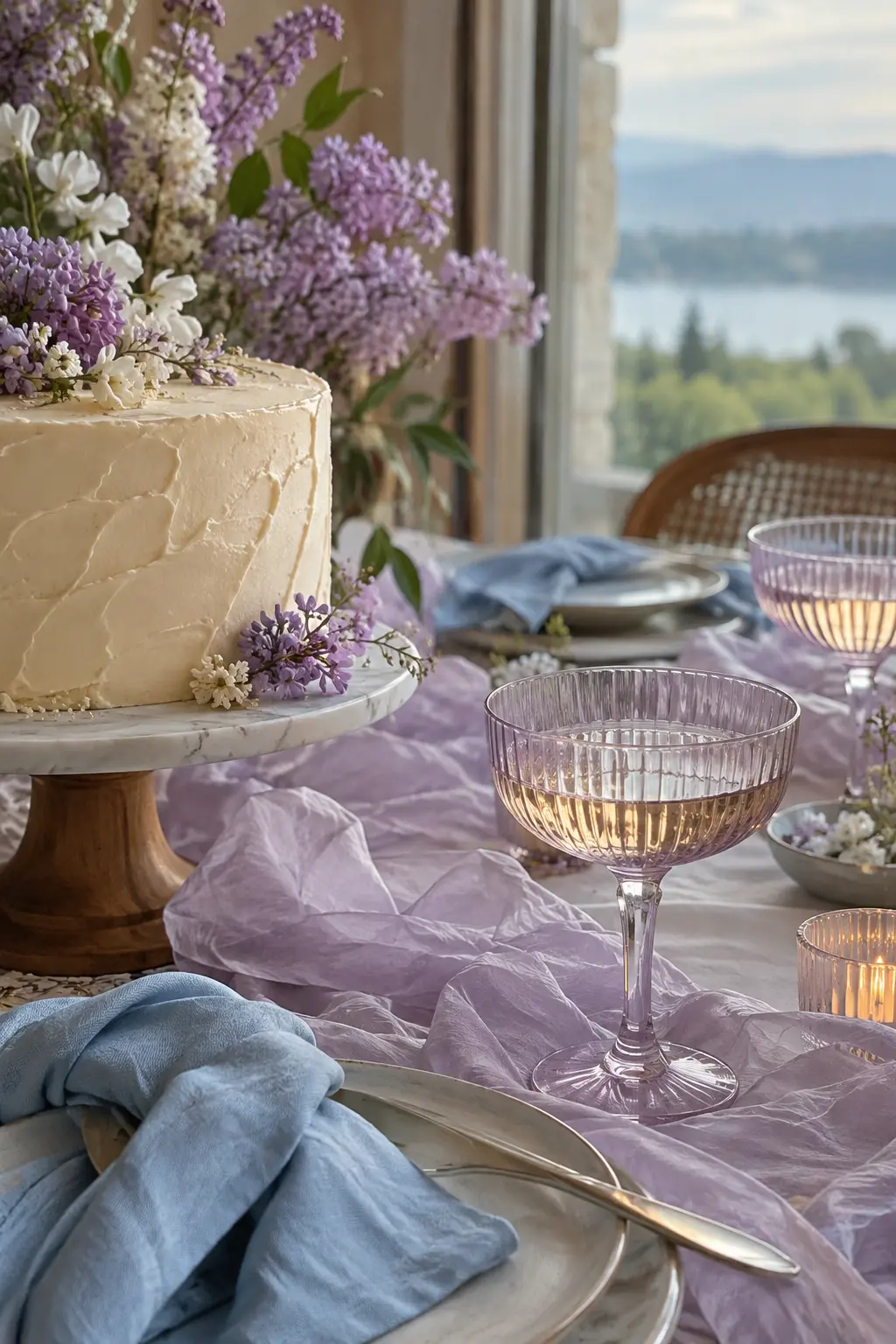
Let lilac carry the floral color, powder blue cool the linens, and buttercream appear in icing and candlelight. Translucent glass and airy organza stop this three-pastel mix from feeling flat under diffused daylight.
4. Peach, Pistachio, and Porcelain White
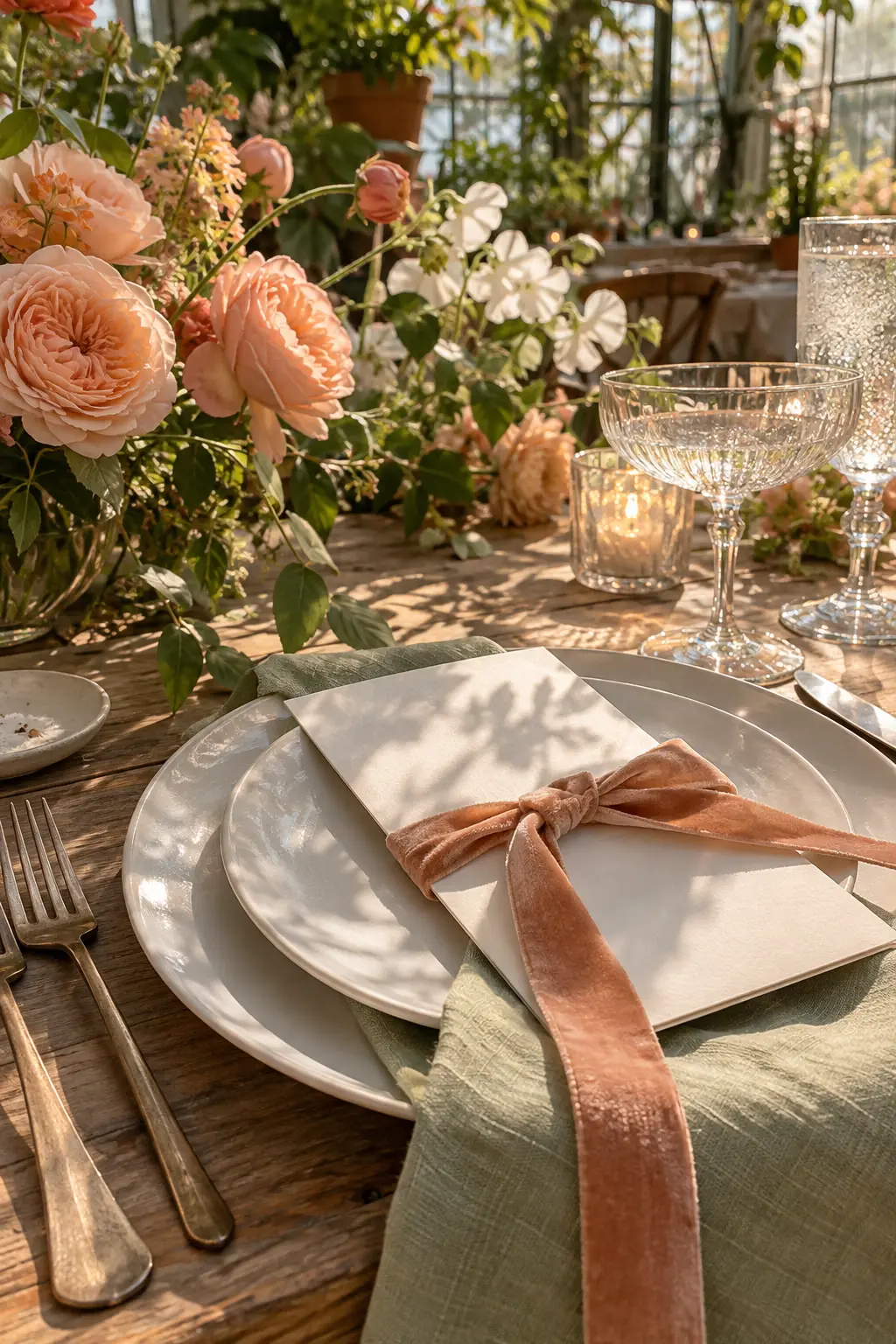
Use pistachio as the base, peach as the friendly middle note, and porcelain white as the clean pause. Velvet ribbon brings needed depth while glossy dinnerware reflects the soft, green-tinted light of a conservatory.
5. Dusty Rose, Mushroom, and Burgundy
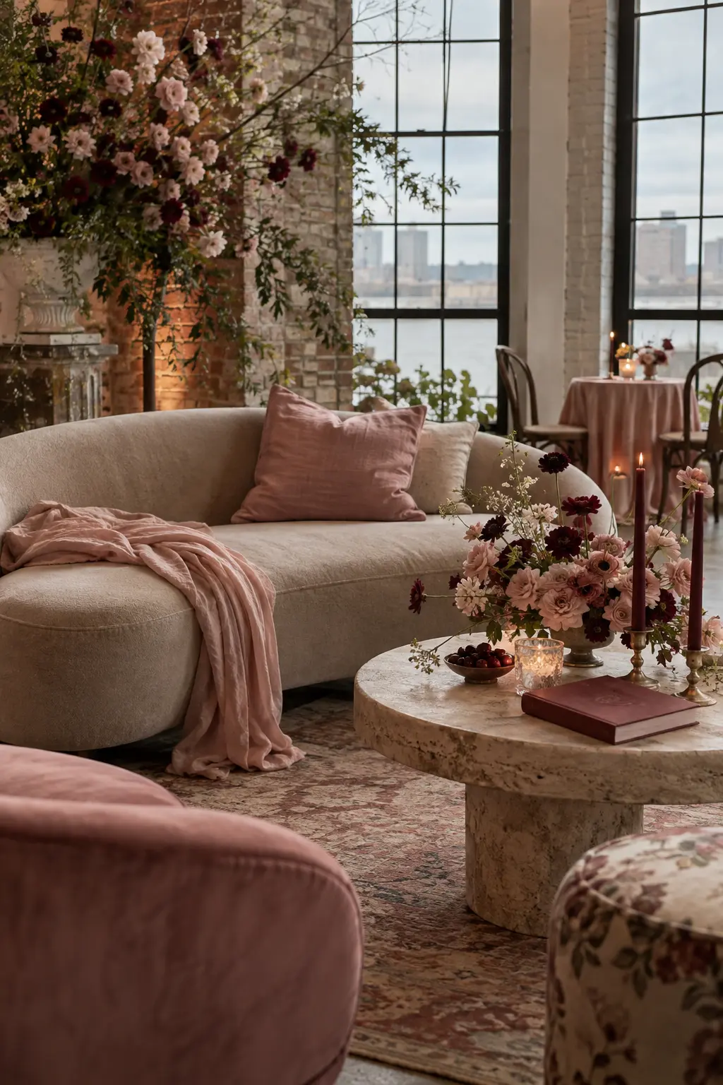
Ground dusty rose with mushroom taupe, then add burgundy in small, decisive accents. Raw silk, stoneware, and velvet give this romantic palette enough texture to hold up in a cloudy loft or pale industrial room.
6. Mint, Soft Coral, and Oat
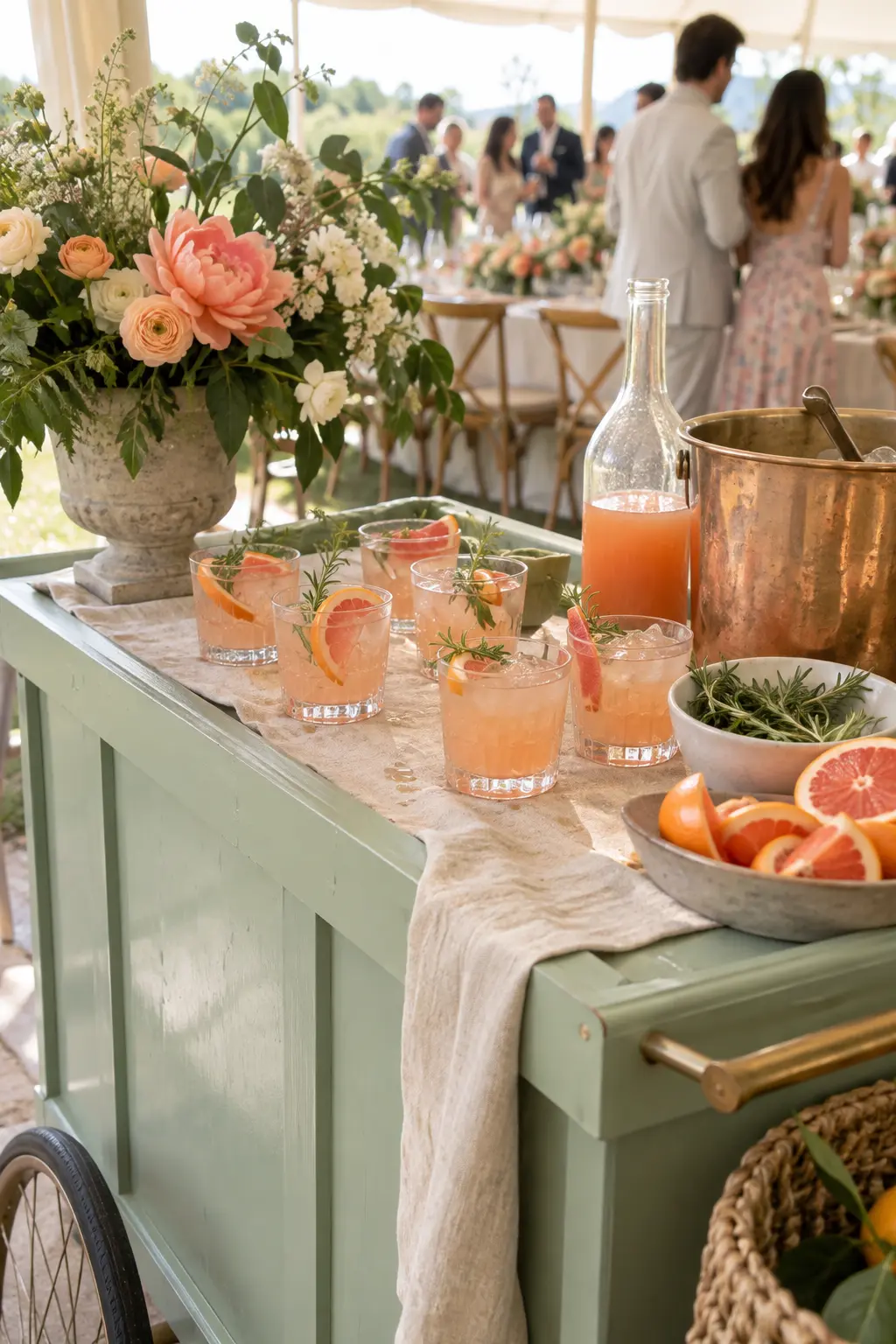
Choose mint for the painted feature, oat for woven and linen pieces, and coral for the detail guests notice first. The neutral fibers keep mint from looking sugary while coral stays visible beneath bright tent light.
7. Periwinkle, Cloud Gray, and Citron
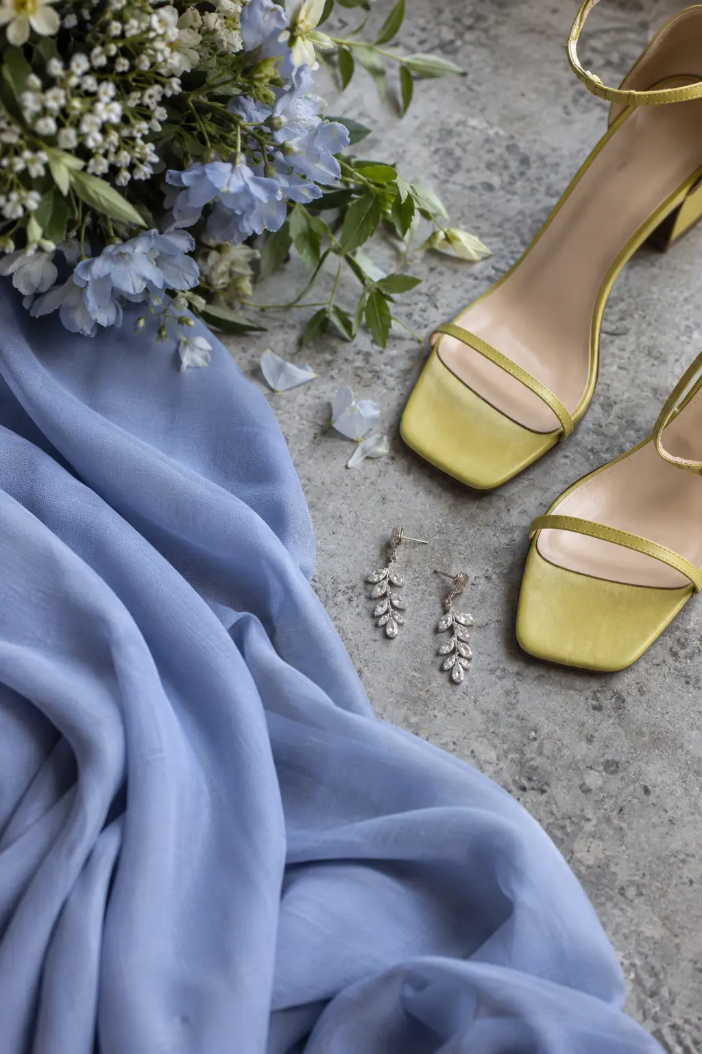
Use cloud gray to support periwinkle, then place citron in only two or three high-impact details. The cool foundation suits an overcast day, while that sharp yellow-green accent keeps the palette awake.
8. Lavender, Ivory, and Moss
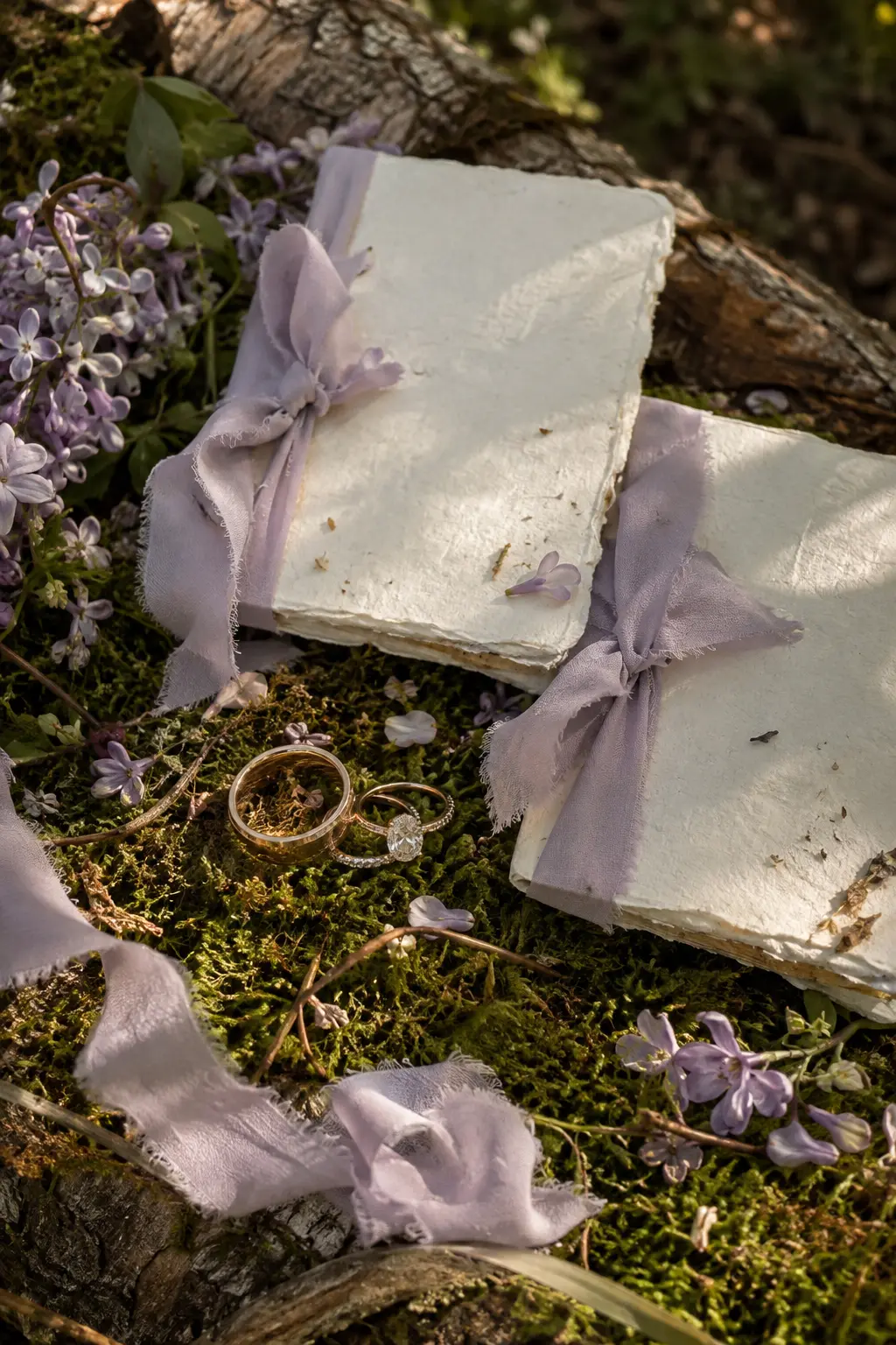
Make lavender the soft color story, ivory the readable base, and moss the organic anchor. Fuzzy moss, handmade paper, and silk ribbon look dimensional in filtered woodland light without turning into a full forest theme.
9. Shell Pink, Celadon, and Pearl
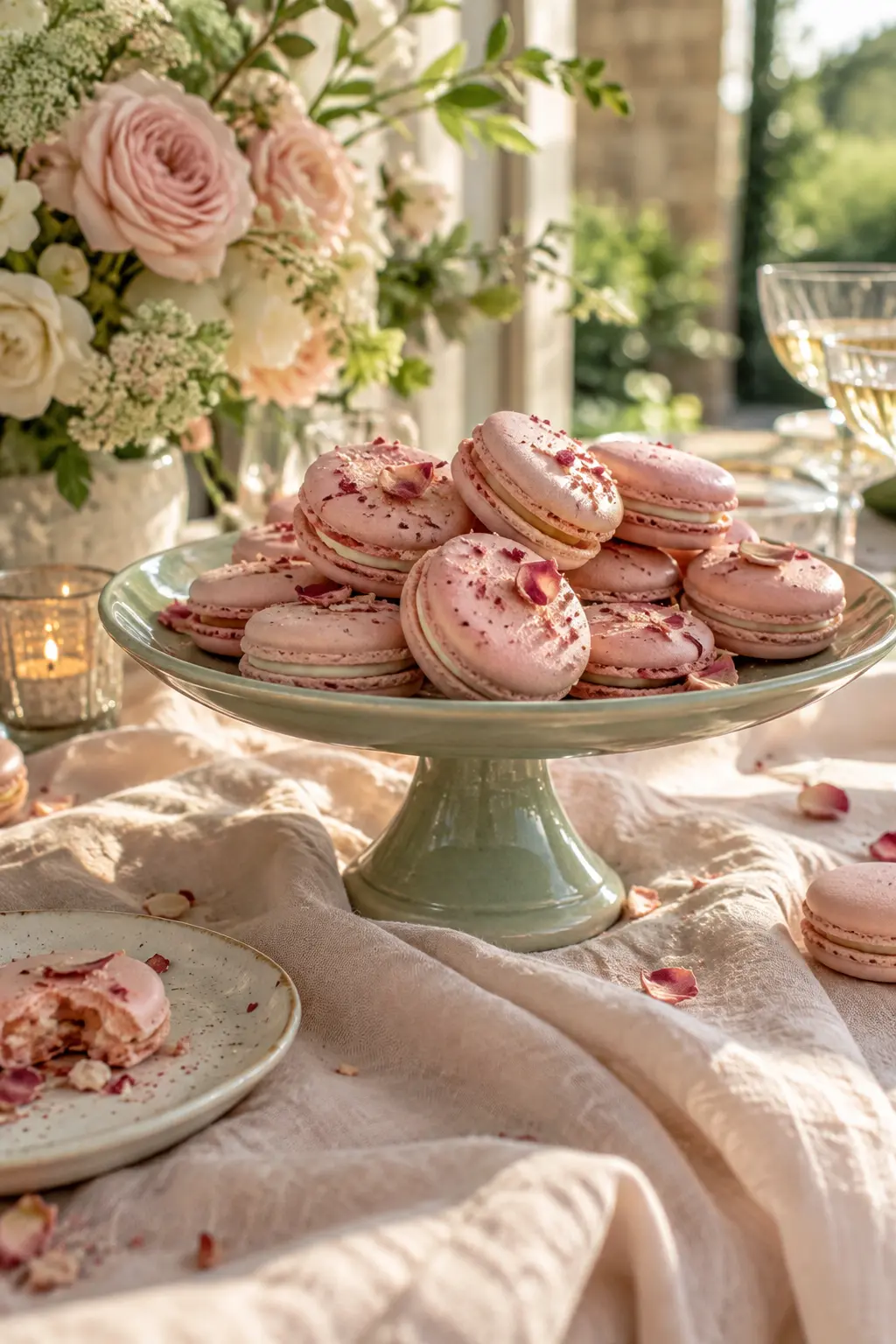
Lead with shell pink, cool it with celadon, and use pearl as a subtle reflective finish. This works best when the shine is limited to fabric or small accessories rather than every surface.
10. Chamomile White, Leaf Green, and Sunny Yellow
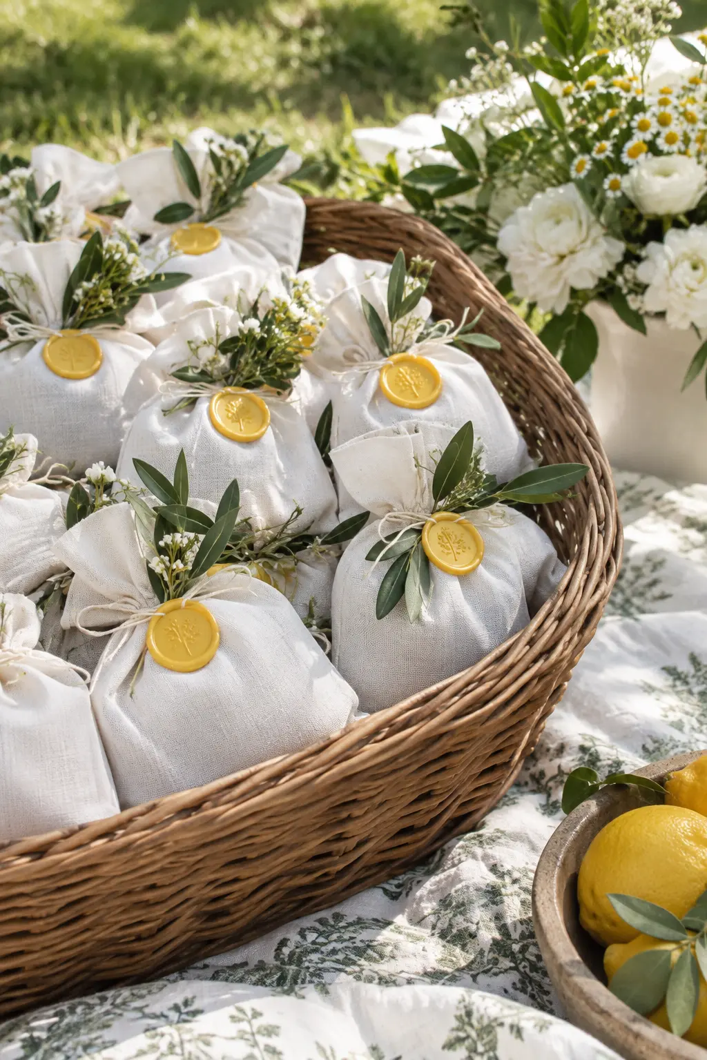
Let white and green occupy most of the scene, with yellow appearing in flower centers, stitching, or wax seals. Linen and wicker keep the colors casual enough for a lawn while crisp daylight preserves their freshness.
Fresh Brights for Spring
Bright spring palettes work best when one quiet surface separates the strongest colors. Each system below assigns the energy to a different material or event detail.
11. Tulip Red, Pale Aqua, and Cream
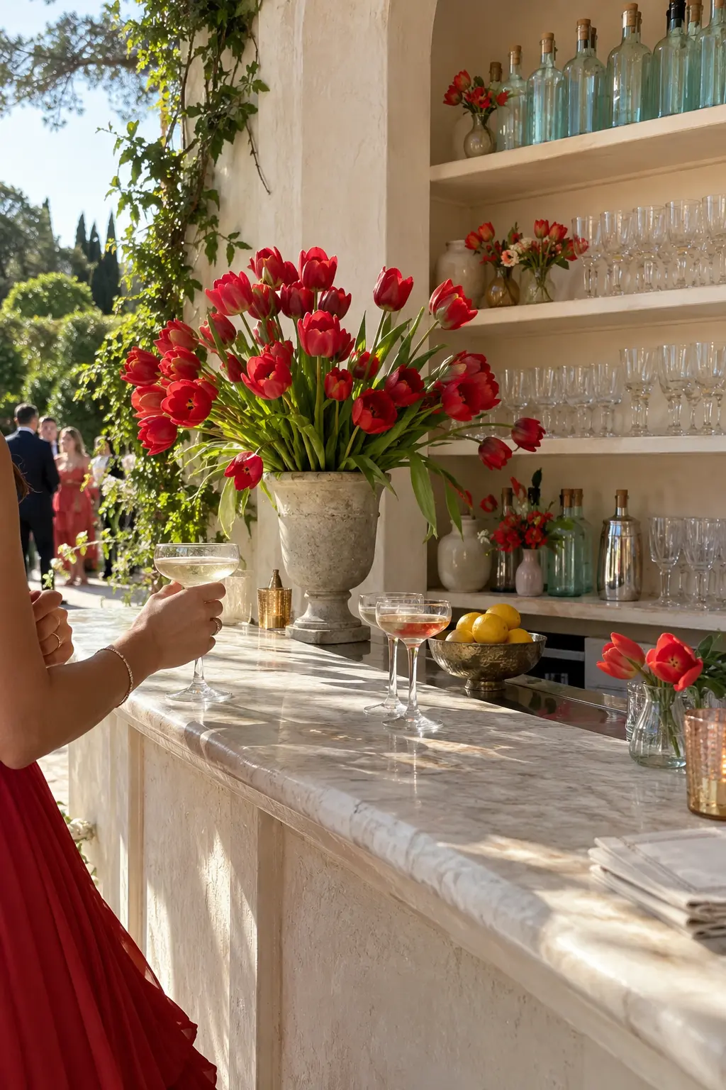
Give tulip red the starring role, use cream to soften the setting, and add pale aqua through glass. The cool glass offsets the red while plaster and cotton prevent the combination from becoming nautical.
12. Coral, Cornflower, and Sand
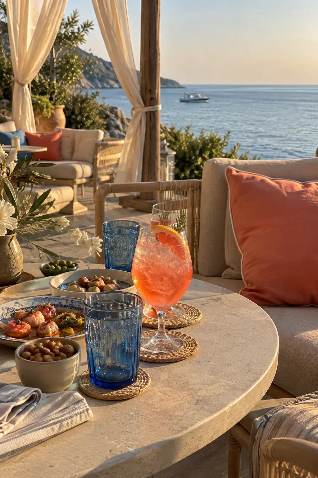
Use sand-colored canvas and linen as the field, cornflower blue as the cooling support, and coral as the bright accent. These materials absorb coastal glare so the stronger colors stay clear instead of washed out.
13. Fuchsia, Tangerine, and Pale Pink
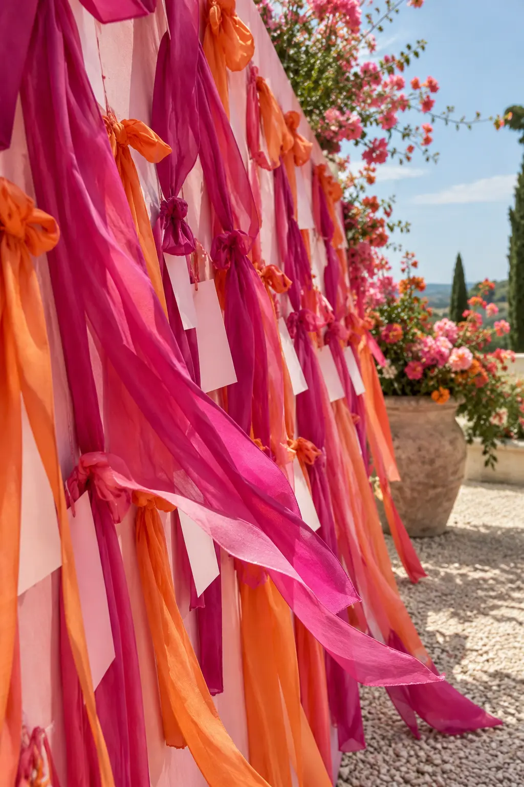
Start with pale pink across the widest surface, then layer fuchsia and tangerine in controlled blocks. Keeping the saturated colors on silk and ribbon makes the energy feel intentional under open-sky light.
14. Poppy Orange, Cobalt, and White
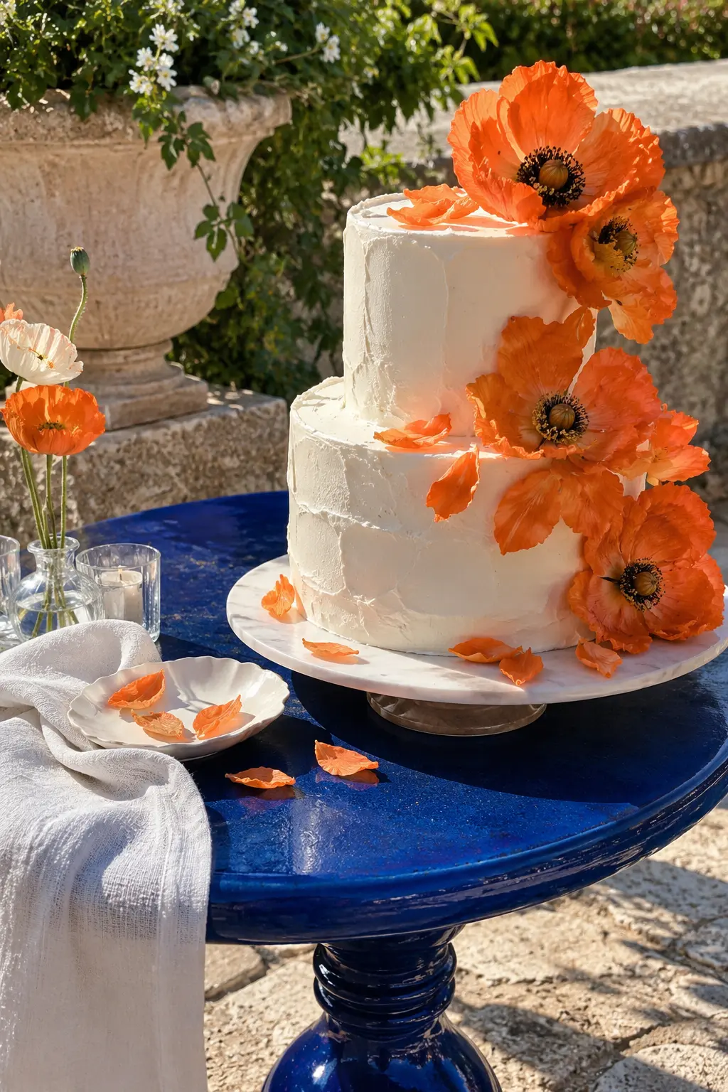
Crisp white gives poppy orange and cobalt enough separation to coexist. Use cobalt in glossy glass or lacquer, orange in one focal detail, and white across cloth or icing for a clean late-spring contrast.
15. Magenta, Grass Green, and Lilac
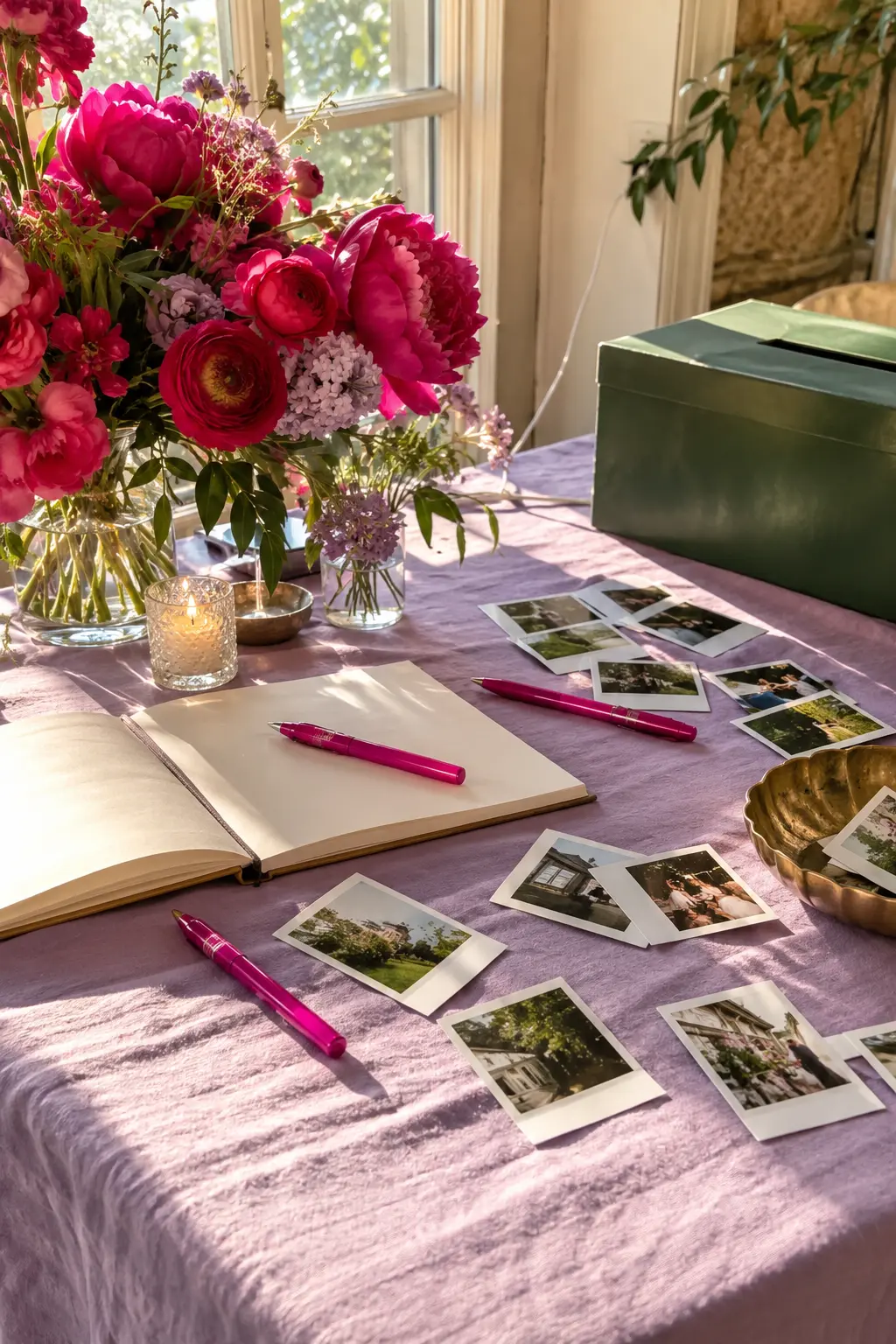
Treat grass green as the organizing color, magenta as the strong focal note, and lilac as the soft transition. Matte paper and woven fabric keep the combination playful but usable in a bright reception room.
16. Raspberry, Marigold, and Blush
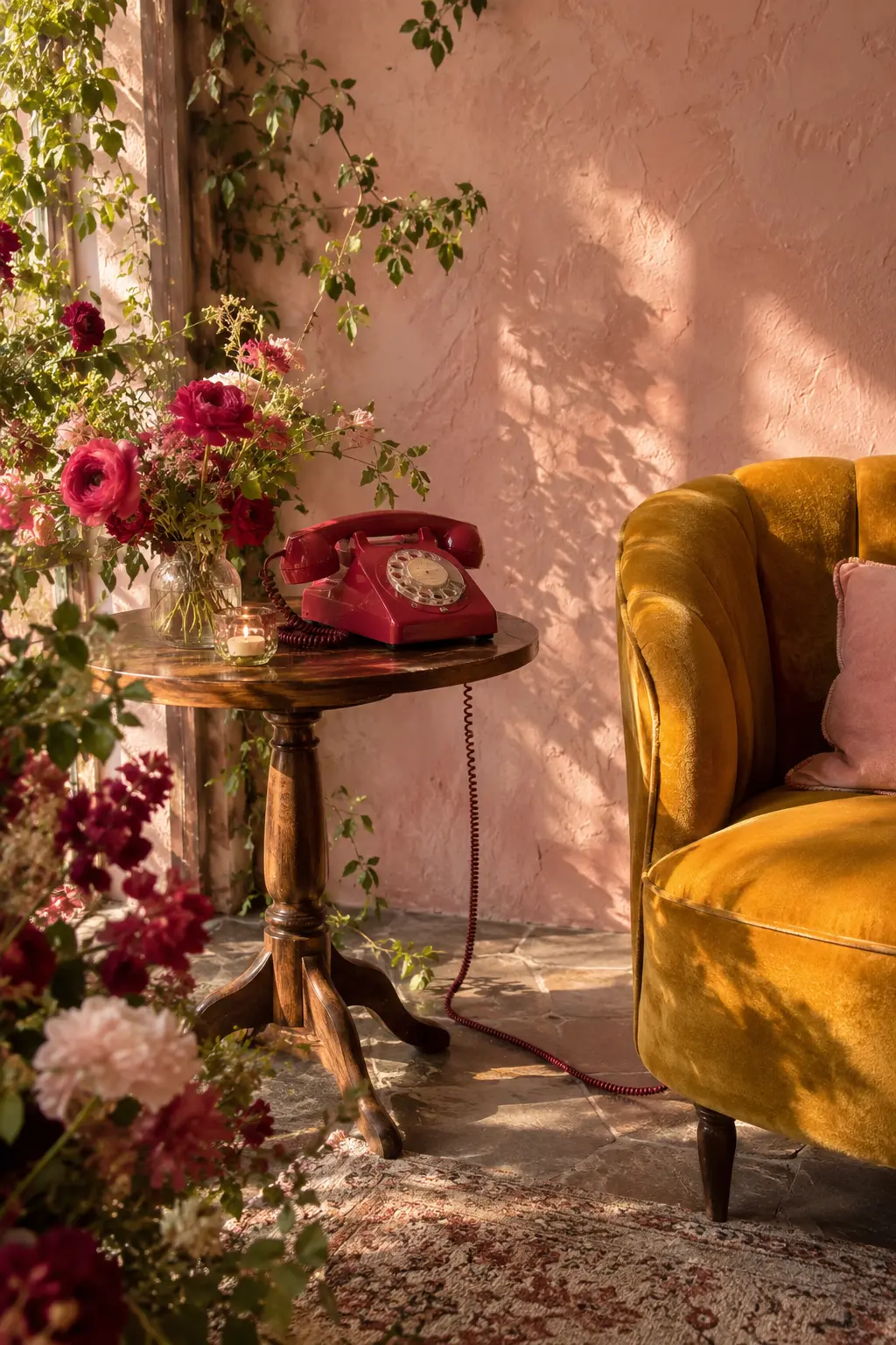
Let blush cover the wall or large textile, then introduce raspberry and marigold through two distinct objects. The pale foundation allows both saturated hues to glow in late-afternoon light without fighting.
17. Chartreuse, Sky Blue, and Soft White
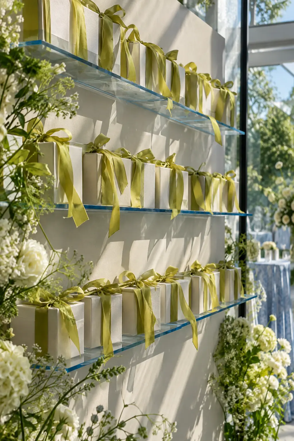
Use white as breathing room, sky blue in transparent or reflective pieces, and chartreuse in ribbons or foliage. The crisp materials make chartreuse feel botanical instead of neon.
18. Cherry Pink, Tomato Red, and Pale Lilac
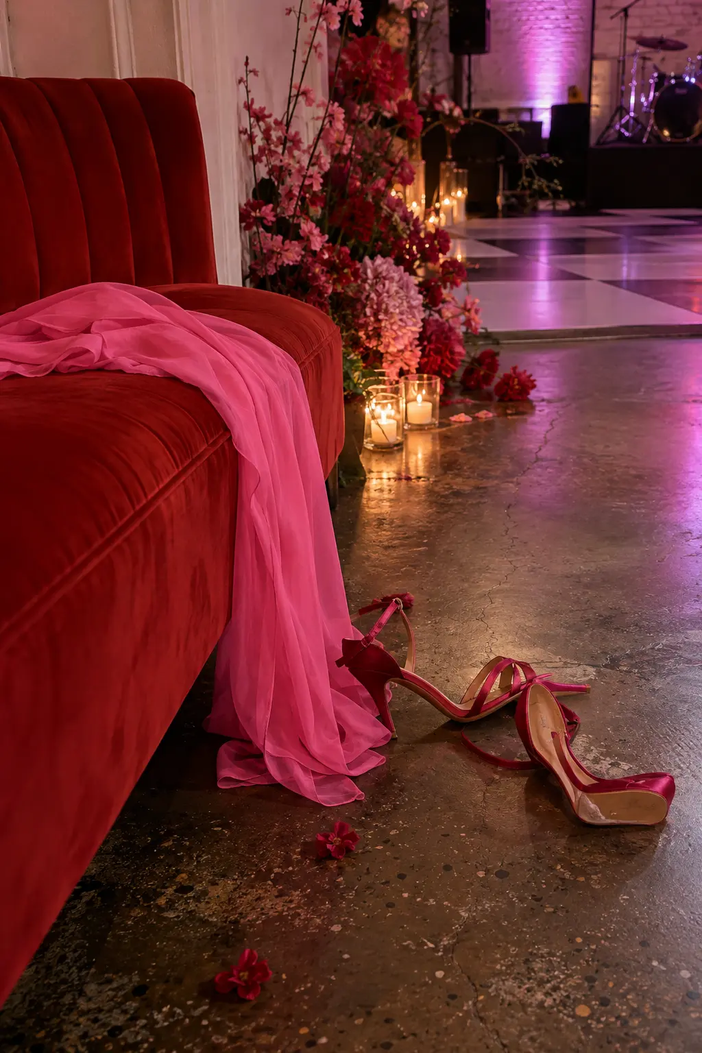
Pale lilac is the buffer that makes two neighboring reds feel modern. Keep cherry pink on fabric, tomato red on a solid object, and let the lilac venue surface show around both.
Botanical Greens and Earthy Spring Tones
Green-led palettes can feel polished, rainy, garden-grown, or architectural. The finish of the material matters as much as the exact shade.
19. Botanical Green, White, and Black
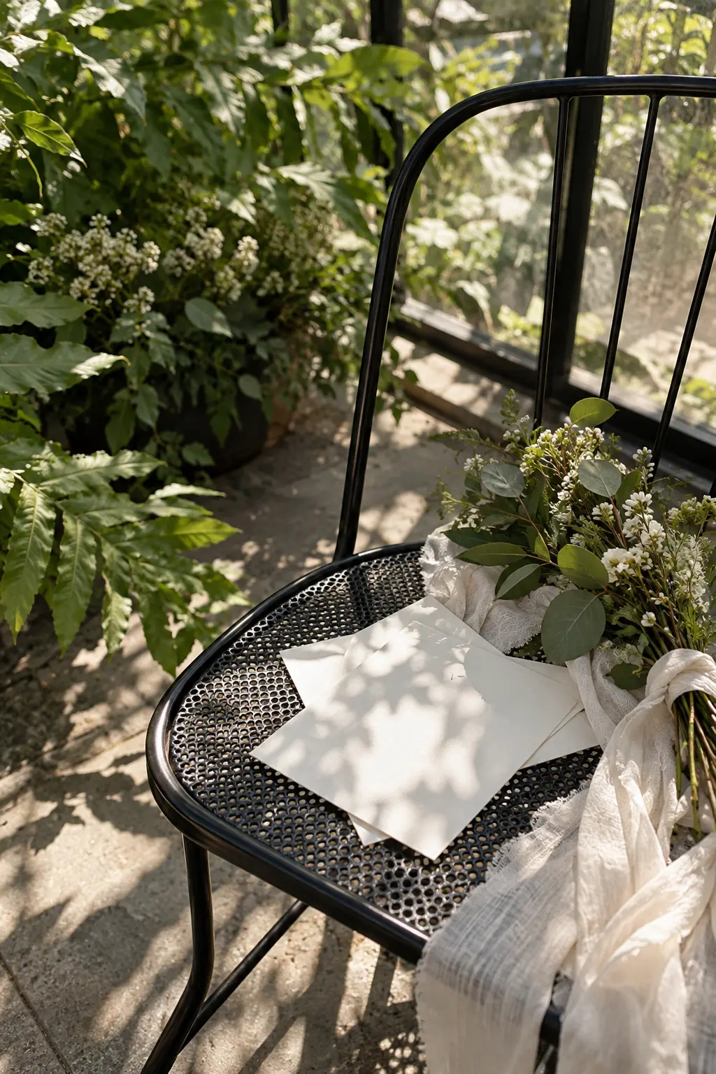
Layer several greens as the dominant family, use white for clarity, and add black only in thin architectural lines. Matte leaves and hard metal respond differently to greenhouse sun, creating depth without extra colors.
20. Olive, Parchment, and Terracotta
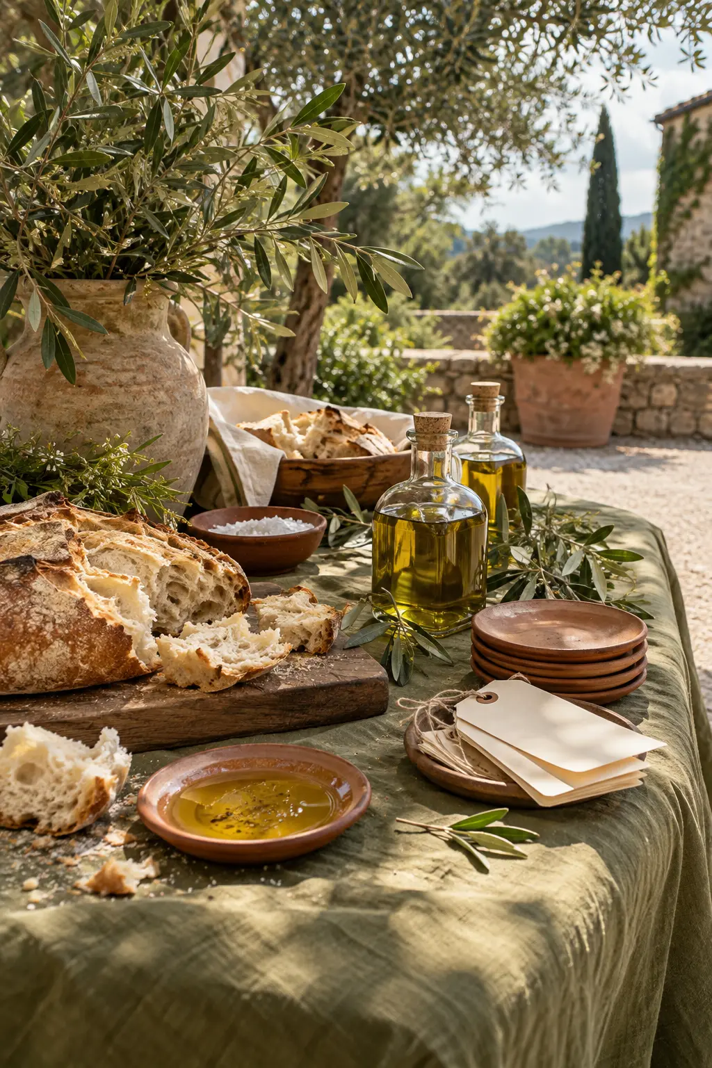
Use olive on linen, parchment on paper, and terracotta in unglazed serving pieces. The earthy finishes warm dappled orchard light and make the palette feel springlike without relying on pastel flowers.
21. Eucalyptus, Fog Blue, and Pewter
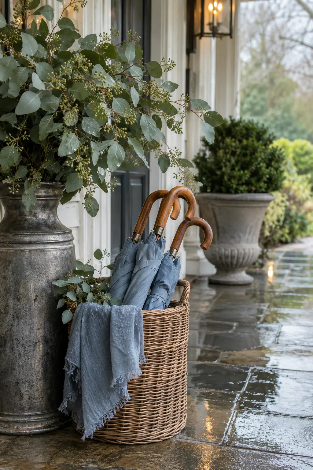
Keep eucalyptus matte and leafy, fog blue soft and textile-based, and pewter lightly reflective. This combination borrows the cool cast of a rainy day, then restores life through green stems.
22. Fern, Apricot, and Walnut
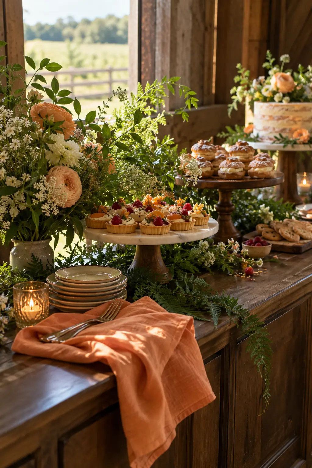
Walnut creates the dark foundation, fern green supplies the natural middle, and apricot adds a warm highlight. In a barn or wood-lined room, choose apricot paper and fabric so it remains visible beside the timber.
23. Clover, Lilac, and Limestone
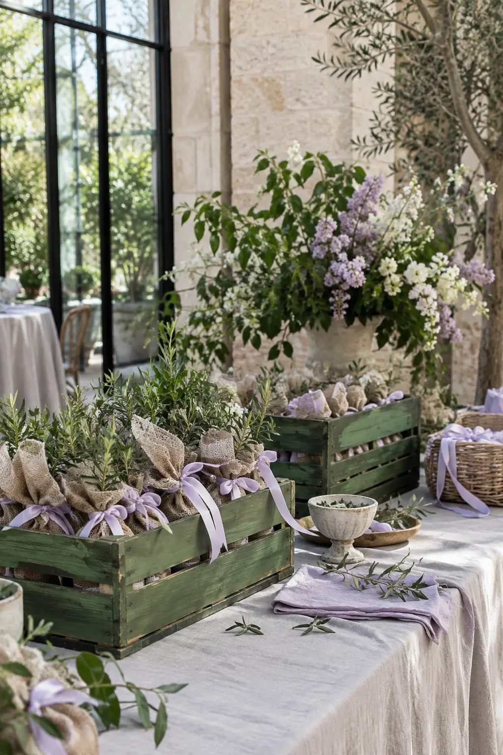
Use limestone as the broad neutral, clover on structured pieces, and lilac in soft ties or drape. The mineral surface takes the edge off clover while clear atrium light keeps the purple airy.
24. Moss, Pale Peach, and Copper
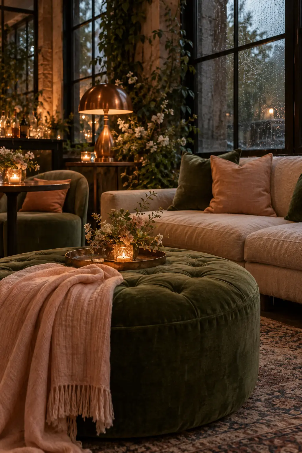
Lead with moss in upholstery or fabric, bring in pale peach for softness, and use aged copper for small points of warmth. This palette is especially effective for an indoor rain plan where window light is low.
Blue-Led Spring Wedding Colors
Blue changes dramatically between harbor sun, museum light, overcast windows, and evening terraces. These palettes give it a specific supporting texture and warm counterpoint.
25. Seafoam, Navy, and Cherry Blossom Pink
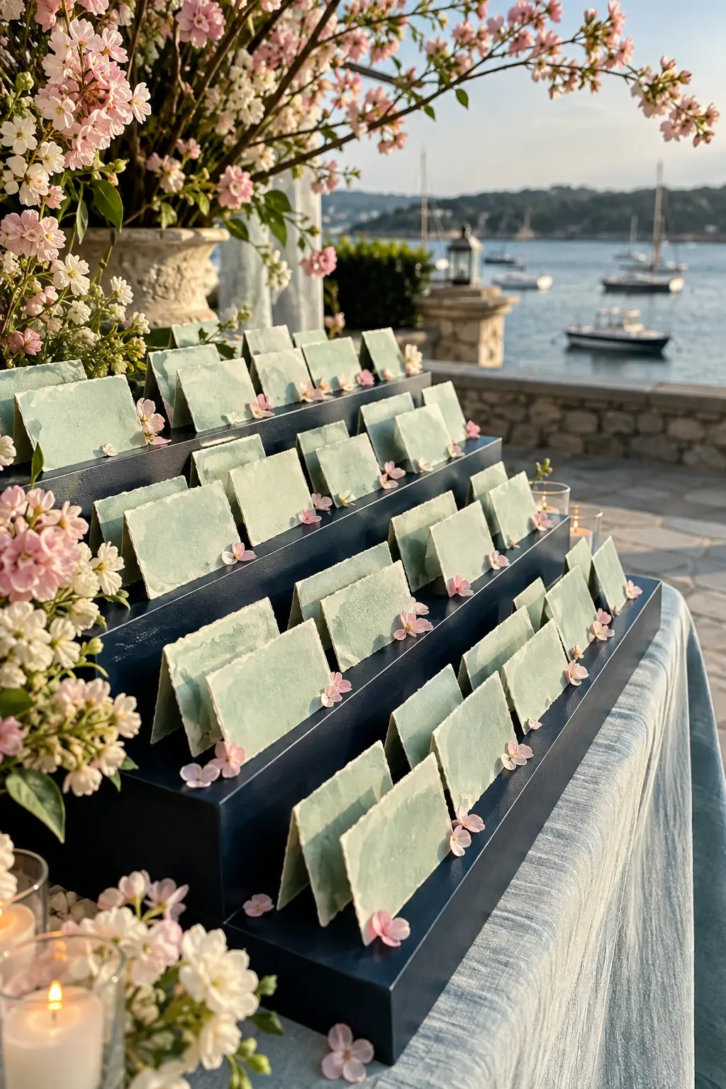
Seafoam sets the spring tone, navy supplies structure, and blossom pink should appear sparingly. Tile, painted wood, and petals give each color its own texture in breezy harbor light.
26. French Blue, Cream, and Rose
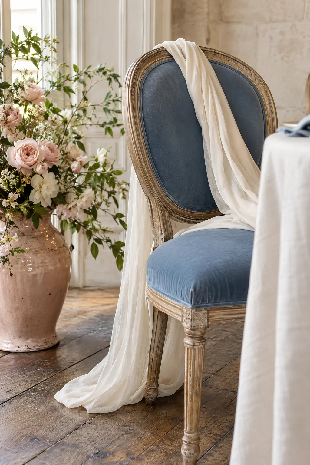
Let French blue define the main upholstered or fabric element, cream soften the edges, and rose appear in glazed ceramic or a small floral note. North-facing light keeps the scheme calm and elegant.
27. Dusty Blue, Flax, and Mustard
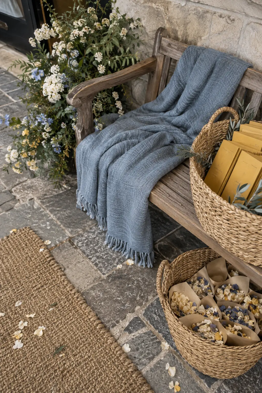
Use flax for the largest woven surfaces, dusty blue for calm, and mustard for one confident accent. The natural beige bridge helps blue and yellow coexist under flat overcast light.
28. Teal, Pale Peach, and Champagne
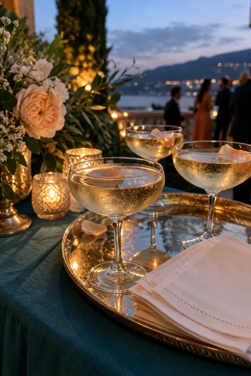
Teal is the anchor, pale peach is the soft note, and champagne metal or satin catches the remaining evening light. This hierarchy keeps peach visible as the venue moves from daylight into blue hour.
29. Delft Blue, Butter Yellow, and White
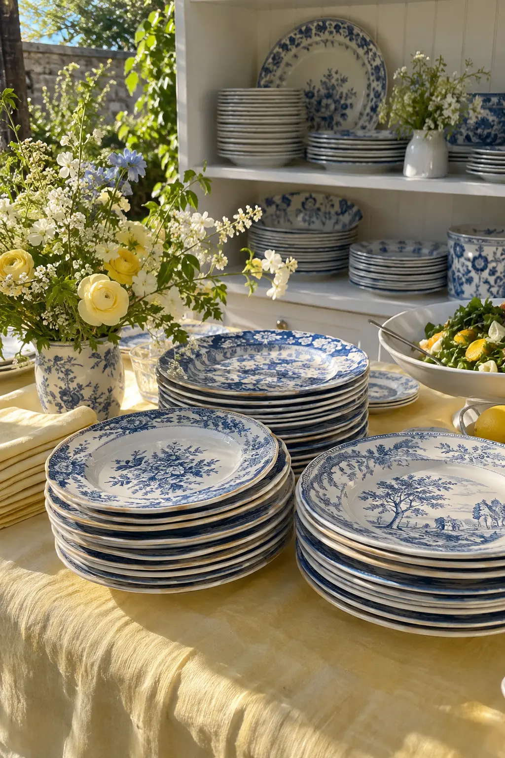
Let patterned blue ceramics carry the visual interest, use white shelving and serving pieces for space, and weave butter yellow through linen. Sunlight makes the glaze sparkle while cotton keeps the yellow soft.
30. Storm Blue, Sage, and Silver
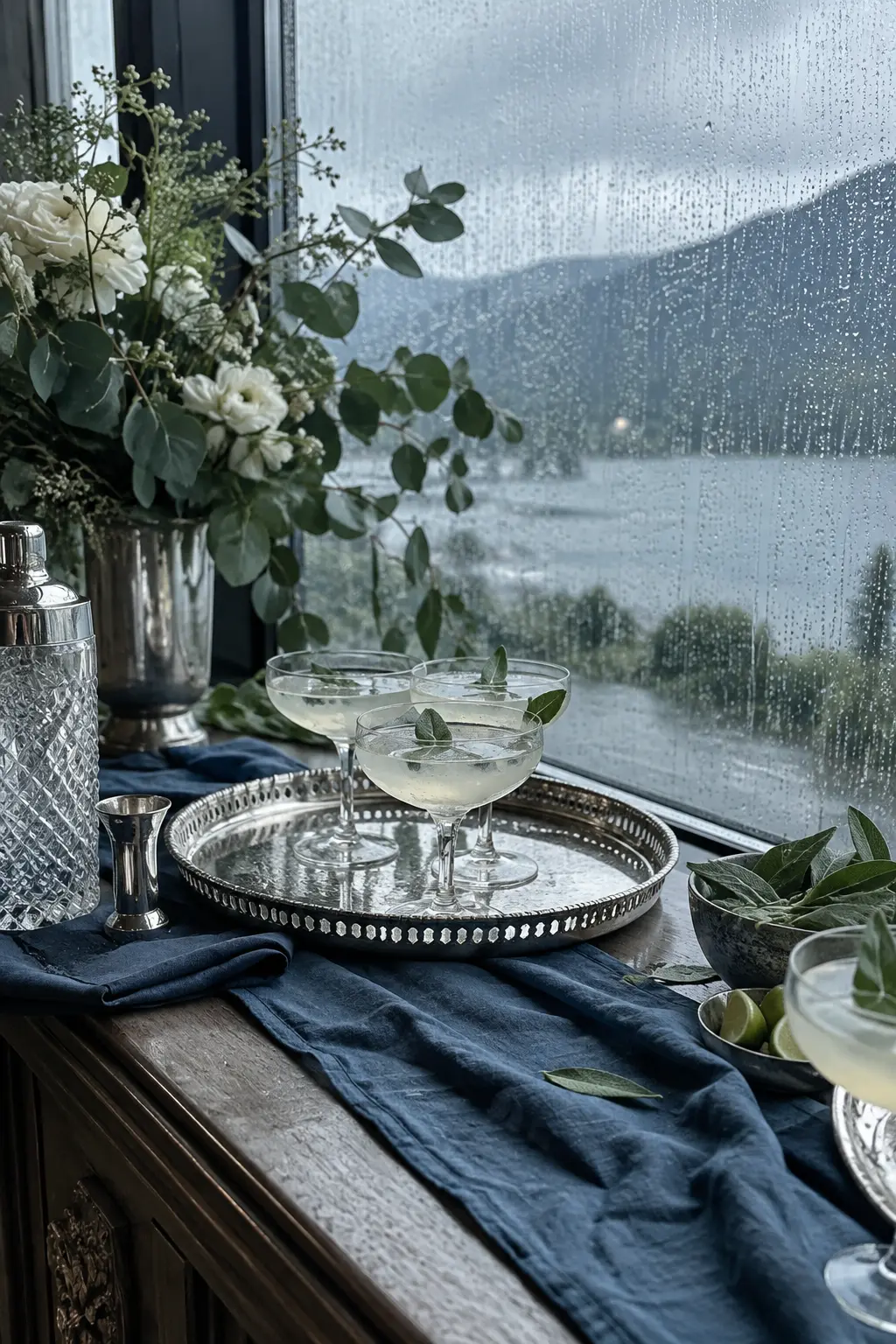
Use storm blue across cloth or painted wood, sage in fresh garnish and paper, and brushed silver for reflection. Rain-cloud light makes the metal and slate surfaces feel deliberate rather than dull.
31. Ice Blue, Blossom Pink, and Charcoal
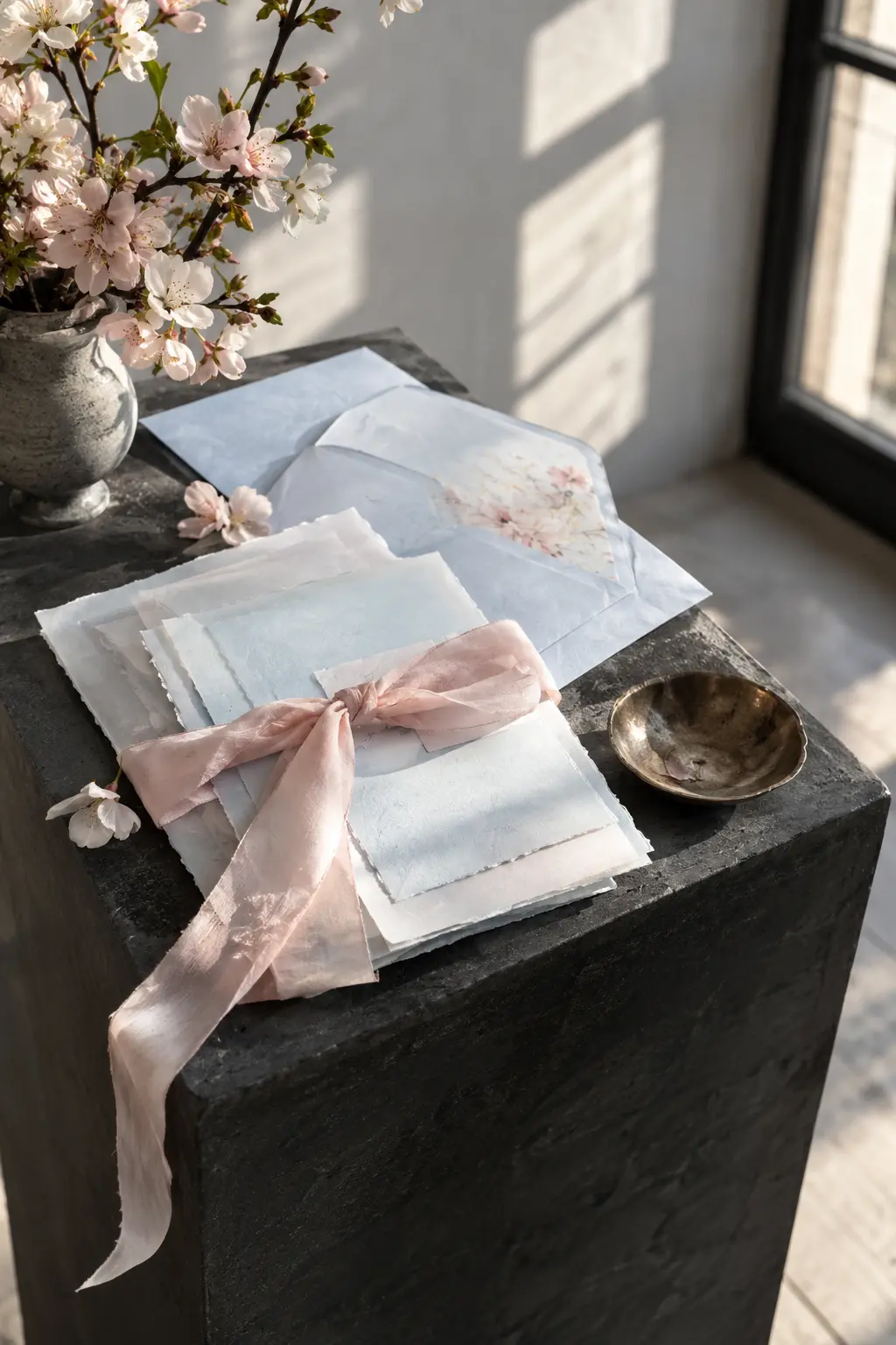
Build the palette from ice blue and blossom pink, then outline it with charcoal. That dark line gives pale colors definition in a modern museum or gallery where the light can feel cool.
32. Hydrangea Blue, Lilac, and Leaf Green
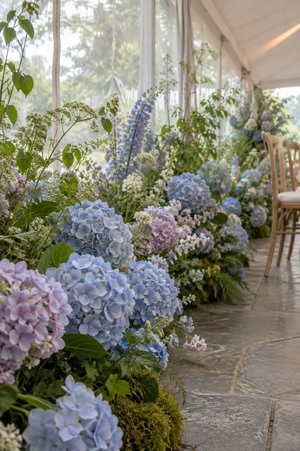
Use hydrangea blue as the main flower color, lilac as a neighboring transition, and leaf green as the grounding line. Clear water and glass reveal subtle color shifts under a diffused tent wall.
Yellow, Peach, and Golden Spring Palettes
Warm spring colors stay fresh when linen, stone, wood, or sage creates breathing room. Use the strongest yellow or orange in a smaller, deliberate dose.
33. Lemon, Ivory, and Leaf Green
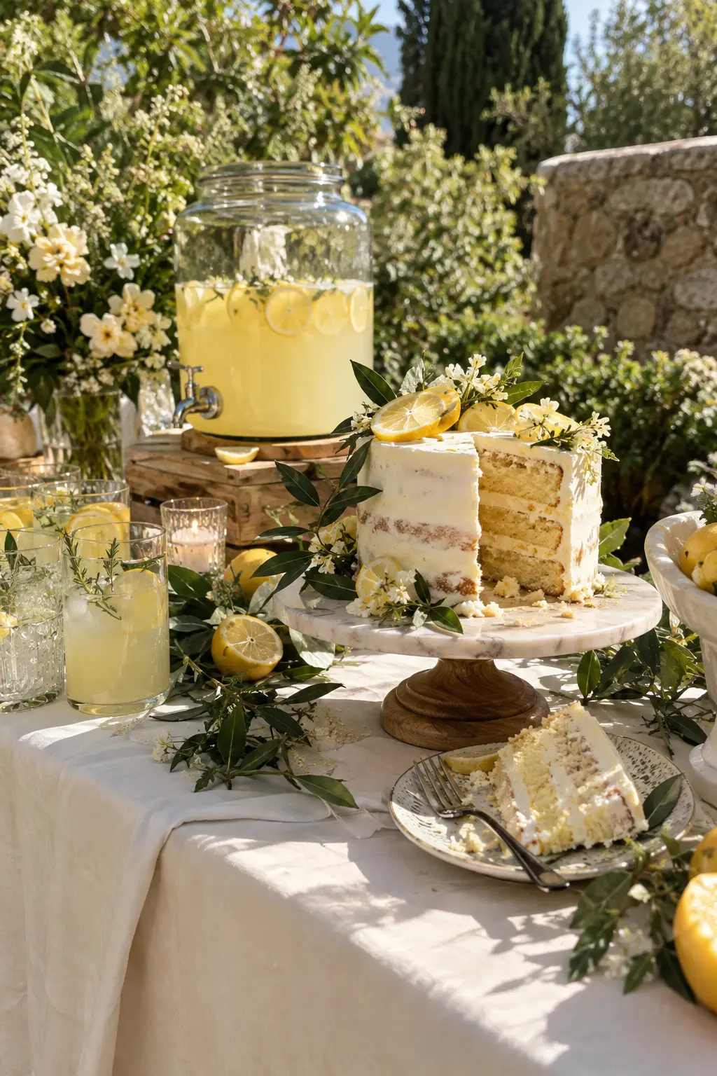
Let ivory linen absorb most of the visual space, then add lemon in food, candles, or ribbon and leaf green in restrained sprigs. Midday light keeps the yellow bright while the ivory prevents glare.
34. Butter Yellow, Blush, and Warm Gray
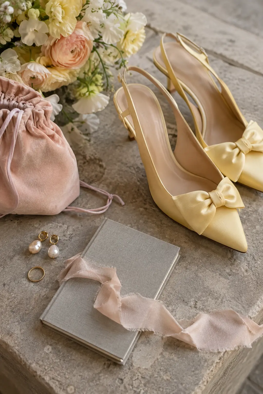
Warm gray is the quiet base, butter yellow the cheerful lead, and blush the soft connector. Stone and suede give this gentle palette enough substance for cloudy early-spring light.
35. Honey, Cream, and Cornflower
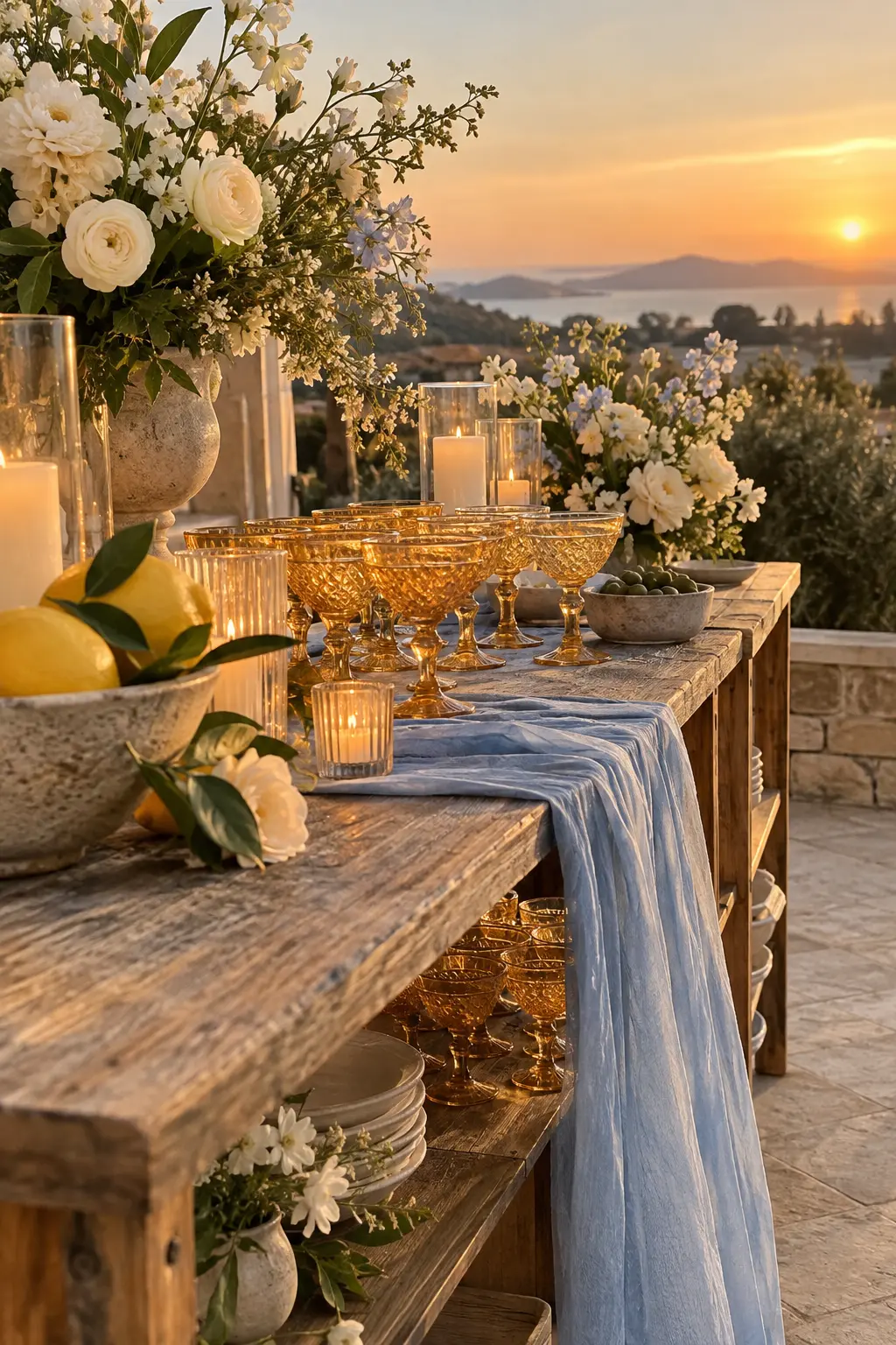
Use cream widely, cornflower blue in shaded textiles, and honey in transparent glass. At sunset, the glass warms while the blue holds its color, creating a balanced terrace palette from afternoon through dinner.
36. Peach, Marigold, and Sage
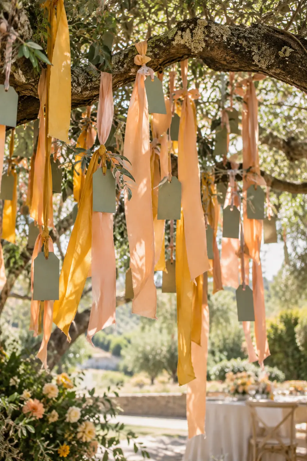
Make sage the breathing room, peach the main soft color, and marigold the concentrated accent. A leafy outdoor setting reinforces the green while ribbon movement separates the two warm hues.
37. Apricot, Pale Blue, and Cocoa
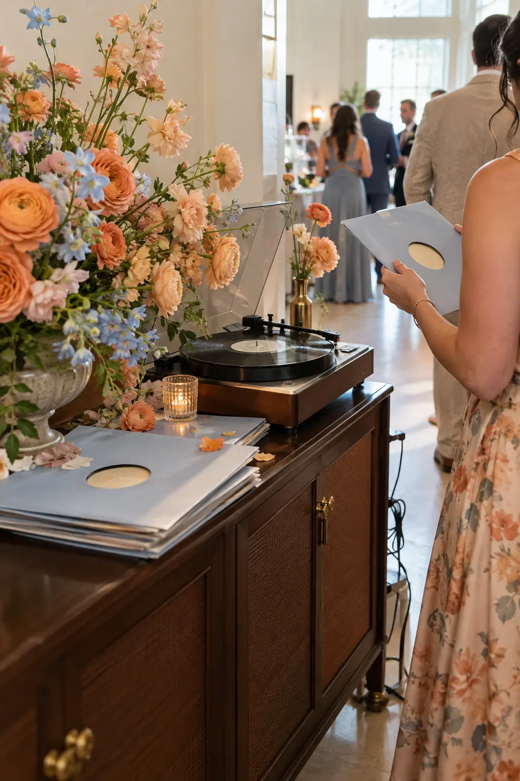
Cocoa wood gives apricot and pale blue a stable frame. Keep blue on paper or cloth and apricot in flowers or small accessories so the colors remain legible in a bright white hall.
38. Primrose, Lavender, and Chalk White
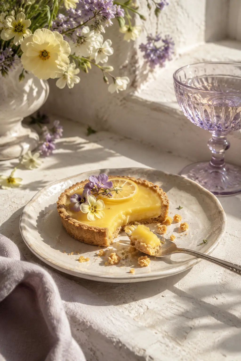
Chalk white should dominate, primrose supply the bright focal point, and lavender appear in transparent glass. Direct noon light creates colored shadows through the glass and keeps the palette crisp.
Romantic Pink, Mauve, and Lavender Systems
Romantic palettes need contrast in value or finish. Velvet, dark wood, translucent acrylic, and layered sheers keep related pinks and purples distinct.
39. Blush, Wine, and Mauve
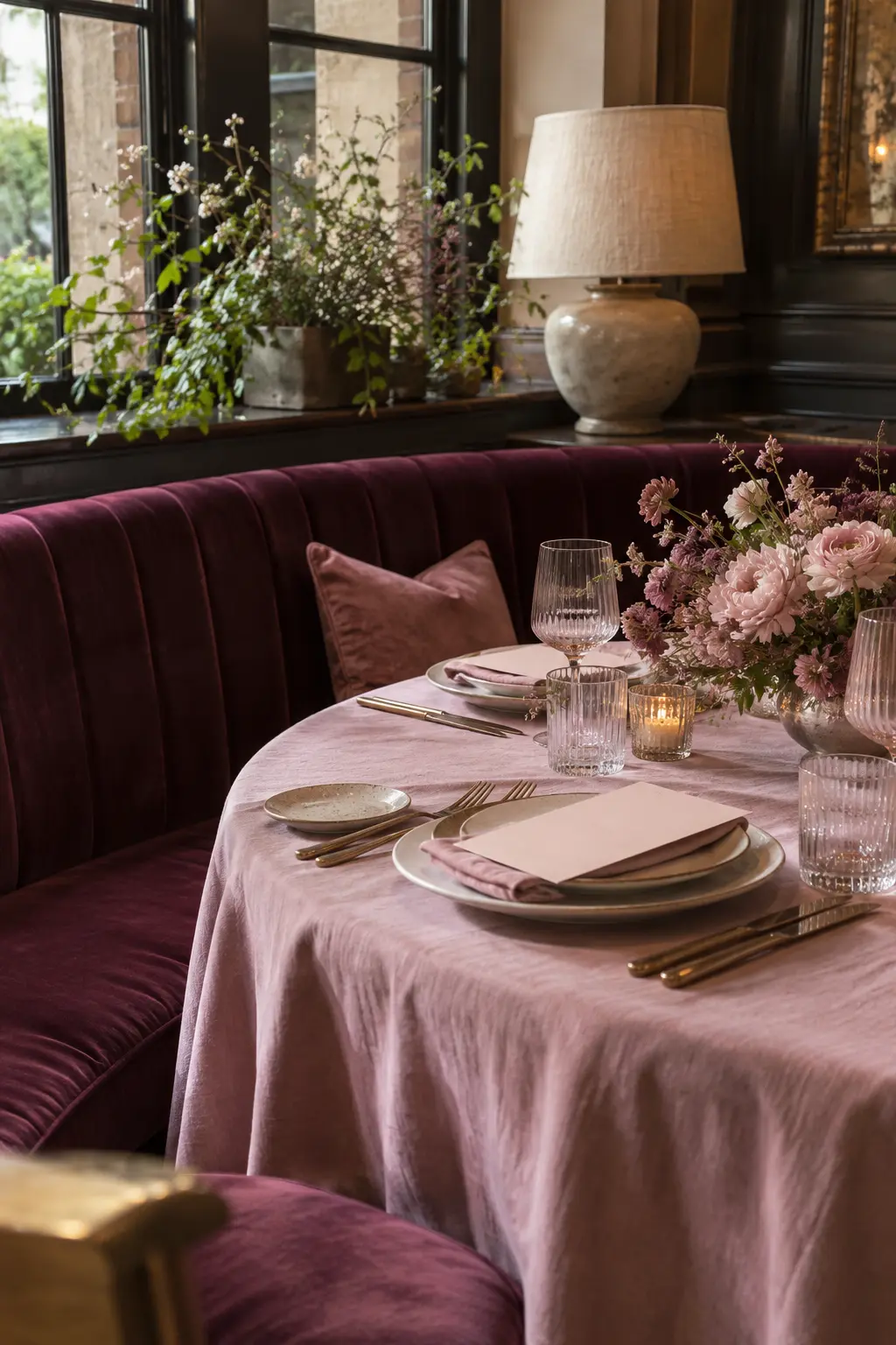
Layer mauve as the middle tone, blush on paper and linen, and wine in one deep velvet element. Low restaurant light brings out the fabric texture and stops tonal pinks from merging.
40. Rose Quartz, Lavender Gray, and Pearl
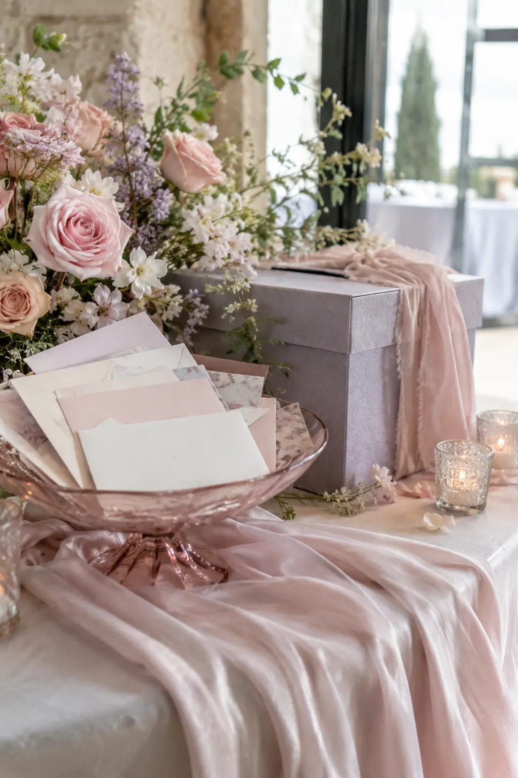
Use lavender gray for the largest object, rose quartz in translucent accents, and pearl on soft fabric. Cool indoor daylight gives this palette polish without pushing it toward candy colors.
41. Mauve, Sage, and Antique Gold
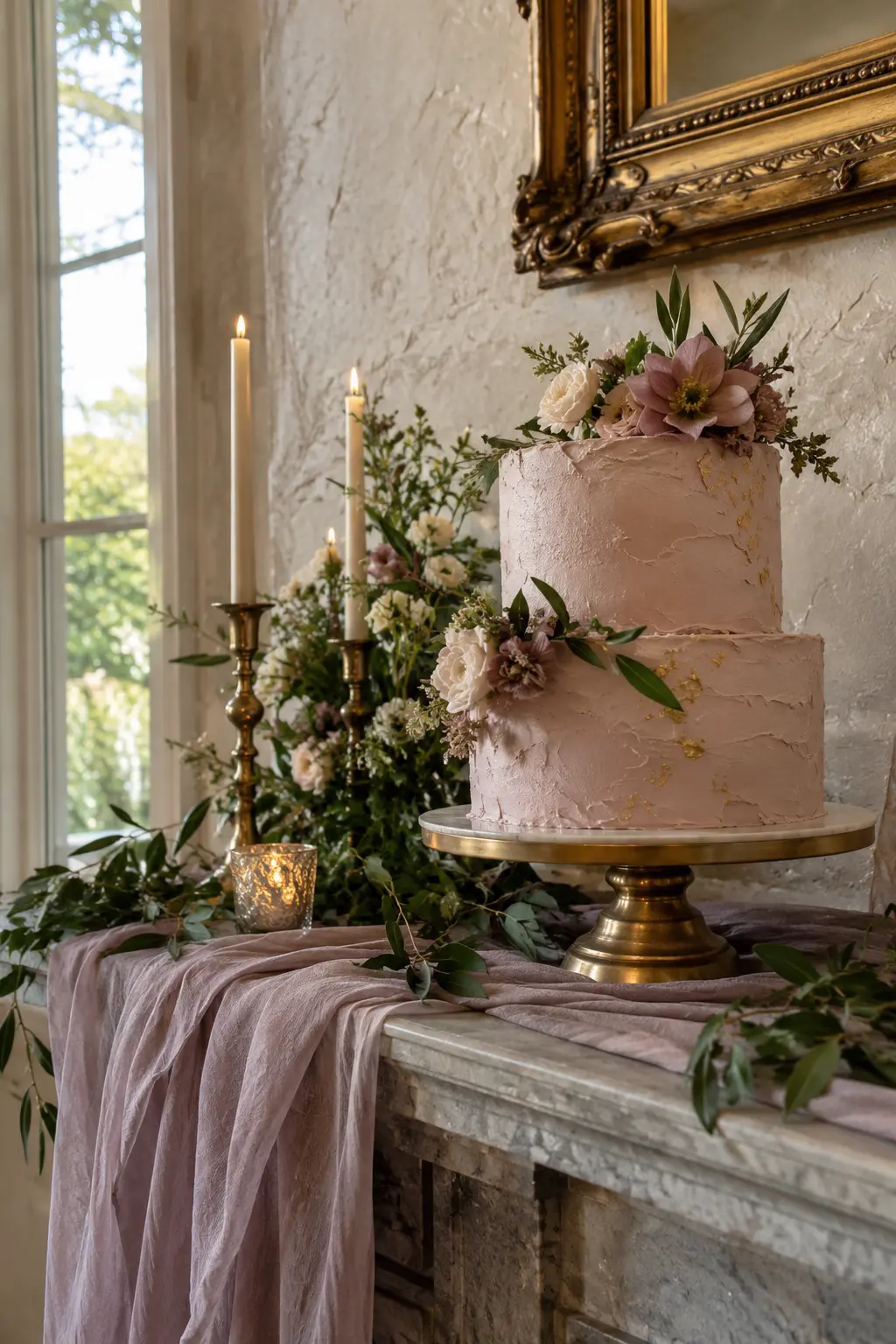
Sage is the stabilizing base, mauve adds romantic color, and antique gold should appear only in aged details. Patina works especially well in historic rooms because it echoes existing warm surfaces.
42. Orchid, Peach, and Espresso
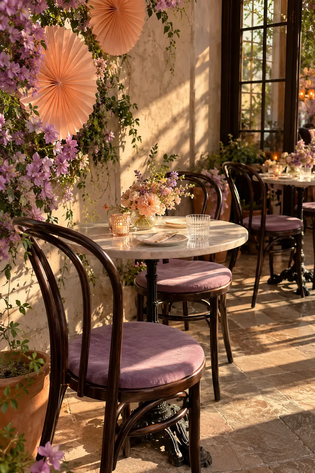
Espresso wood provides the visual outline, orchid leads the color, and peach softens it. Strong late-afternoon sun creates graphic shadows that help these neighboring warm hues stay distinct.
43. Petal Pink, Lilac, and Ice Blue
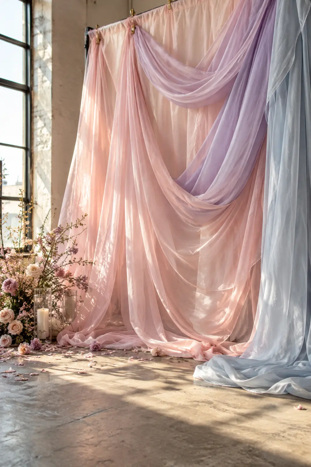
Arrange these pale colors in sheer overlapping layers rather than solid blocks. Window light passing through the fabric creates new in-between tones, giving the palette dimension without additional décor.
44. Rhubarb, Dusty Rose, and Celery
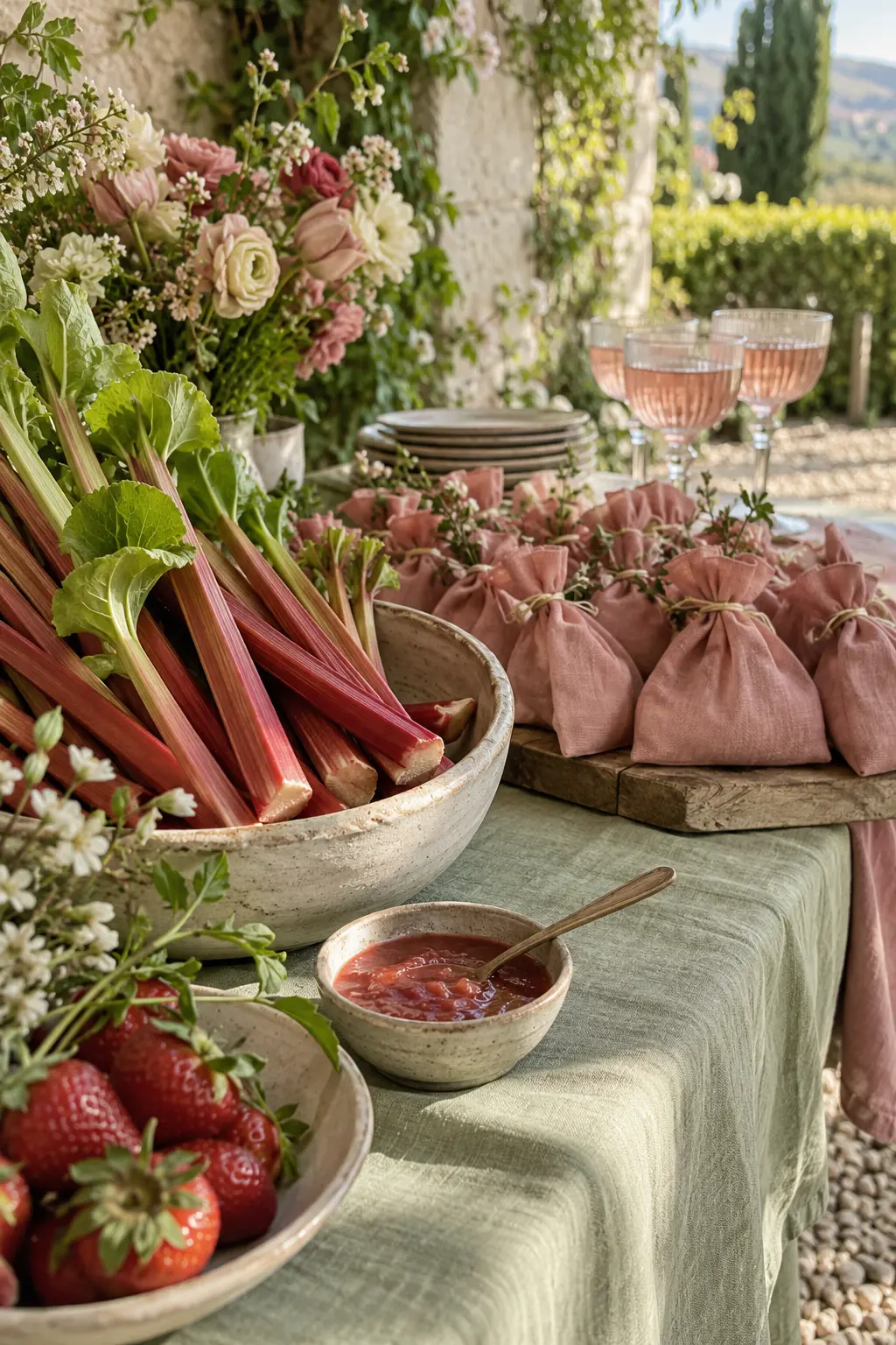
Use celery as the fresh foundation, dusty rose as the bridge, and rhubarb as the deepest accent. Matte ceramic and raw produce make the palette tactile and distinctly spring without depending on a floral centerpiece.
Spring Neutrals, Rainy Days, and Greenhouse Light
These final systems are built for subtle venues, weather plans, and glasshouse settings where light and surface texture do most of the visual work.
45. Bone, Flax, and Pale Olive
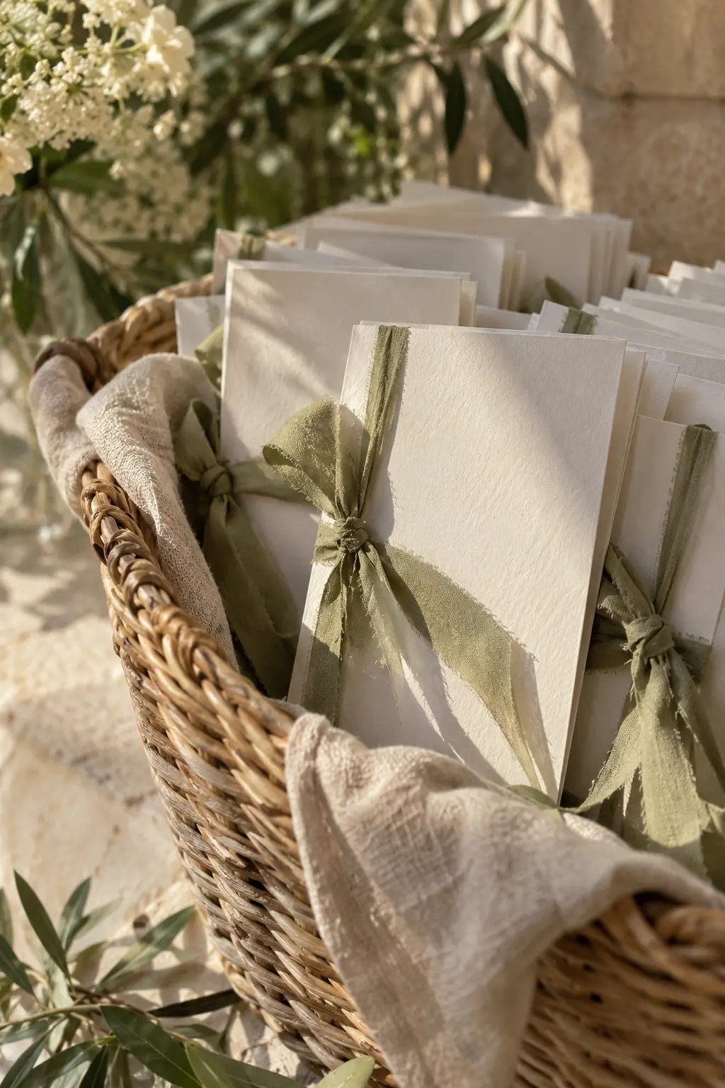
This quiet system depends on texture: bone paper, flax linen, and pale olive ribbon. Layer matte surfaces so the subtle differences remain visible in soft sun, especially at minimal or modern venues.
46. Greige, Buttercream, and Dusty Blue
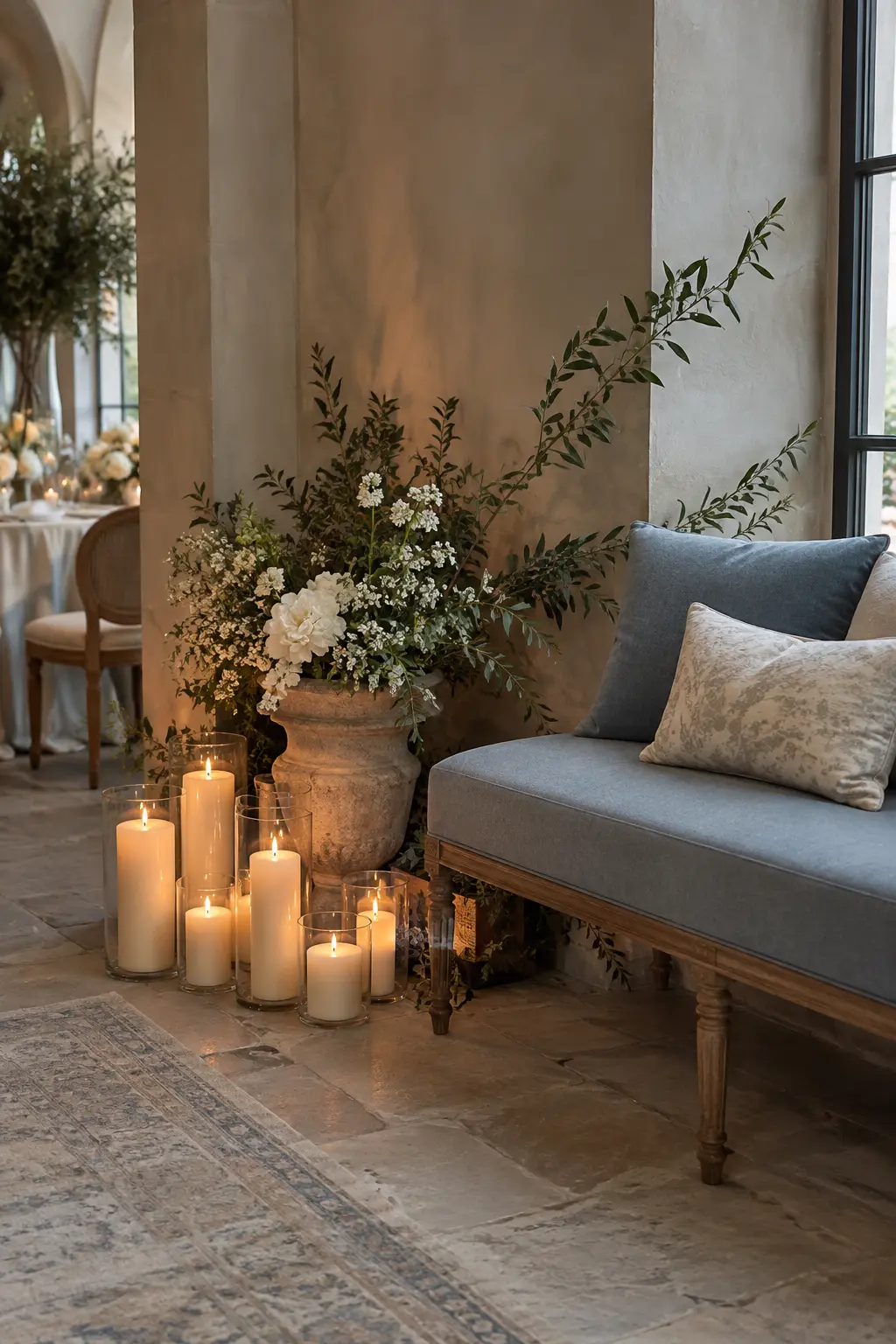
Use greige on walls and stone, dusty blue on seating, and buttercream in candles or small fabric details. The warm yellow note counters cool gallery lighting without changing the restrained mood.
47. Clay, Almond, and Soft Mint
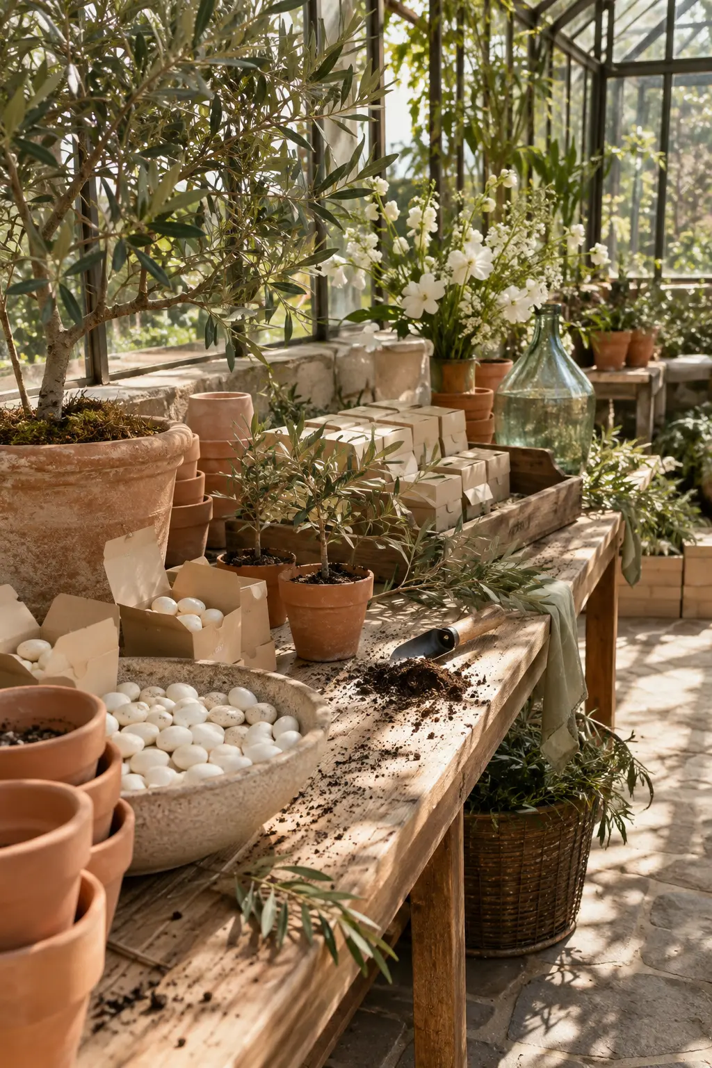
Unglazed clay is the grounding material, almond is the neutral body, and soft mint provides the spring lift. Greenhouse light reveals every texture, so allow natural soil specks and worn edges to remain.
48. Champagne, Pale Sage, and Ink
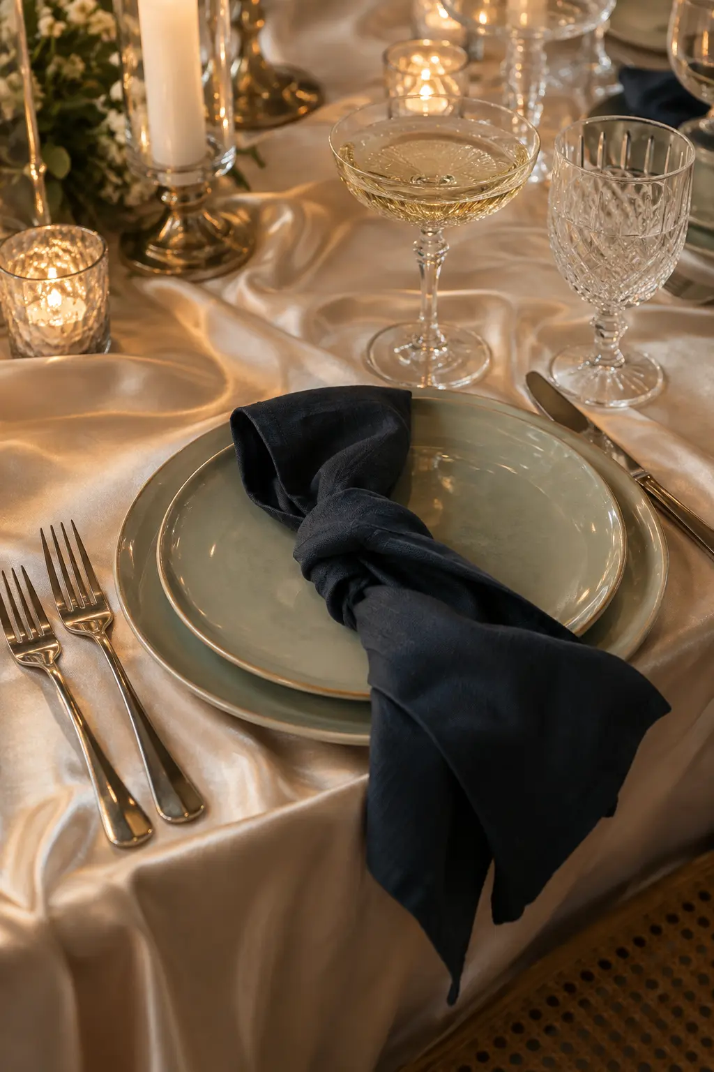
Let pale sage cover the plate or linen, champagne add restrained sheen, and ink create one tailored dark block. Crystal and satin catch ballroom light while the ink prevents the palette from fading into beige.
49. Rain Gray, Wisteria, and Wet-Leaf Green
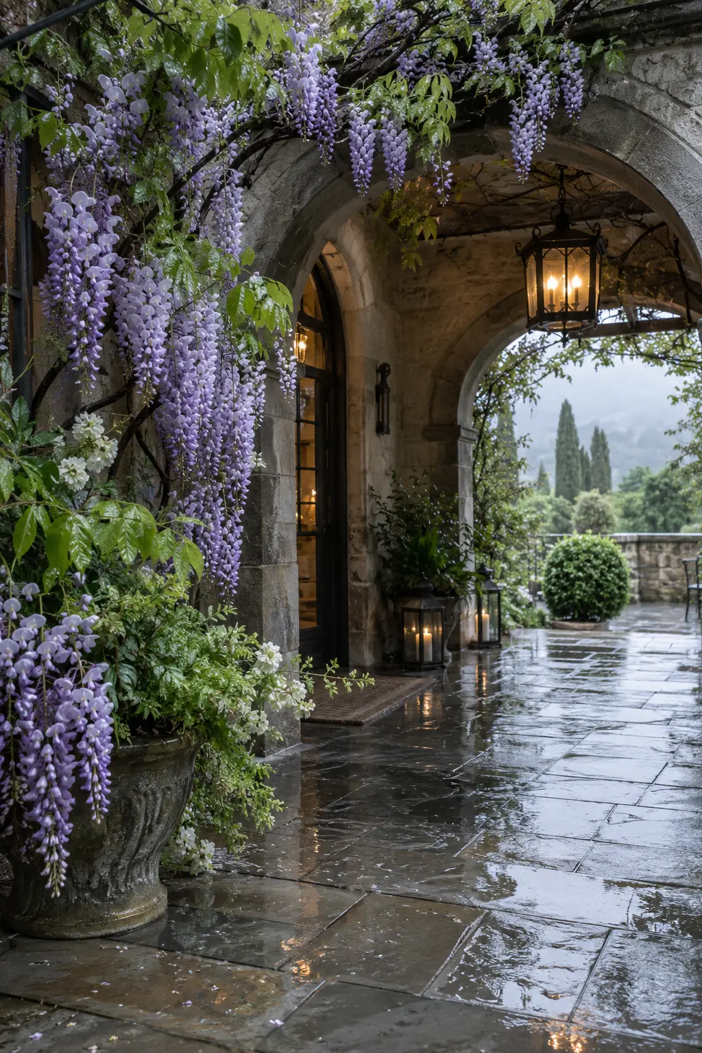
Rain gray should come from stone and sky, wisteria from accessories, and wet-leaf green from real foliage. Reflective puddles deepen all three colors and turn a rainy arrival into part of the design.
50. Glasshouse Green, Clear Aqua, and Grapefruit
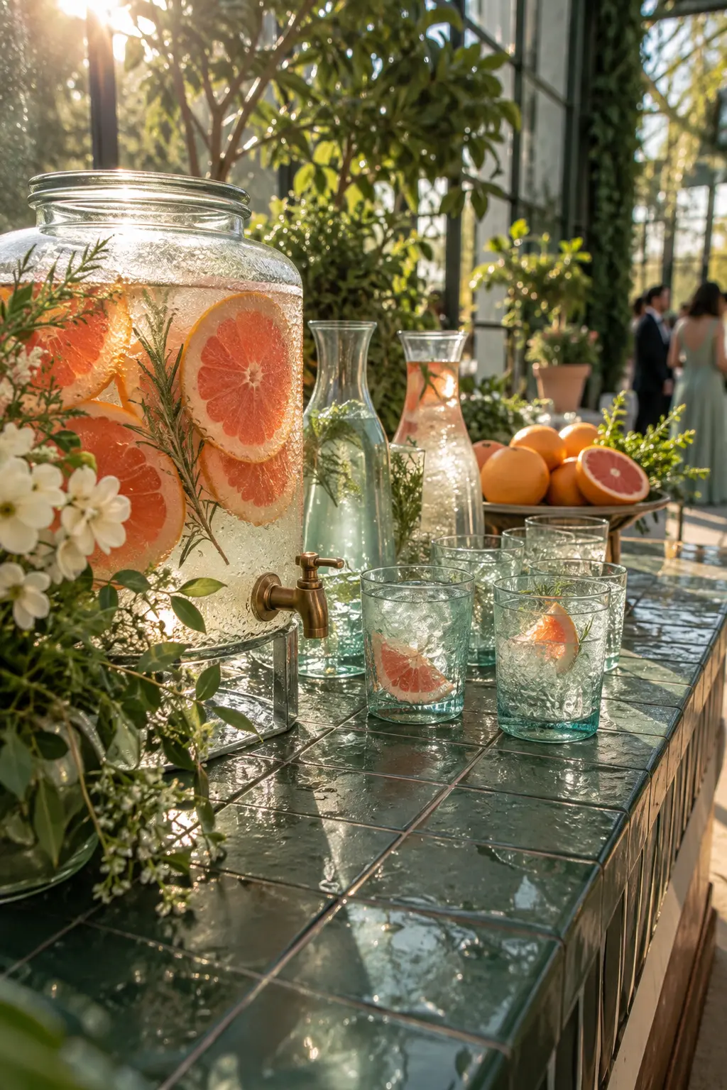
Allow foliage to dominate, use clear aqua in vessels and water, and add grapefruit as the warm accent. Transparent materials multiply greenhouse daylight while condensation keeps the setup relaxed and believable.
Choose a Spring Palette That Works in Your Real Venue
Shortlist three systems that suit your venue, then gather one physical sample for each major material. Photograph those samples in daylight and after sunset before committing to rentals, paper, or attire.
The strongest palette is not the one with the most colors. It is the one guests can recognize across different details because the hierarchy stays consistent from arrival through the reception.
Spring Wedding Color FAQs
How many colors should a spring wedding palette include?
Three roles are usually enough: a dominant foundation, a supporting color, and a smaller accent. You can use lighter and darker versions of those colors without treating every shade as a new palette color.
Do spring wedding colors have to be pastel?
No. Saturated red, cobalt, chartreuse, navy, or magenta can feel springlike when paired with fresh materials, seasonal light, and enough neutral space.
How can I test colors before booking rentals?
Collect swatches of fabric, paper, metal, and ceramics, then photograph them at the venue during the hours your event will happen. Compare the images beside your florist and rental samples.
What if the wedding day is rainy?
Choose colors that still separate under cool, low light and plan one reflective material, such as glass, brushed metal, or wet-look stone. Keep an indoor sample board so vendors can match the intended hierarchy.
This post may contain affiliate links: full affiliate disclosure.